How to make more space without adding square footage
It sounds like magic, but it’s really just good design.
When Bill and Judy Boland reached out to us about renovating and potentially adding on to their 1920’s farmhouse, they assumed they would need additional square footage to accommodate their needs. They came to us for the same reason many owners of historic homes do, wanting to work with a team equipped to integrate old and new and ready to handle the unexpected during construction - “we liked the idea of using a firm that covered all the bases from the design all the way through the building process.”
Source: Henrico County property records
The Bolands have lived in their home for 30 years and with three grown children living in Richmond and five grandchildren right in the neighborhood, they never considered the option of moving to a new home once they became “empty nesters.” Their lifestyle had changed, though, and with the desire to stay in their home for another 30 years, came new necessities such as a first-floor master suite, a larger dining room for family gatherings, and improved energy efficiency throughout their home.
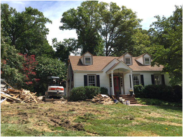
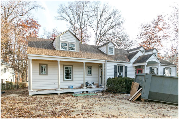
After their initial meeting with the Bolands, Matt and Bronwen Warner tag-teamed a design that completely demolished previous additions that had suffered moisture, mildew and foundation issues, replacing them with a bright new space that tied into the original home with consistent ceiling heights, floor levels and design details. Rather than build another addition to create a larger dining room, they pitched the idea of combining an infrequently used library with an adjacent bathroom to make one large dining room with better flow for entertaining. Their old, cramped dining room then became a comfortable breakfast room. Also on the first floor, three small bedrooms were transformed in a master suite, a powder room and a generous staircase to the second floor bedrooms.
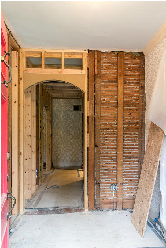
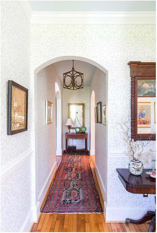
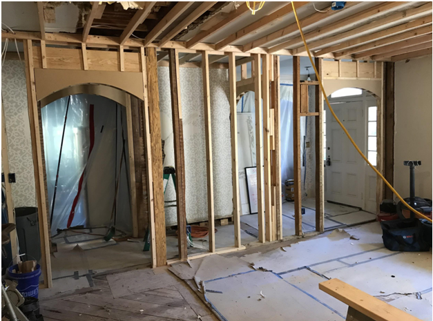
It was important to the Bolands that the history of the home be preserved and extended into the new spaces, so our crew took great care to repurpose old doors and hardware, match the new trim to the existing trim, refinish the heart pine floors, and create archways that matched the home’s original design. The Bolands did their part as well, refinishing and painting an old cottage chest to become a vanity for the downstairs powder room - perhaps the biggest bang for the square footage buck we’ve seen!
They refinished and painted the piece themselves, and we adapted it for plumbing connections in the powder room
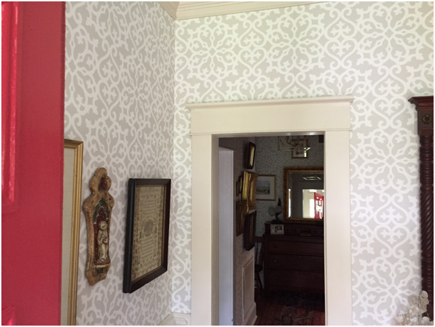
The Boland’s dresser in it’s new home, paired with Judy’s bold, colorful wallpaper selection, makes a fun and unique space out of this little powder room.
The Bolands did not live in their home during the renovation, but it was still important that areas of the house that were not being worked on were kept clean and protected. This can be a real challenge, but according to Mrs. Boland, the RIC crew “took great care of our property and left it clean each and every day during the construction. We were able to leave some furniture and valuables in the rooms that were not being renovated and the crew created dust barriers for those rooms. The crew did an excellent job of communicating with us about everything that was happening during the renovation.”
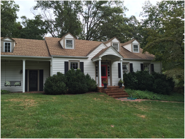
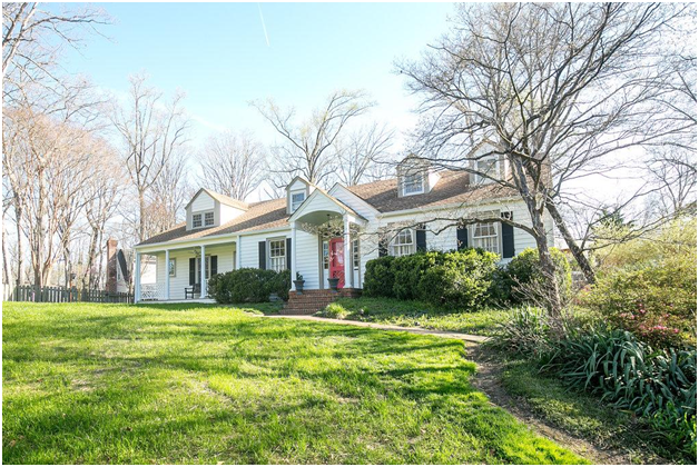
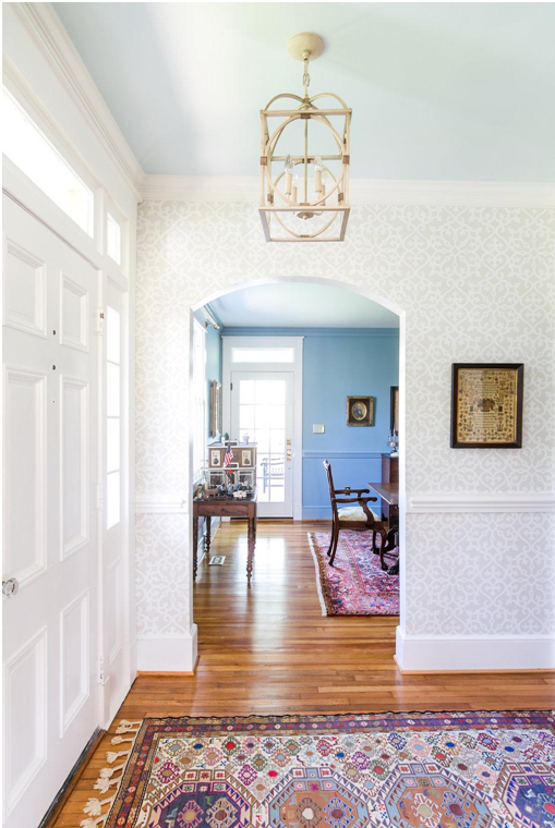
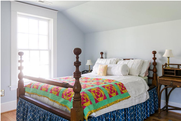
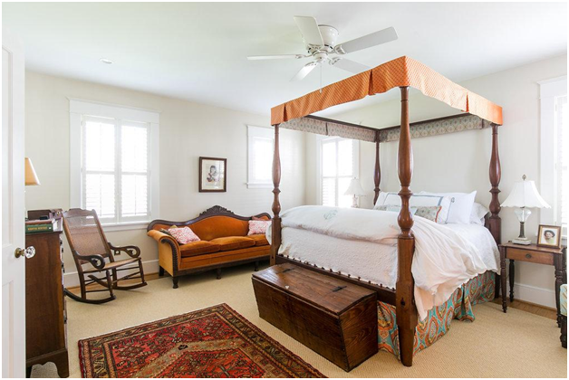
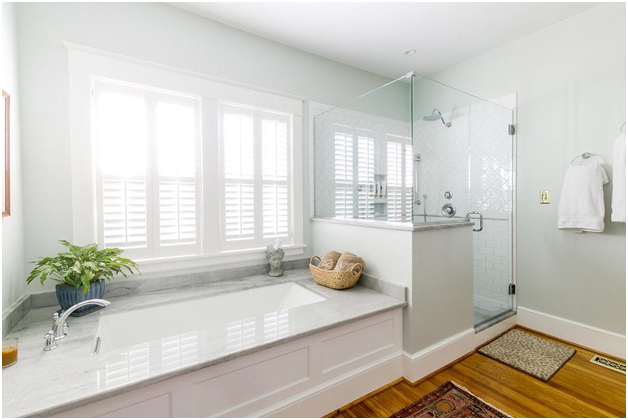
From the outside, it’s difficult to tell how significant some of the changes were in this renovation. However, as soon as you walk through the front door, you’re greeted with a large entry hall that opens up into a big, airy, light-filled dining room. You might guess it was part of the home’s original design. Their large, antique dining table that had been handed down through their family now has the space around it to comfortably seat 12 or more people at their weekly Sunday dinners. The sunny master suite includes his-and-her closets, a spacious master bath and refinished original hardwood floors throughout. The second floor of the addition connects to the original attic bedroom suite, and includes a new guest bedroom and a “grandkids’ lounge.”
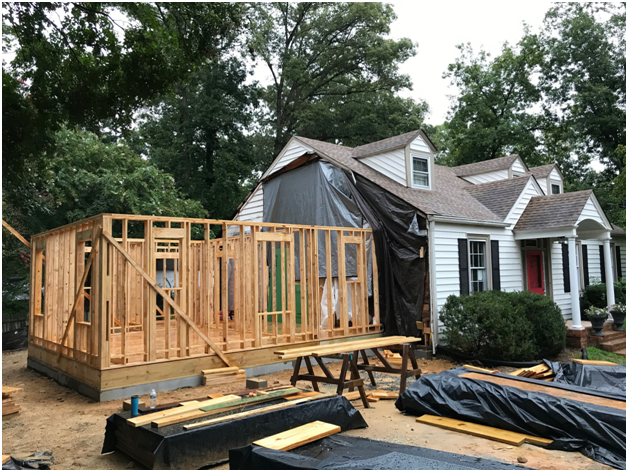
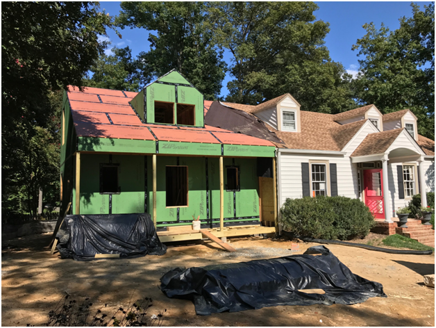
The project began by demolishing previous additions and rebuilding on the same footprint to abide by setbacks and make the best use of the space.
We value any opportunity to make the most of what a client already has. We know that even a small change (like a wider doorway in a heavy traffic area) can make a big difference in how your home operates on a daily basis. “I cannot imagine being any more thrilled with our renovation” says Mrs. Boland. “We now have a more comfortable, liveable, quieter and more energy efficient home and it is more aesthetically pleasing inside and out. We have always loved this house and we now feel that it is the home it was always meant to be.”

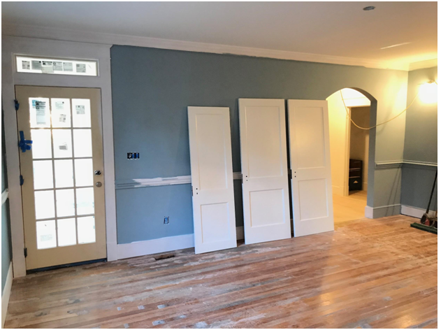
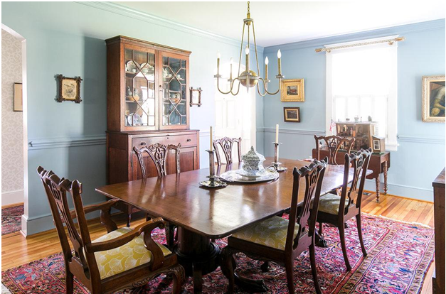
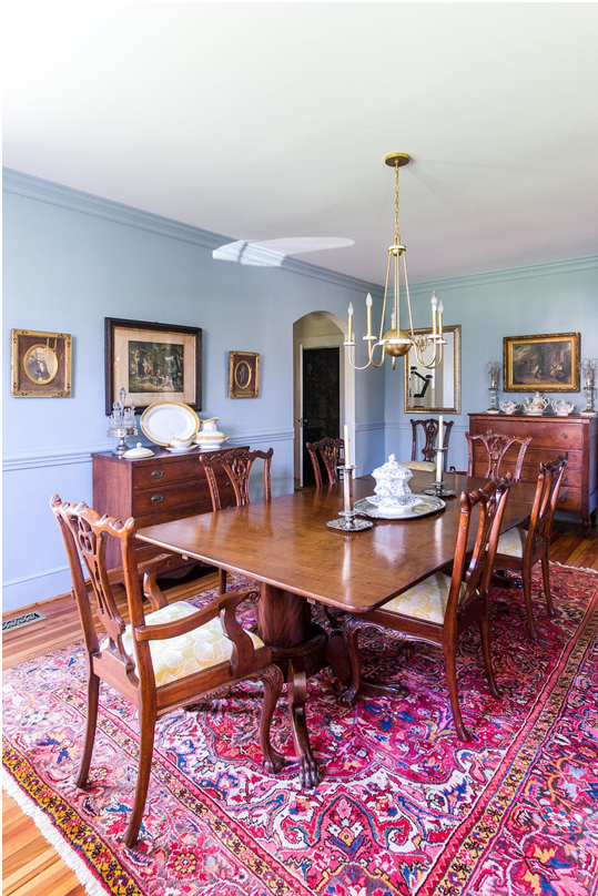
This beautiful dining room is now able to accommodate the family’s weekly get-togethers as well as their family heirlooms.
The Boland’s beautiful home is a great example of rethinking and reworking underutilized spaces and coming up with creative solutions all along the way. The Boland’s advice for other empty nesters looking to renovate? “Plan for 20 years out. Go for comfort, safety and beauty. Hire RIC Design Build!” We promise they said that without any coaxing from us!
Seemingly small changes in the entryway, including a larger opening into the hallway and an additional entrance into the dining room, make’s the home’s first impression much more welcoming.
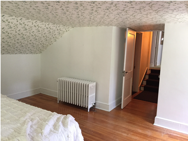
Before the renovation, the upstairs bedrooms only had about 6 feet of clearance. In the remodeled upstairs we were able to give them standard ceiling heights and level flooring.
The new first-floor master suite is now a relaxing retreat for the Bolands that they’ll be able to enjoy for decades to come.
“Final” photos by Sarah Derr


