Project Update: High Point Barbershop Opens!
As many people in Richmond already know, last month High Point Barber Shop opened its highly anticipated second location in Scott’s Addition.
Last year we wrote about how proud we are to have been the contractor for the new location’s renovation, which was designed by Campfire & Co., a Richmond-based Branding and Interior Design firm. Although it took a bit longer than expected due to some unforeseen hurdles, the end results are stunning and we are so excited to share some photos and details of the finished product.
Darren Brown, left and Matt Warner, right
Darren Brown, part owner of High Point Barbershop, was our contact throughout the project. He worked hard to convince us to take on a commercial renovation, something a little bit out of our wheelhouse, but we’re very glad he did. We caught up with him recently to get his take on the project and finished product and he couldn’t be happier. “The most important thing is that we’re now able to take walk-ins and the appointment calendar isn’t always six weeks out. That was never our vision for the shop, so I’m so glad we are able to put our hands on more people’s hair with this new location.”
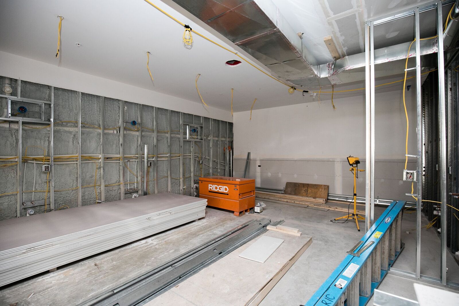
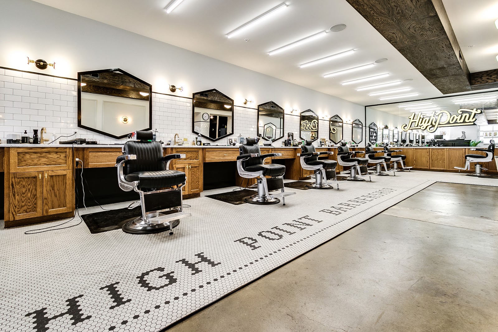
The new location includes eight barber stations with one chair dedicated to walk-ins. This has allowed High Point to hire several new full-time barbers who had been apprenticing at the first location. On our end this meant plumbing seven sinks along one wall, not to mention about five other sinks throughout the space. In fact, this project may have had the most sinks of any building we’ve renovated. Installing this many sinks required us to tear a trench into the concrete floors around the entire perimeter of the shop, a demo project the High Point crew initially tried to do themselves over pizza one night before quickly realizing that’s a job best left to the professionals. (Ask them about this experiment next time you’re there for a haircut).
So many sinks! (Photo credit: Mick Anderson)
Lots of lighting also needed to be wired and installed including LED fixtures above the chairs, brass sconces on the seating walls, pendant lights over the bar and even a neon sign above the coffee bar.
Loads of lighting! (Photo Credit: Mick Anderson)
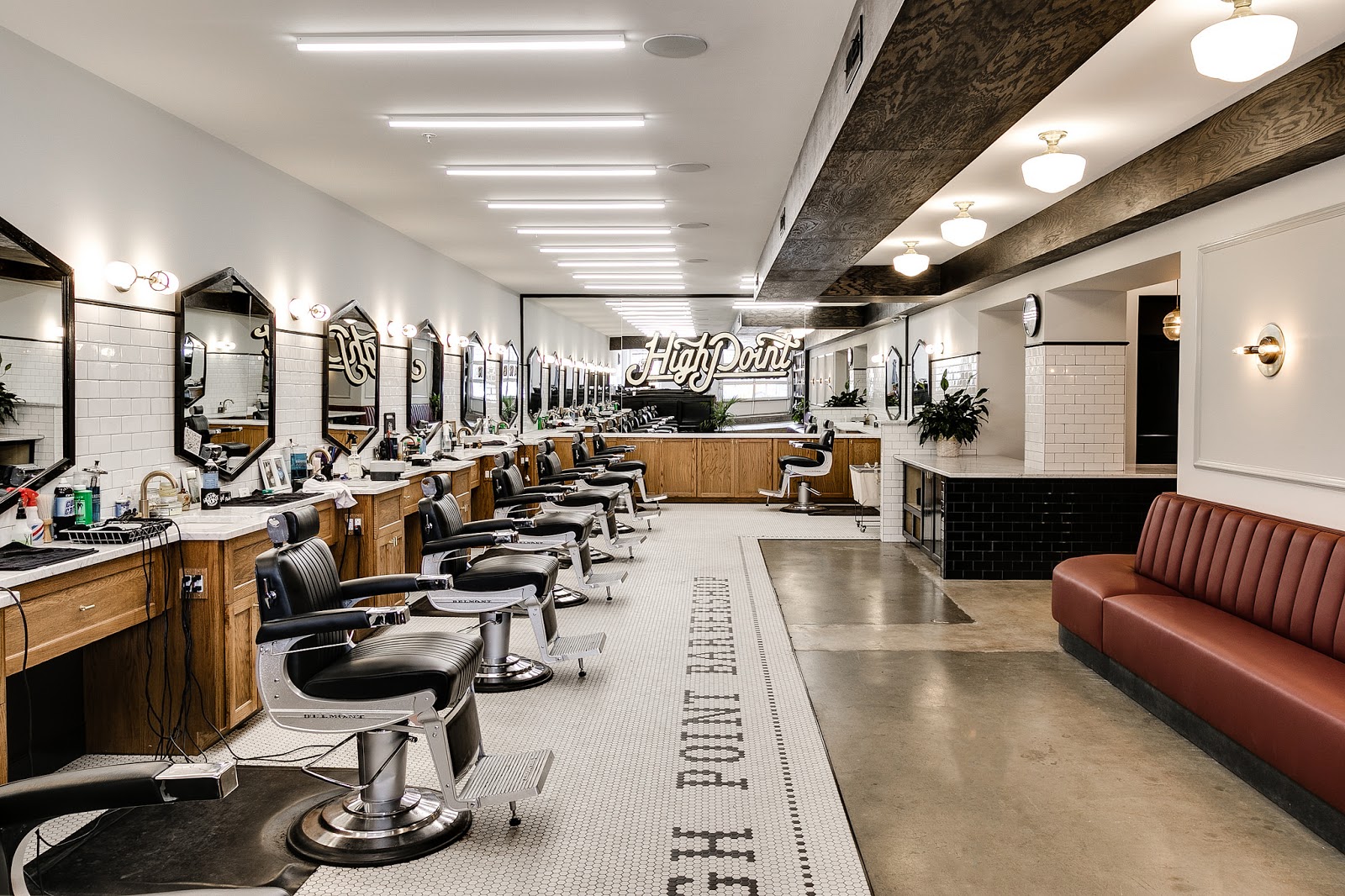
The original space was also broken up into two large rooms with one small opening between them. Because it’s a fairly narrow space to begin with, we knew we had to open up this wall to create a waiting area that integrated with the barber area to allow for the conversations and interactions that make barber shops the gathering places they are. These are the kind of situations where working with the interior designers at Campfire & Co. was really helpful. They expertly designed a wrap-around bar and built-in seating booth that seamlessly joined the two spaces.
Photo Credits: Mick Anderson / Rendering by Campfire & Co.
Although we usually do our own design work for our residential projects, having Campfire on board helped take this bare-boned commercial space to a thoughtful, on-brand place that people love. “People come to the new location and still feel like they’re at ‘home’ - it’s still the barber shop they know and love” says Darren. And it’s true that despite very different layouts and physical space, the two locations feel a lot alike. “There are touch points all over the shop like the vintage hex tile designs, stained wood and marble counters that our clients will find familiar and that are just an embedded part of our brand.”
At the end of the day, we couldn’t be happier with how the shop turned out and we’re glad to know High Point feels the same way. We’re looking forward to more projects with Darren through his other company, Atlas Realty, and who knows - maybe even some more commercial work down the road.


