Project Spotlight: Modern Makeover
One of the amazing things about being in business for over ten years, is that we’ve now had the opportunity to work with clients on multiple projects.
As families grow or needs change, we’ve been able to help clients transition into new homes, often giving our input before an offer is even on the table. This was the case for Britta Petersson and Dan Komorowski. After providing architectural services for a major kitchen renovation in 2014 in their nearly 100-year old house, we continued to do small projects for them until they were ready to move on in 2017.
When Britta Petersson first walked through what would be her future home, she said she immediately saw its potential, but knew it needed some tweaking to meet their specific taste and lifestyle. “I called Matt and he actually walked through the house with me before we made an offer. I needed to be sure I could do what I wanted to do to the house before jumping in. I knew I wanted to use RIC because I could trust it would be quality work and Matt gets my sense of style.” We signed on to do the design and construction portions of their renovation.
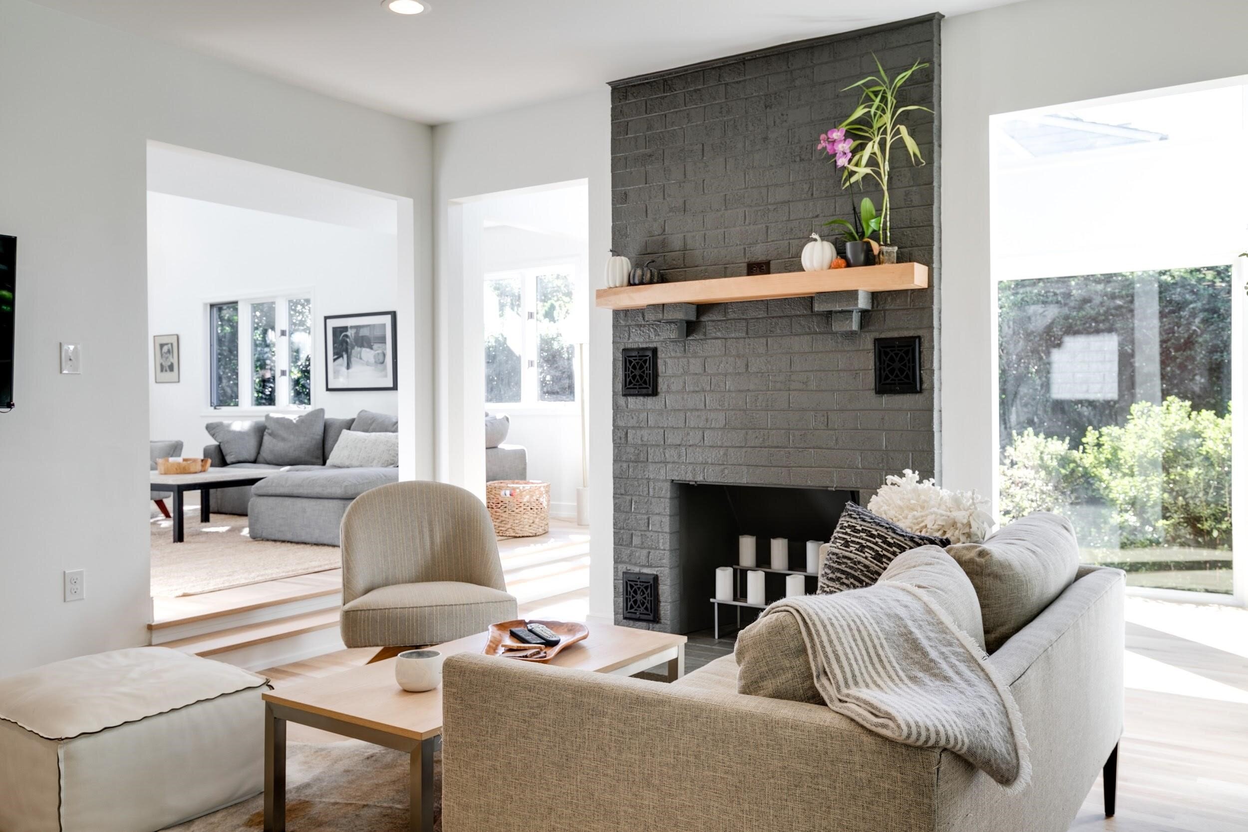
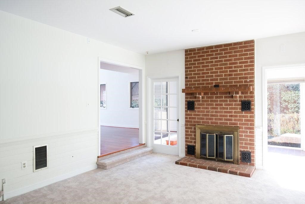
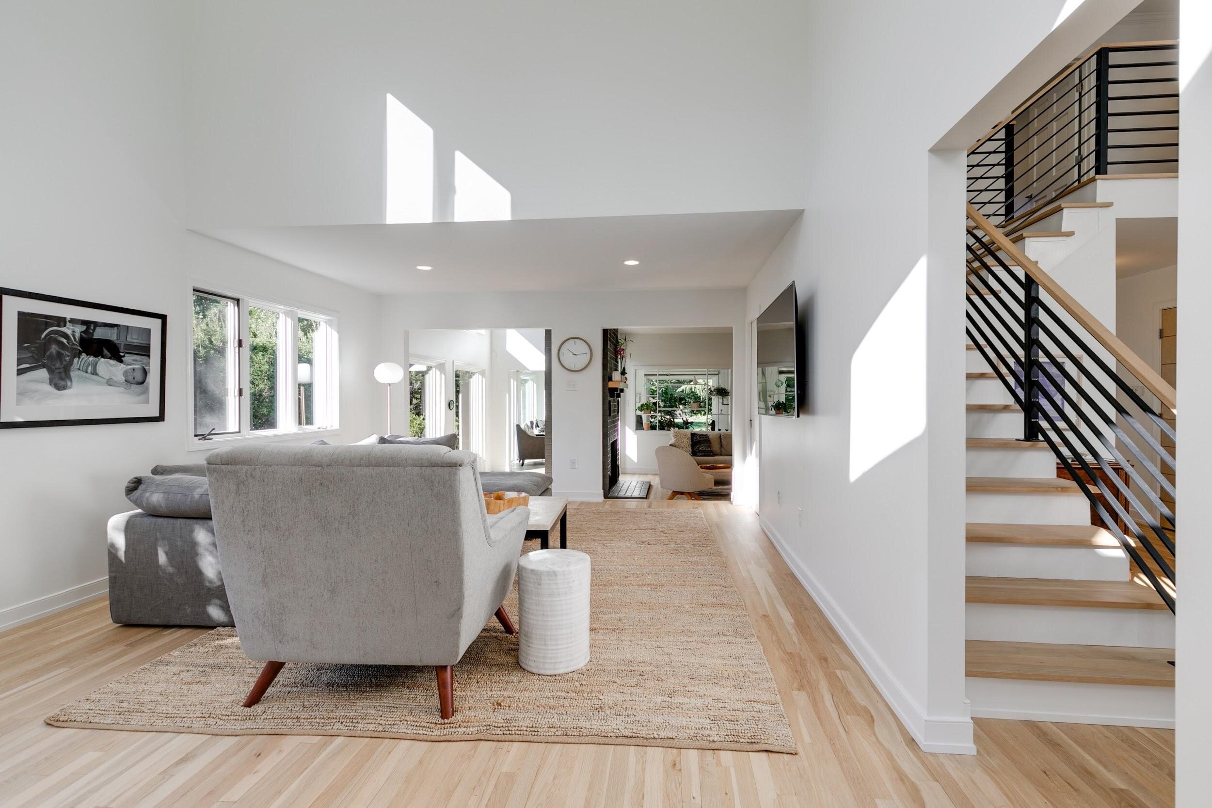
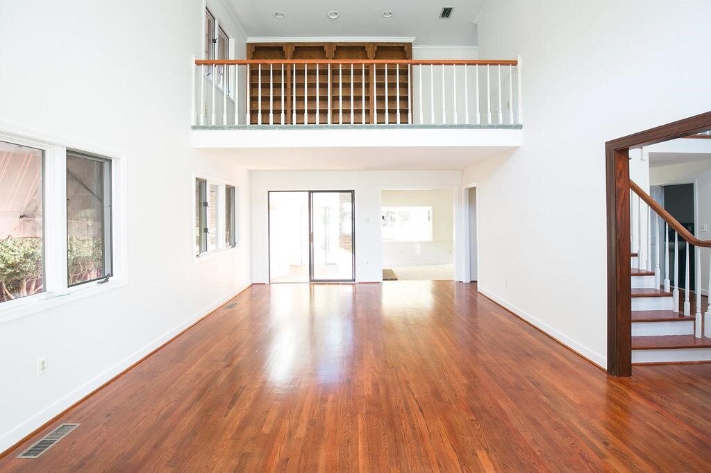
Carpeting was removed for new wood floor installation, brick was painted, new wood mantle stained to match the floors and simplified door trims.
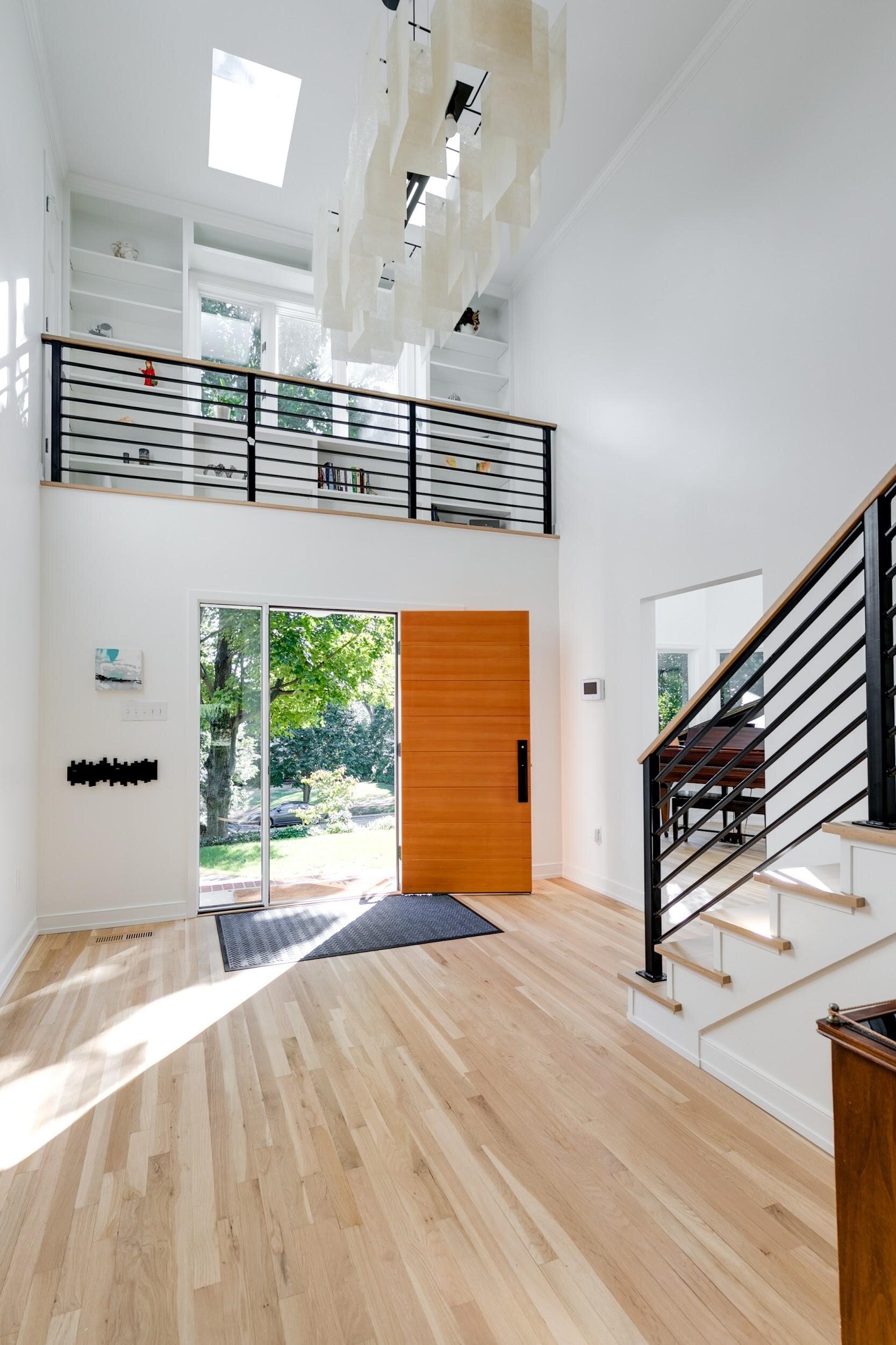
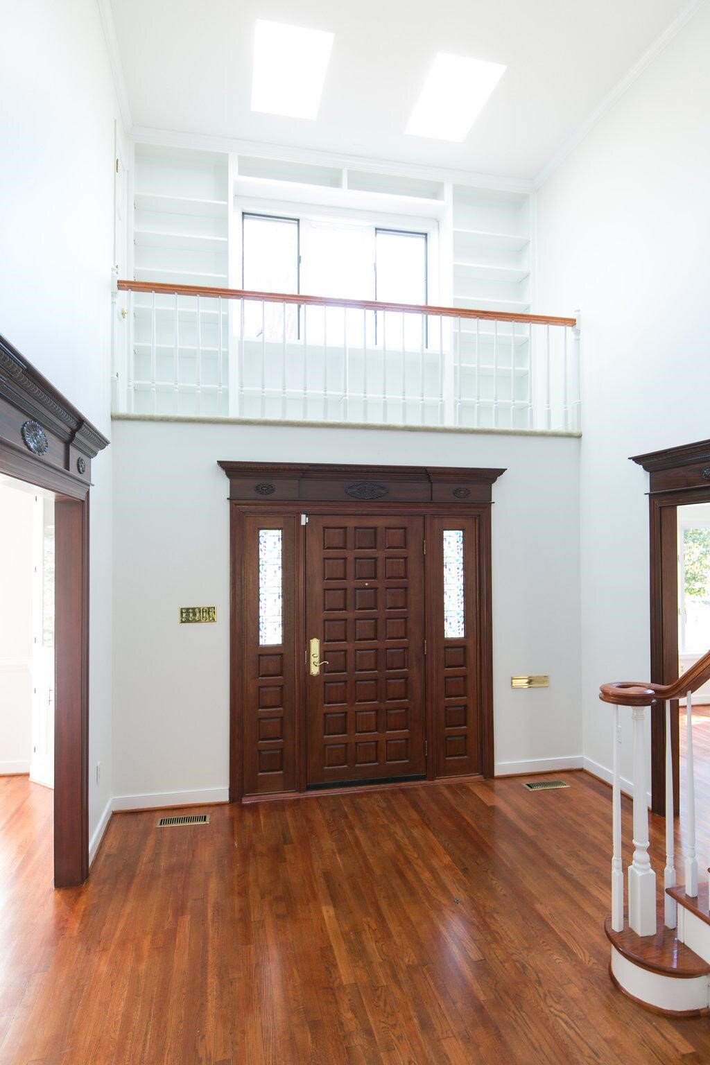
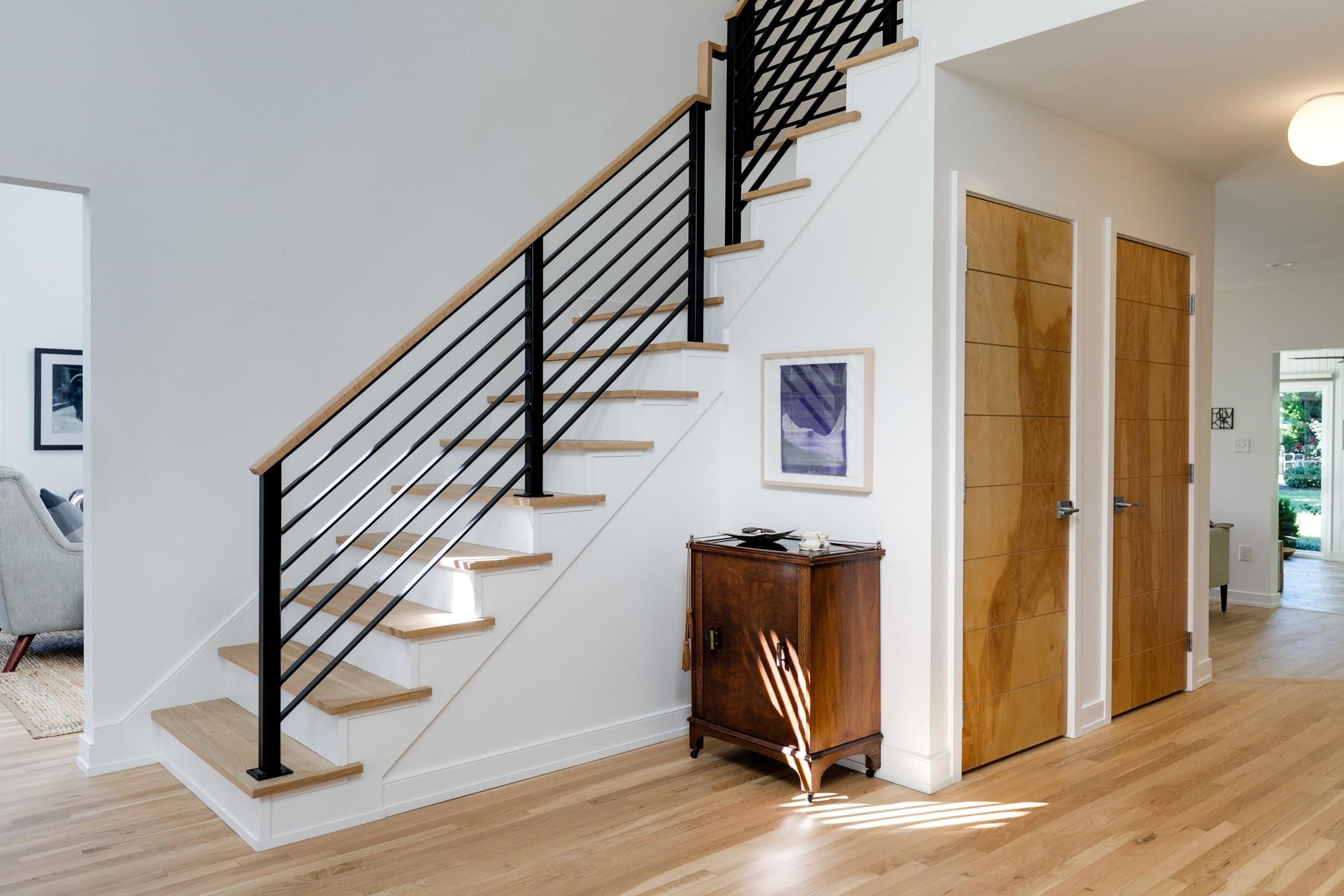
Modern touches like custom iron work and a lighter finish on the floors make a big difference and a big impact when you enter the house.
Petersson and Komorowski prefer a Scandinavian aesthetic - clean lines, natural materials without much trim or fuss. The home they fell in love with was built in 1984, so while it didn’t need the kind of major overhaul that a lot of our historic home projects need, it did require a whole-home update. For the most part, the home’s footprint and layout stayed the same, but details and finishes were updated throughout and a few structural things - such as expanding a bathroom by taking space from a spare bedroom closet - were done to make the house more functional for them.
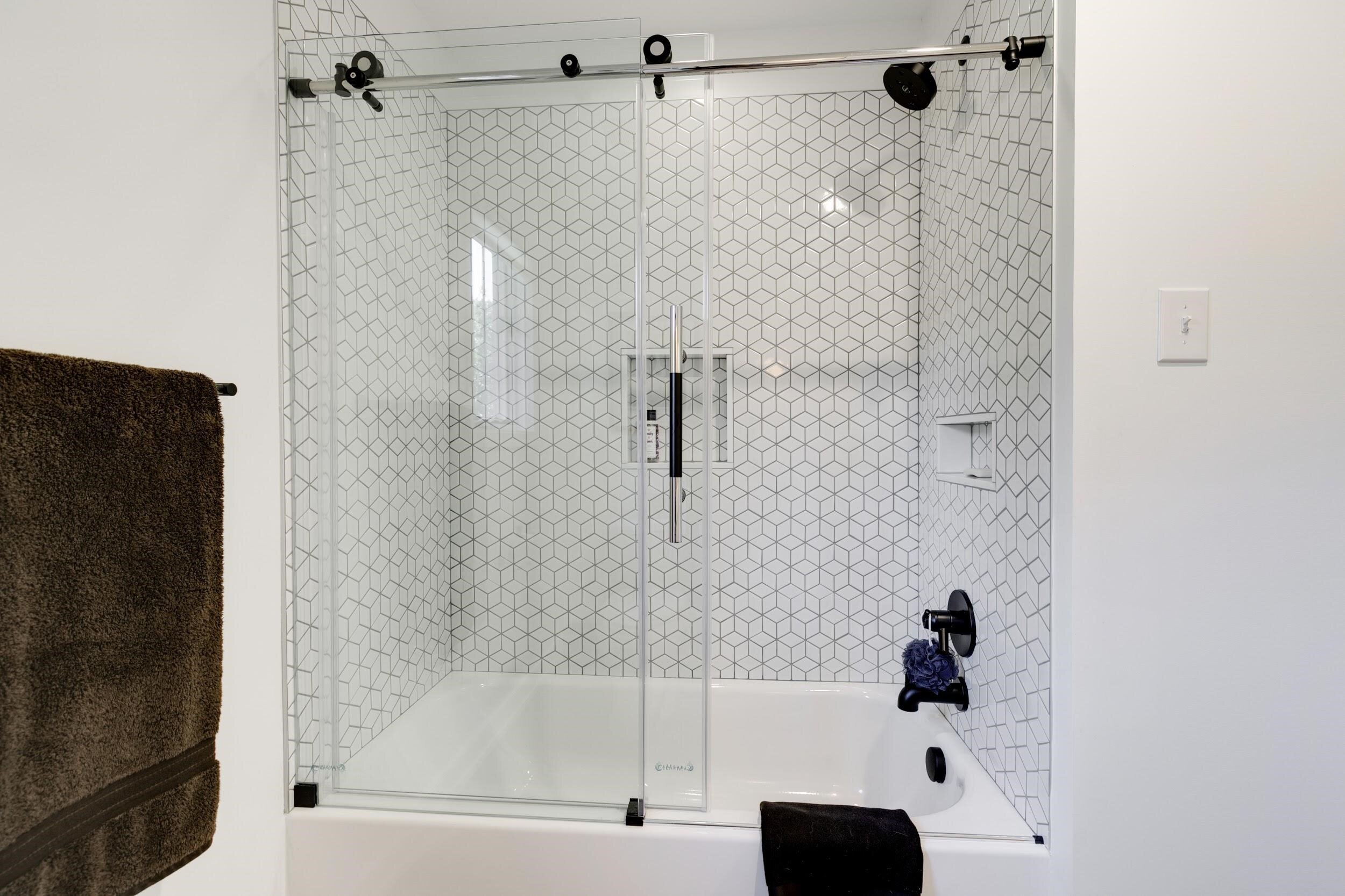
We called this shower tile the Q*bert tile (maybe inadvertently an homage to the ‘80’s roots of the house?).
Keeping the footprint and working with clients whose style we understood meant we were able to do this project with a condensed timeline. We started construction in January of 2018 and we were done by June. In less than six months, we updated all four bathrooms, gutted and rebuilt the kitchen and laundry room with custom cabinetry, replaced or refinished all the flooring, installed custom ironwork on the stairs and loft and completely updated the home’s exterior with a fresh coat of paint and new front door.
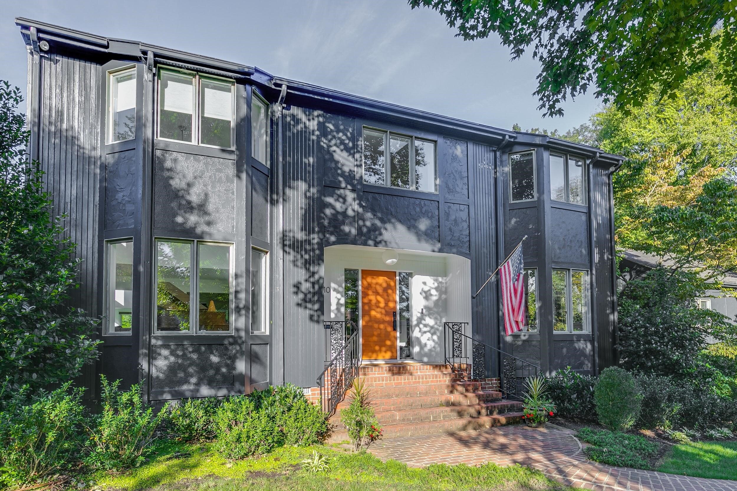
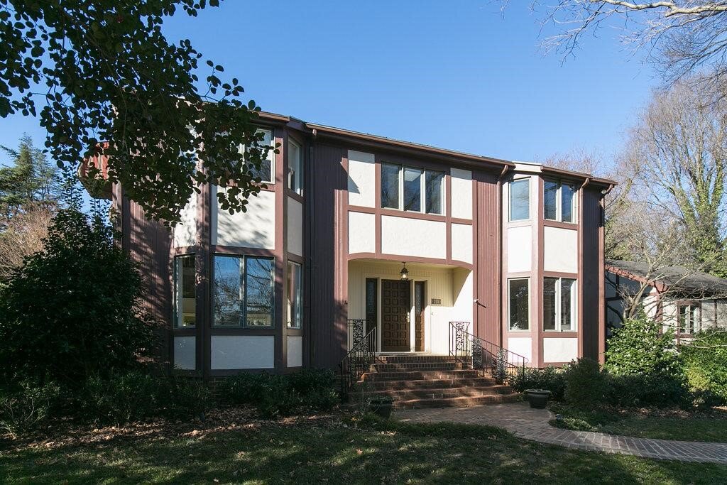
The exterior color was a sticking point for the couple. “As for the outside of the house; we really struggled with the looks of it. I knew we could make the inside perfect for us, but the outside was really not my taste.” When Petersson brought up the idea of painting it black, Matt immediately showed her some ideas he’d been saving on his iPad, including a cabin that had been painted black. They knew then that they wanted to take the plunge. “This exterior has been one of our favorite transformations” says Matt. “The gray exterior really makes a bold statement, and the contrast of colors at the front door with the white makes the walls ‘pop’ against the natural wood door.”
This exterior has been one of our favorite transformations; the gray exterior really makes a bold statement before you even walk in the door.
Other bold design decisions were made in tandem with the homeowners and RIC team. When Petersson showed an example of custom wood doors she wanted for the entryway closet and half bathroom, Matt came up with a way to get the same look for a lot less money by purchasing flat panel doors and having the team make custom cuts to create the same look. “They look just like the ones I wanted in the picture, and are always something people comment on when they come in the house.”
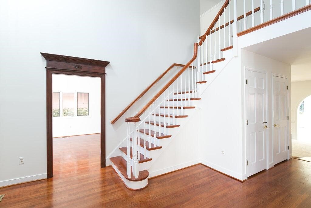
The entry shows details that were used throughout the house - light floor finish, minimal trim, natural woods on the doors and stairs, with a modern black steel railing.
Being able to bounce ideas like this back and forth is one of the reasons we designate a single project manager to each client. Petersson says that whenever she was able to come by the job site “the project manager would show me what was new and ask me little questions that came up. Everyone in the RIC crew was nice, knowledgeable and good at what they do.” This open communication and singular focus allows our team to truly get to know the homeowner so that the project meets their expectations at every step.
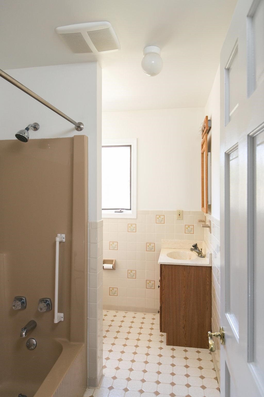
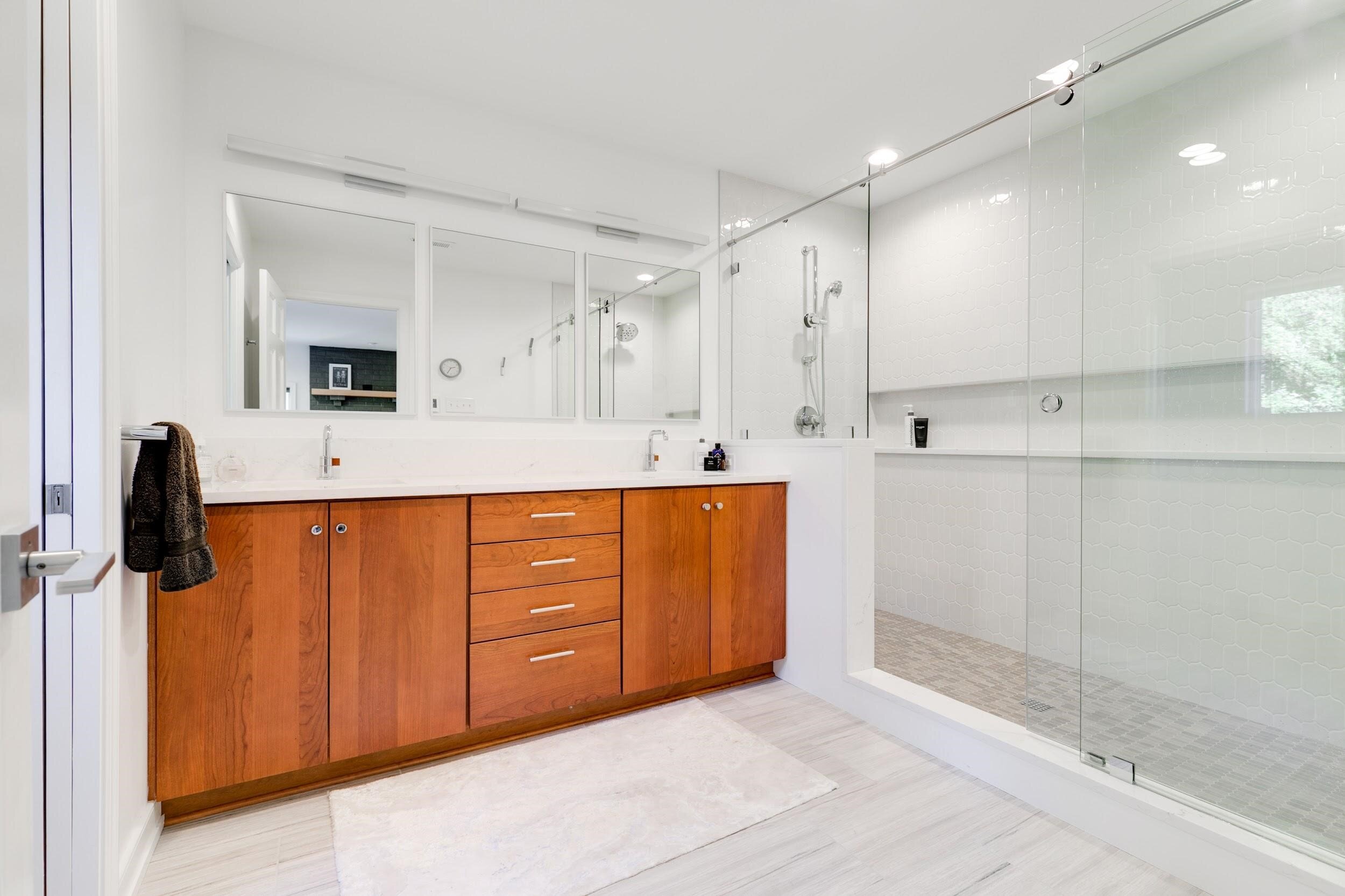
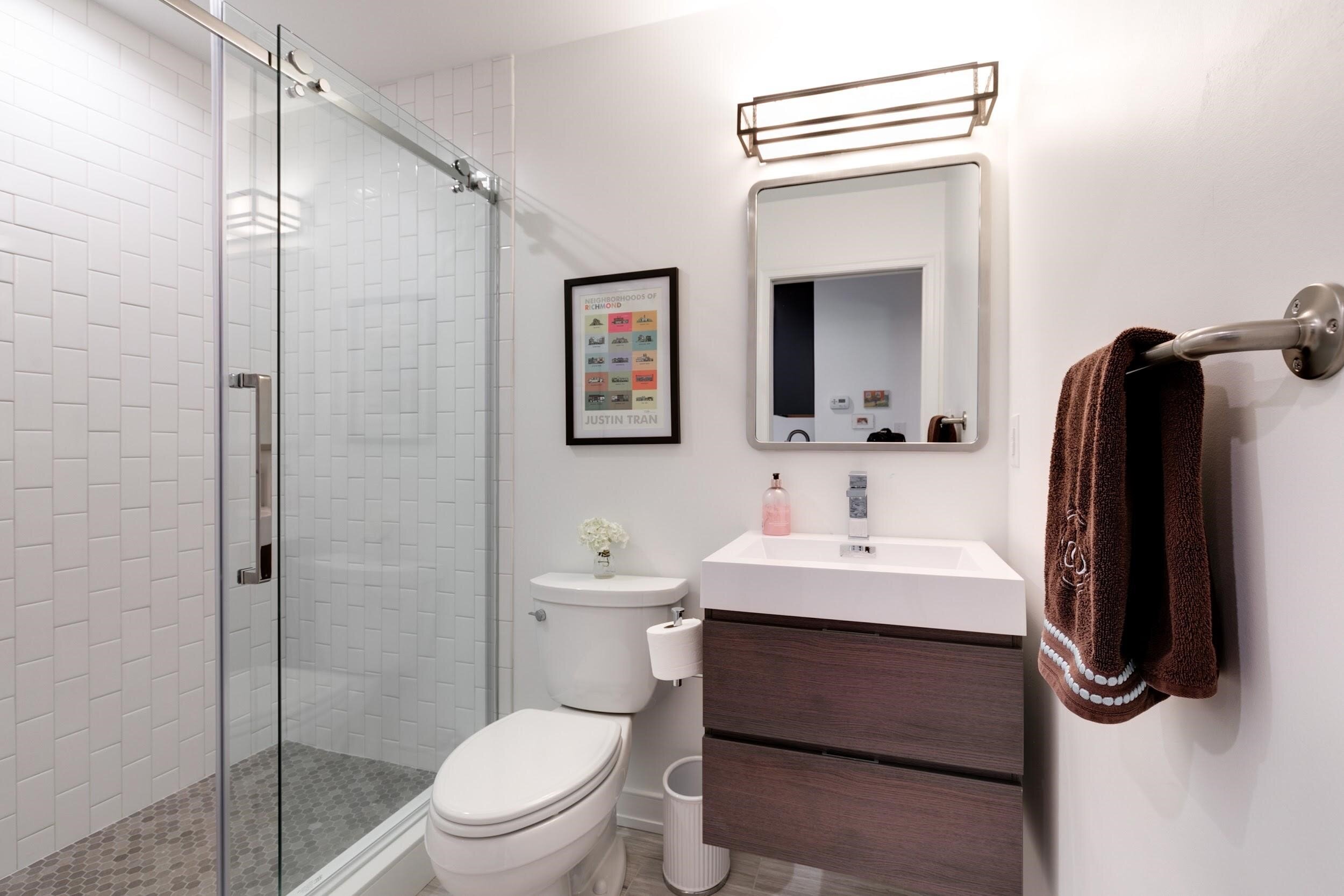
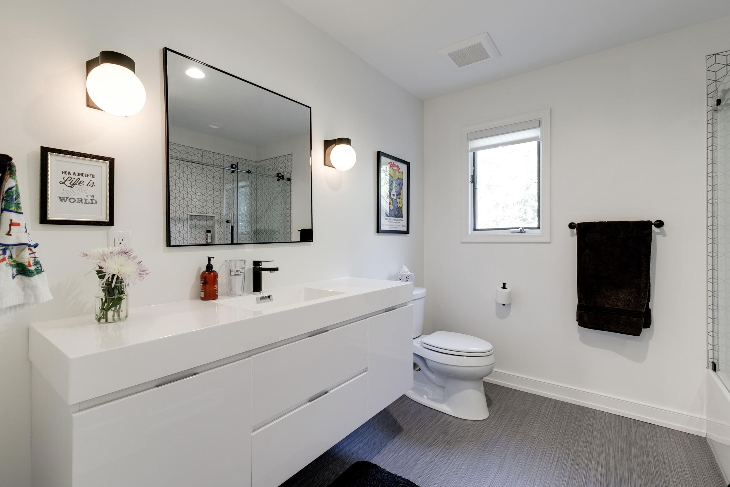
All four bathrooms were renovated in around six months.
Petersson says it’s too hard to nail down her favorite part of their new home, but the “vibe” is spot on. “It’s soothing and peaceful when you come in. Maybe the sunroom? The kitchen? The little sitting room off the kitchen turned out great. The mud/laundry room is pretty amazing. I don't know. I love it all. It's just an easy house to live in.”
The color and material palette continues into the sunroom with a wood effect tile.
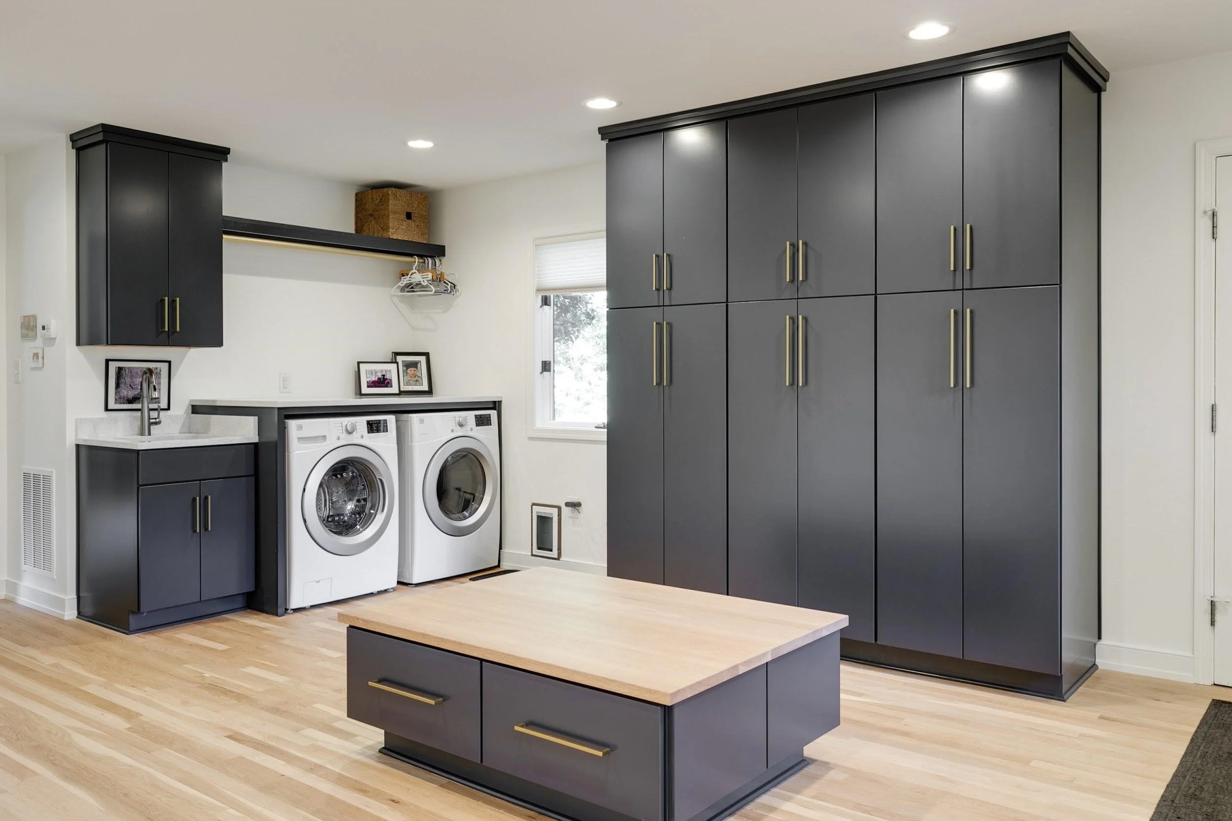
The laundry room included blue cabinets, satin brass hardware and light-colored wood floor (with matching bench seat top).
We want to thank Petersson and Komorowski for trusting us with their homes and helping us create spaces for them that are as stunning as they are “easy to live in.”
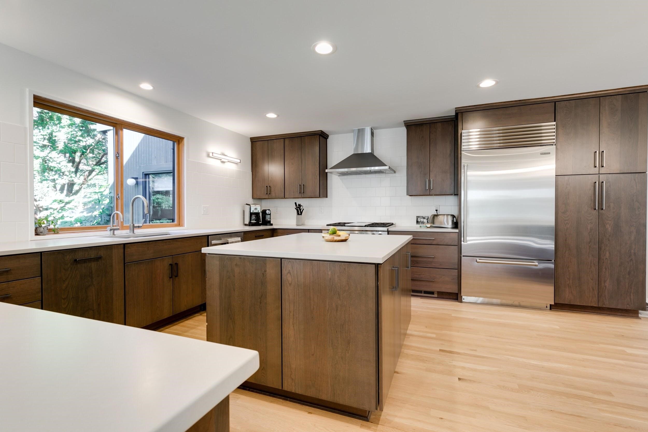
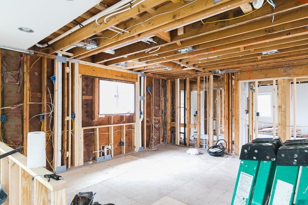
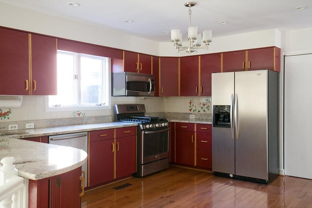
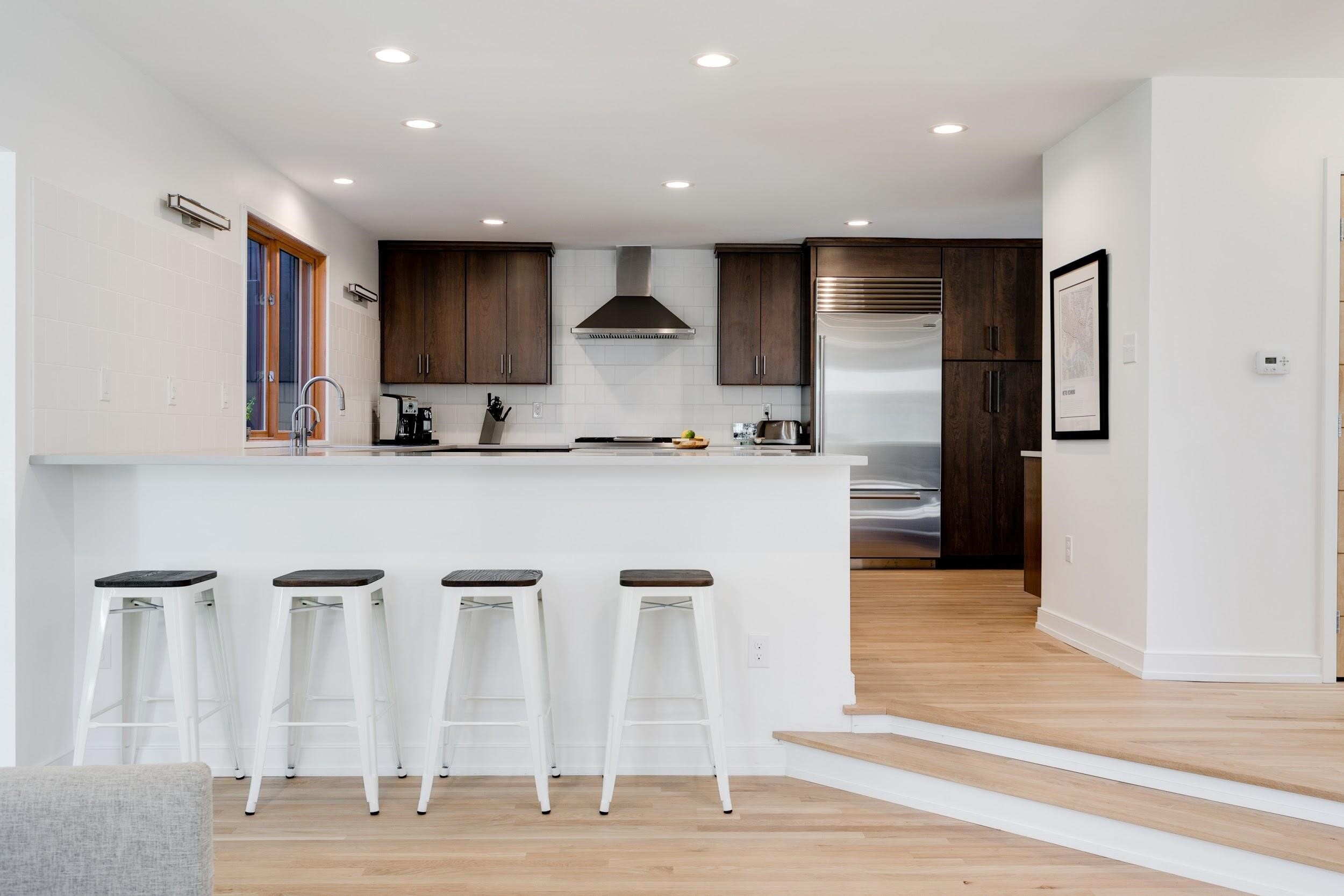
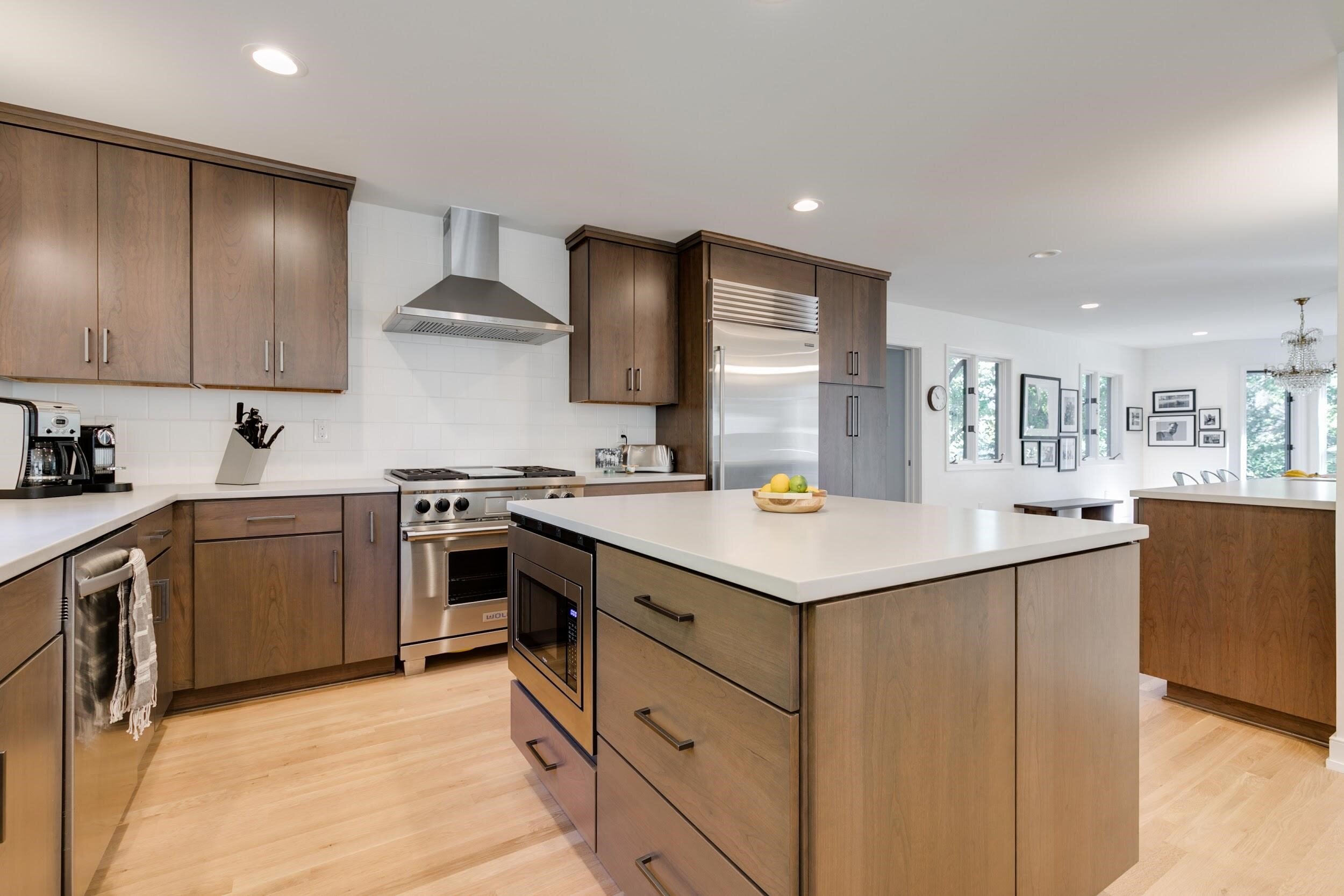
We removed some walls and a pantry, but otherwise the kitchen maintained the same layout and footprint as the original. The renovation brought in the material and color details to the space.
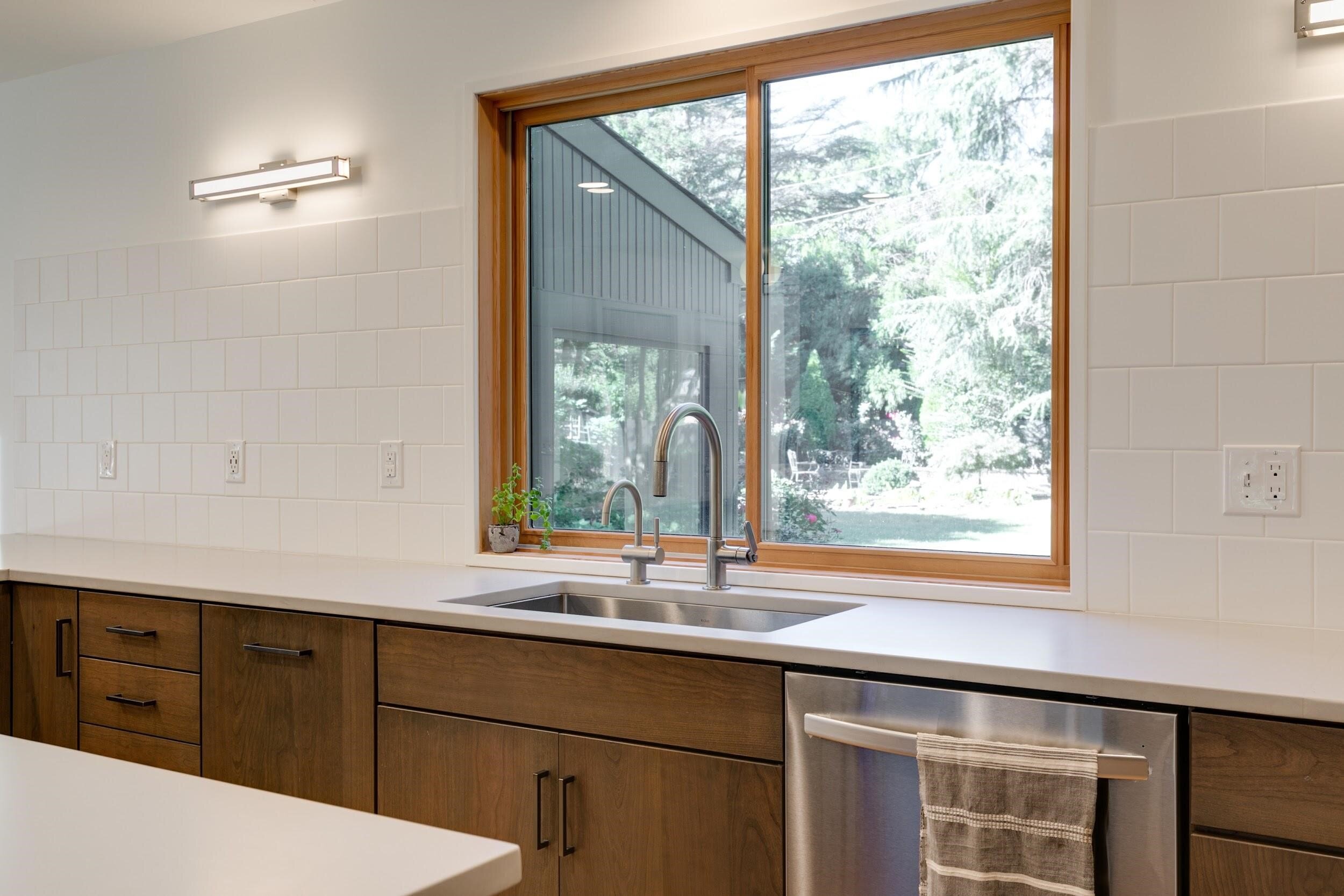
One of our favorite details is the kitchen backsplash space around the sink. A large wood frame window was installed with the wall area left open except for simple, square white tile and light fixtures.
A contrast of colors at the front door, white to make the walls ‘pop’ and natural wood on the door.
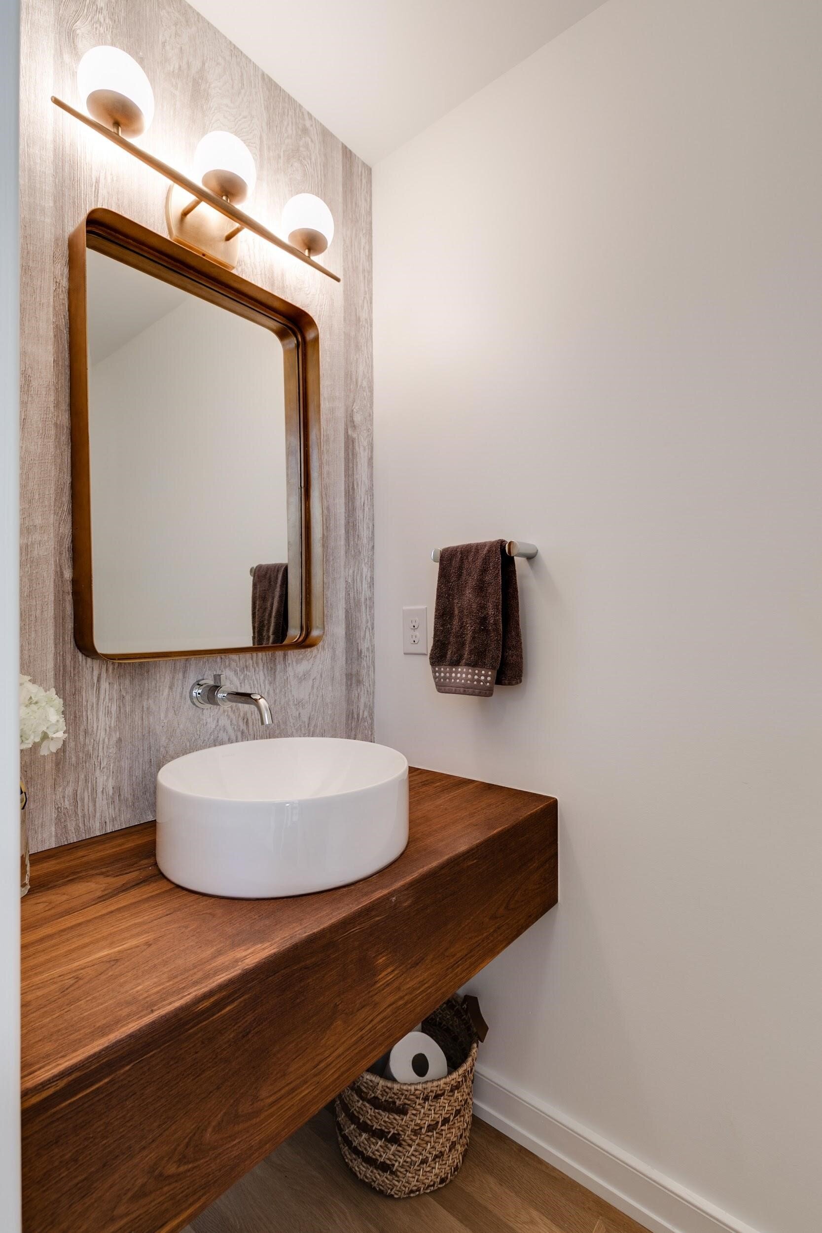
Powder room details - look closely, the wallpaper has a wood texture (as an actual textured surface!). It was picked by the owners’ good friend at Casey Hawthorne Designs.
Material palette carried through the details - a wood handle on the bathroom faucets.
An additional “Thanks!” to our amazing photographers:
Final renovation pictures: Mindie Ballard / @mindieballwell / https://www.mindieballard.com
Before work and during construction pictures: Sarah Der / @sarahanneder / https://www.sarahder.com


