Renovating a Mid-Century Landmark Part 4: Final Touches
This is the final installation of a blog series we’ve been doing on the design/build process of a mid-century modern whole-home renovation project in the Crestwood Farms neighborhood of Richmond, Virginia.
In Part 1, we discussed the purchasing and initial planning phases for the home. In Part 2 we covered how our design planning phase works. And in Part 3 we showed the behind-the-scenes process of construction. Now that the homeowners have been enjoying their home for a few months and with our final photos are in-hand we’re highlighting some of the finishing touches that really brought this home to life.
Homeowners Ron and Sarah Villacarillo came to the project with a very clear vision and a love of the mid-century modern aesthetic. They were also influenced by their travels to Mexico, Hawaii and Palm Springs, and brought vibrant elements from each destination into their colorful home. RIC’s team of designers and craftsmen worked closely together with the Villacarillos from demolition to move-in day, developing details, finishes and materials that worked seamlessly with the products and design components that Ron and Sarah had selected early in the process.
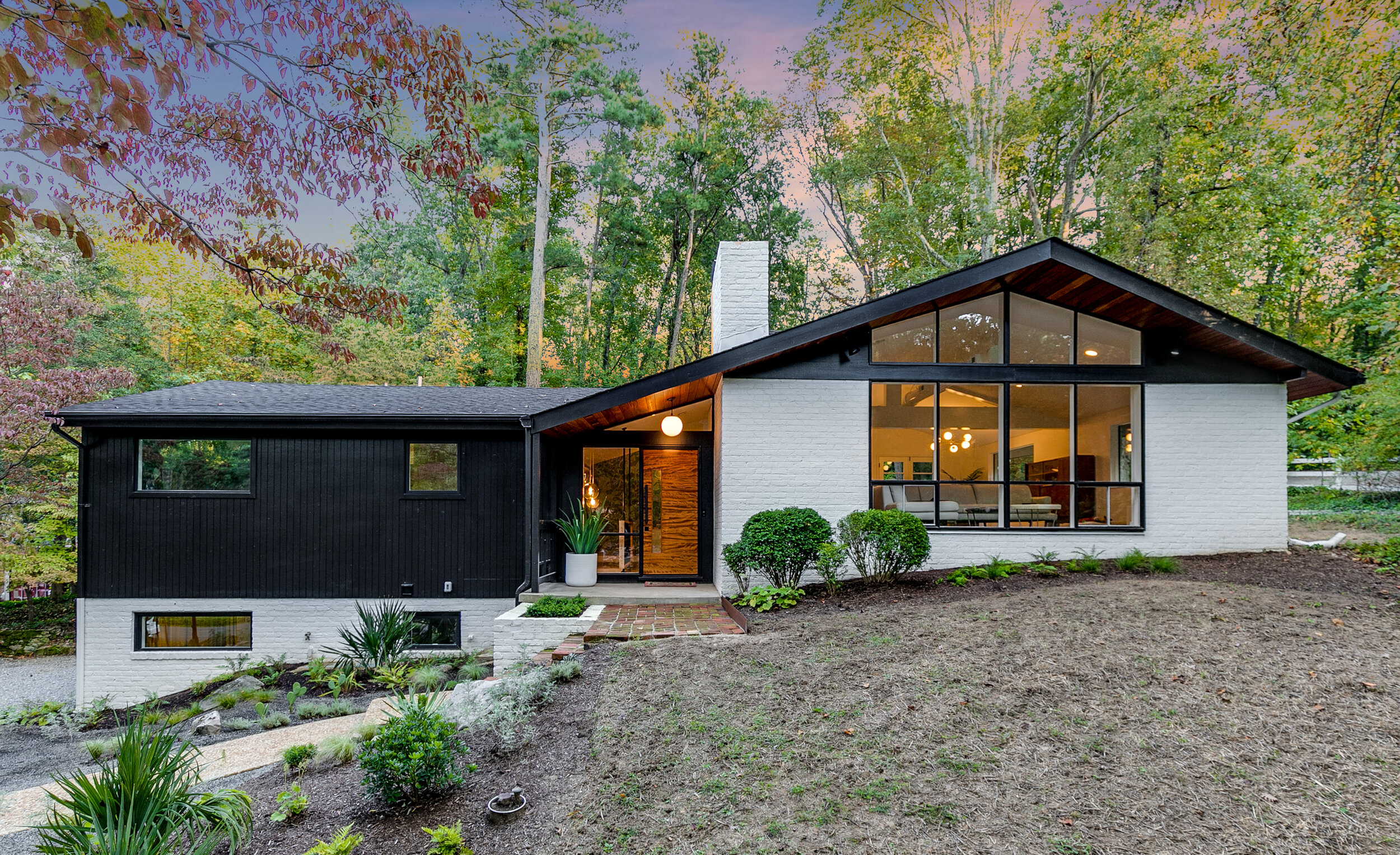
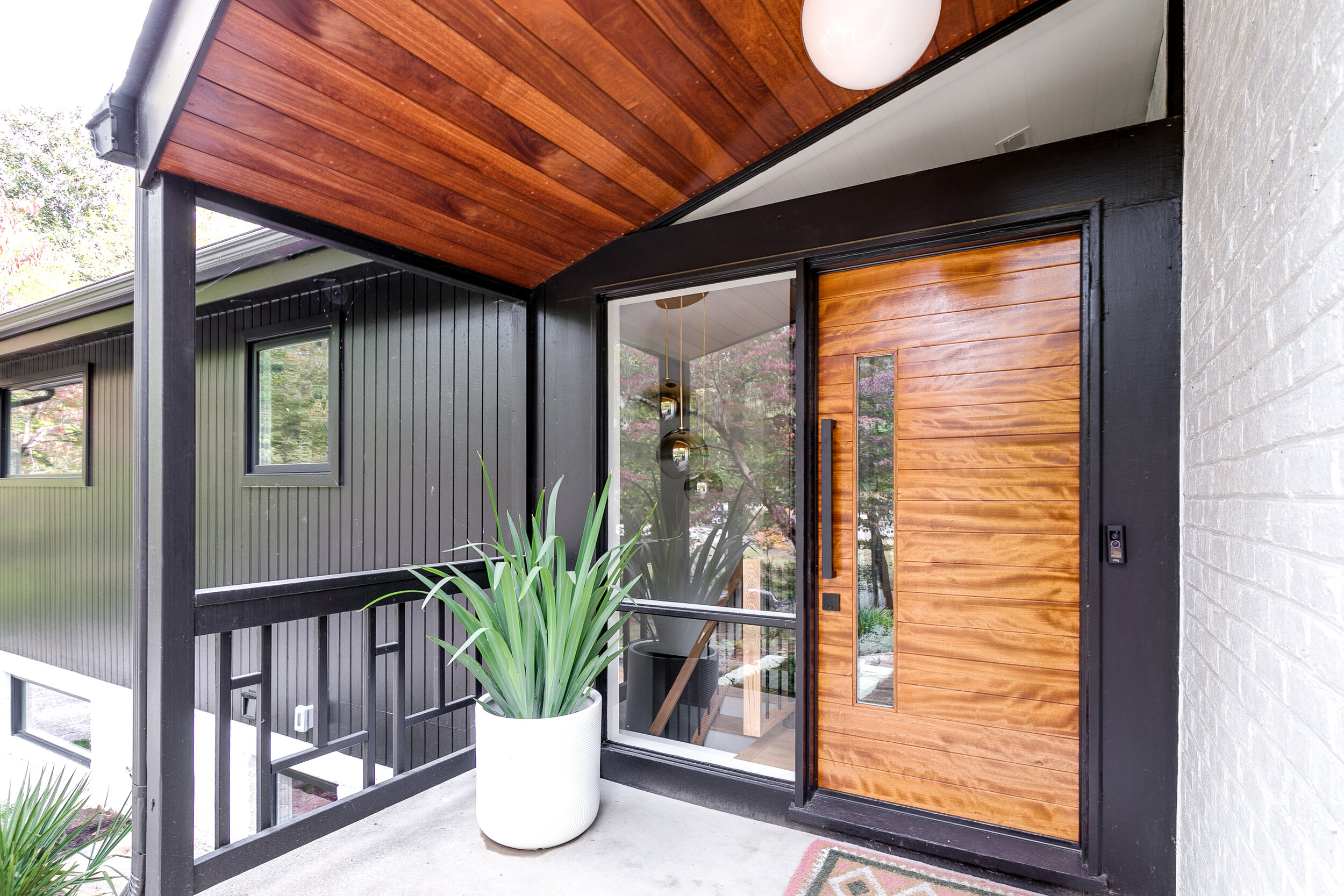
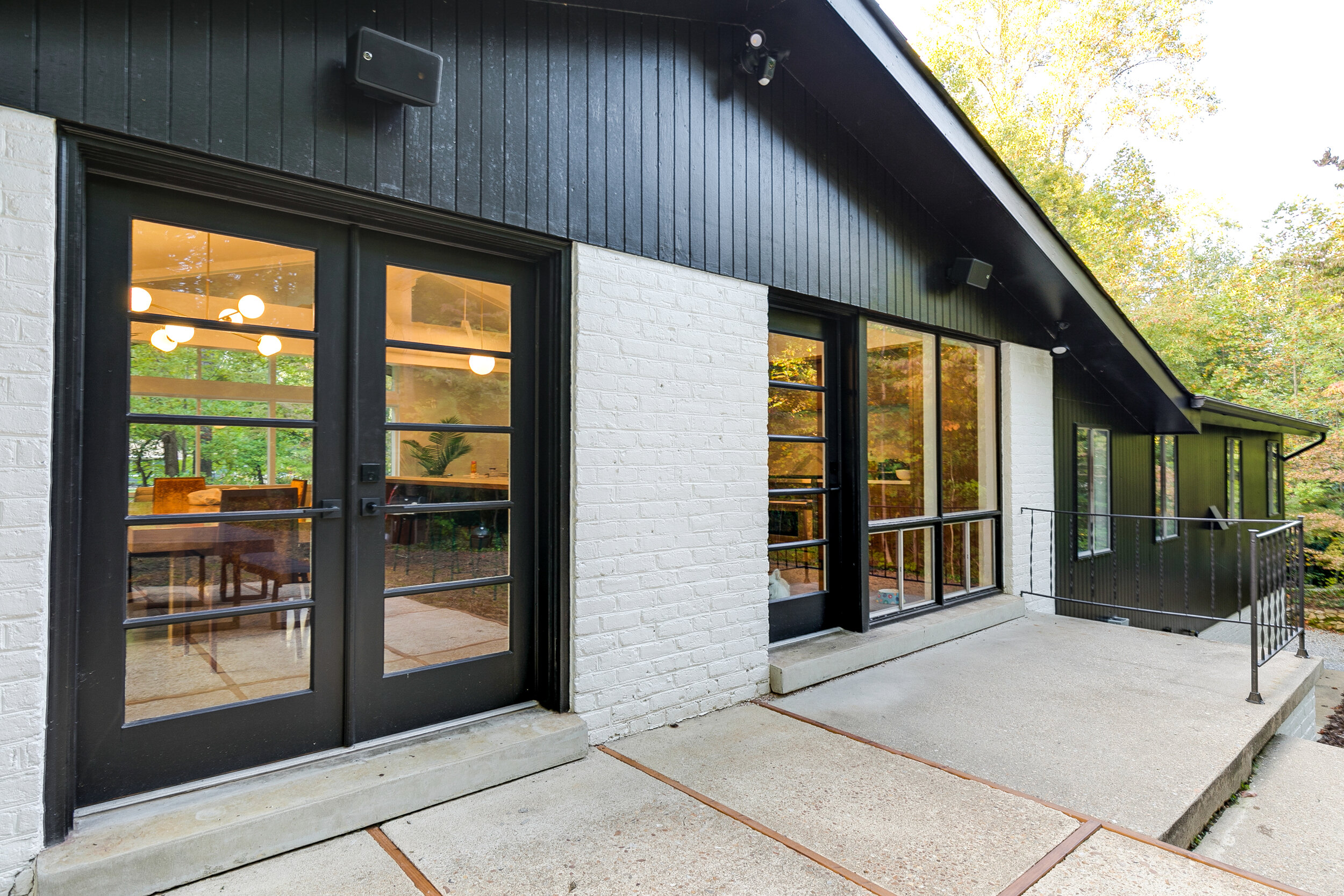
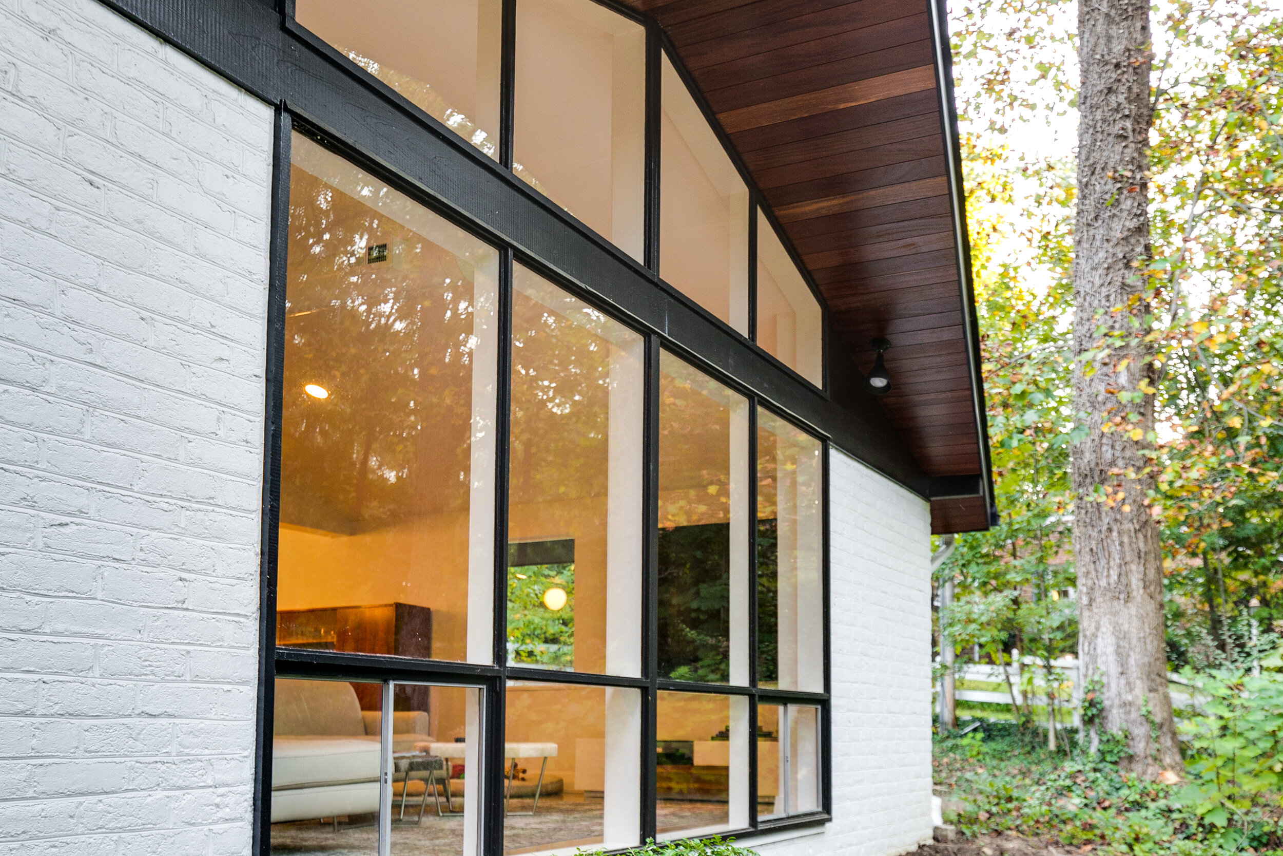
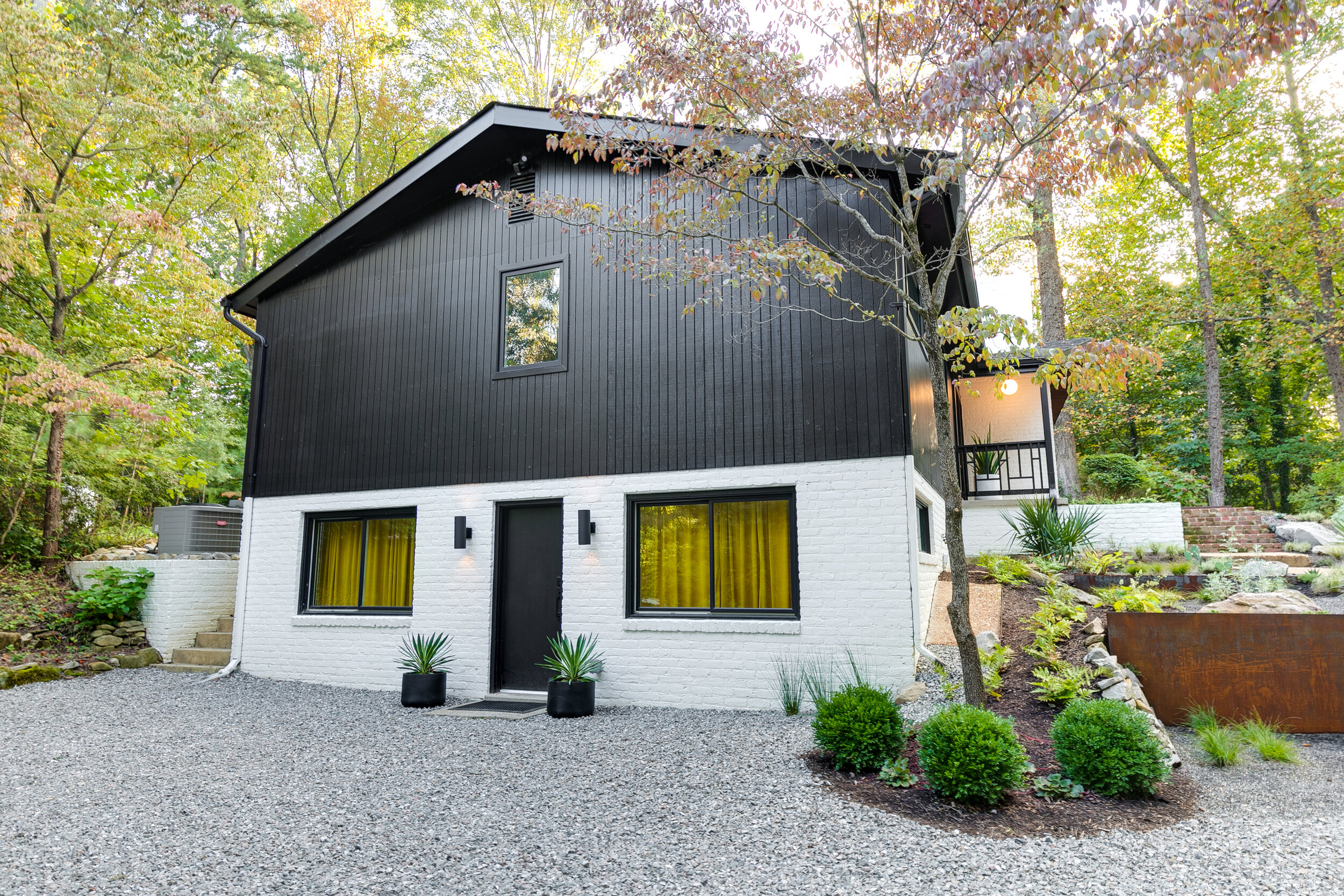
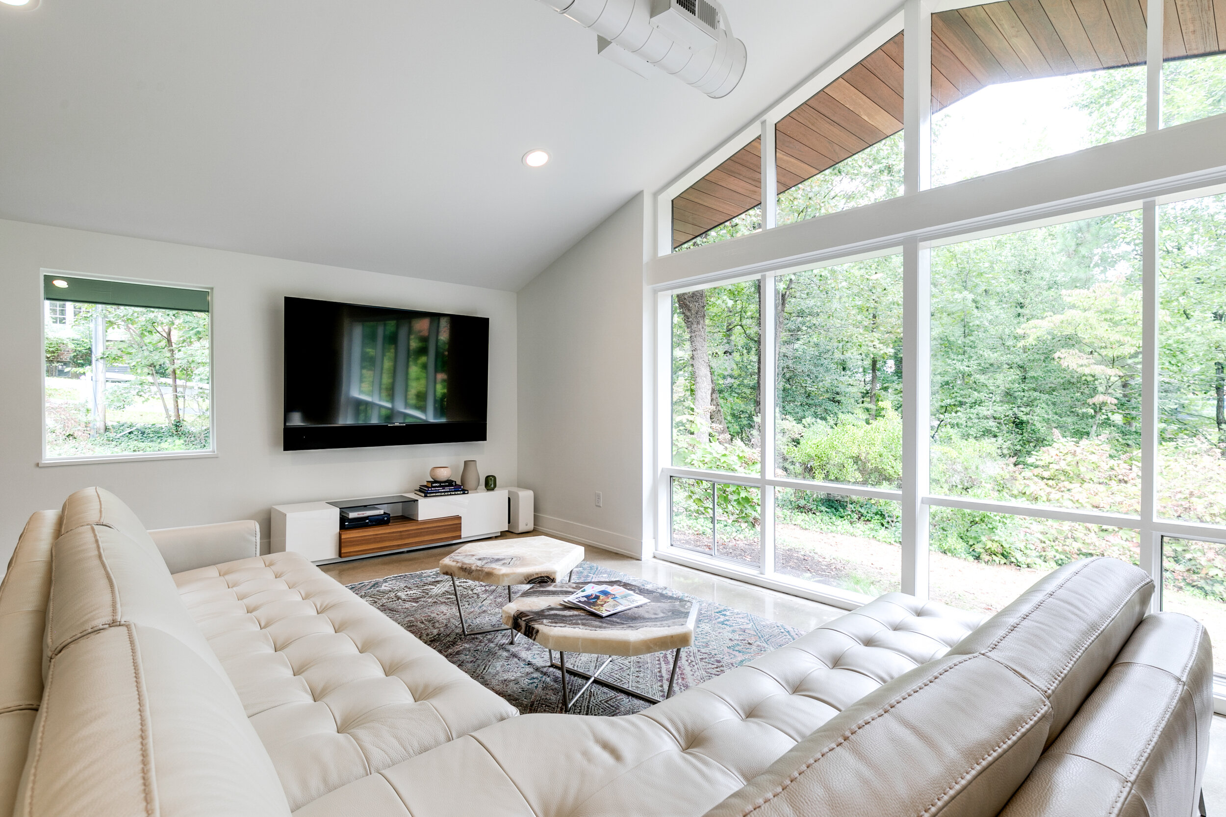
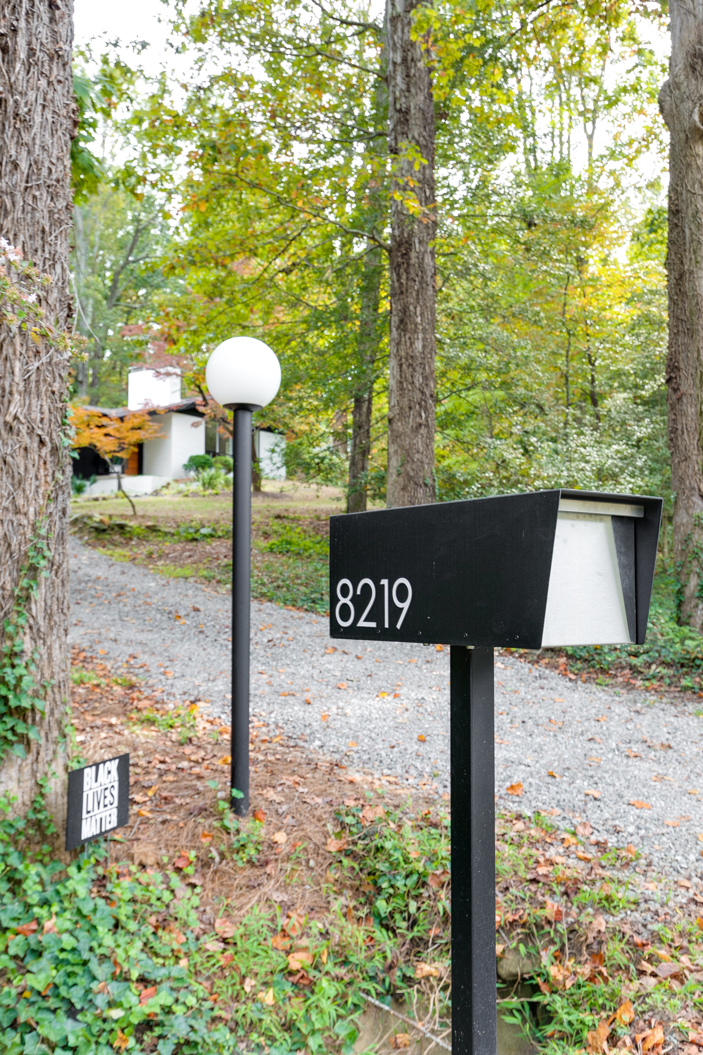
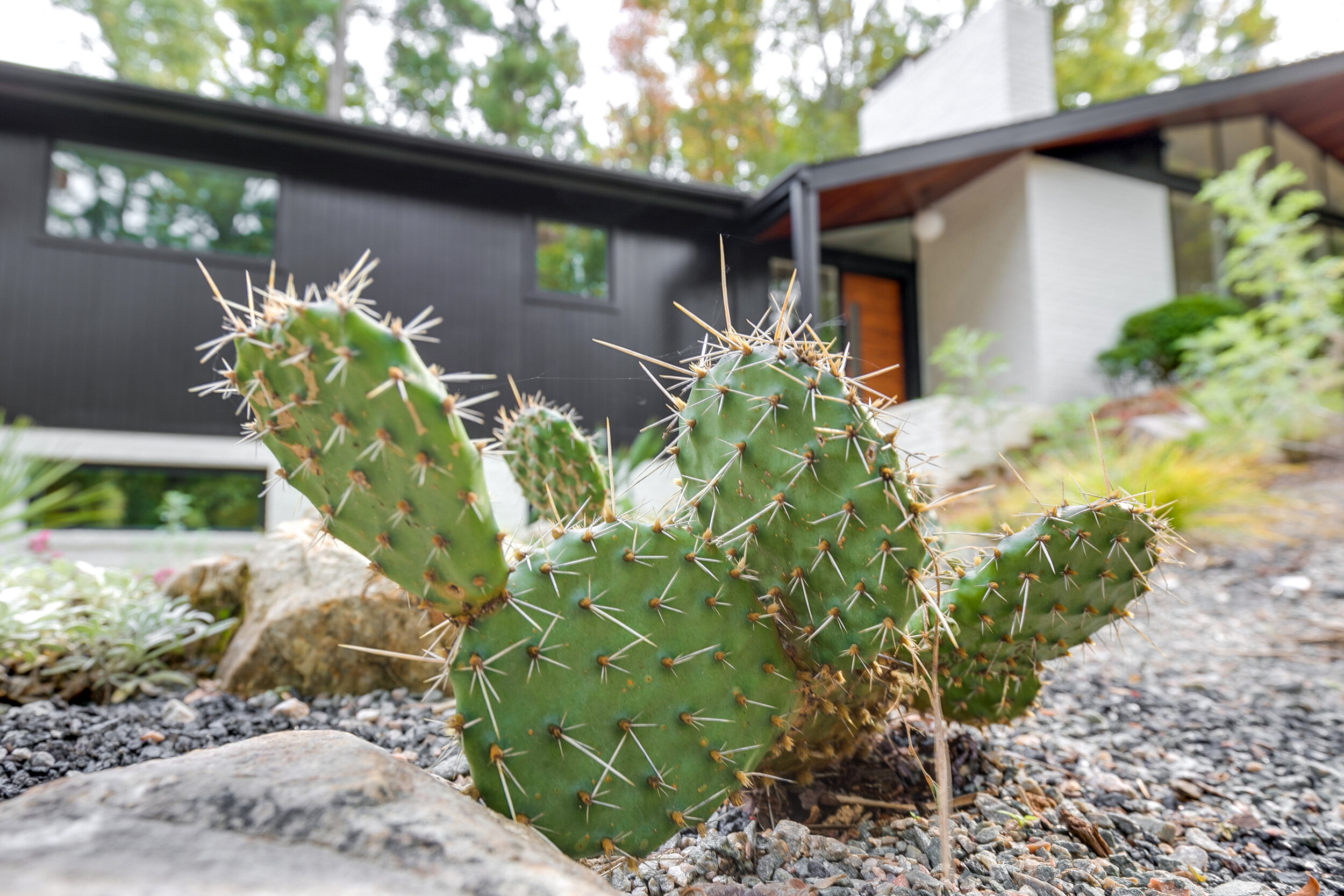
We’ve shared many of the beautiful interior details in this home and how they came together in our earlier posts on the home (read more here if you missed those.) While the interior design is eye-catching throughout, the new and improved exterior does its best to steal the show. Out front, the painted plywood soffit was removed and replaced with warm, natural cumaru wood which accentuates the new front door. The modern black and white exterior color palette combined with the Palm Springs-inspired landscaping creates a bold but welcoming entry point. At the back of the house, a custom kitchen door was built to match the original dining room doors, opening up the kitchen to more light and views of the backyard. The original single-pane aluminum windows were replaced with new energy efficient models around the house, while the large floor-to-ceiling living room picture window remained intact and was restored. As years of water damage from slow leaks on the interior mandated, the roof was also replaced, as was all the exterior lighting around the house.
With a construction undertaking this extensive, there can be challenges and surprises, but homeowners Ron and Sarah say “it really did come together as we had imagined it. In fact, if you look at some of the early mood boards and sketches, the finished product is almost identical.”
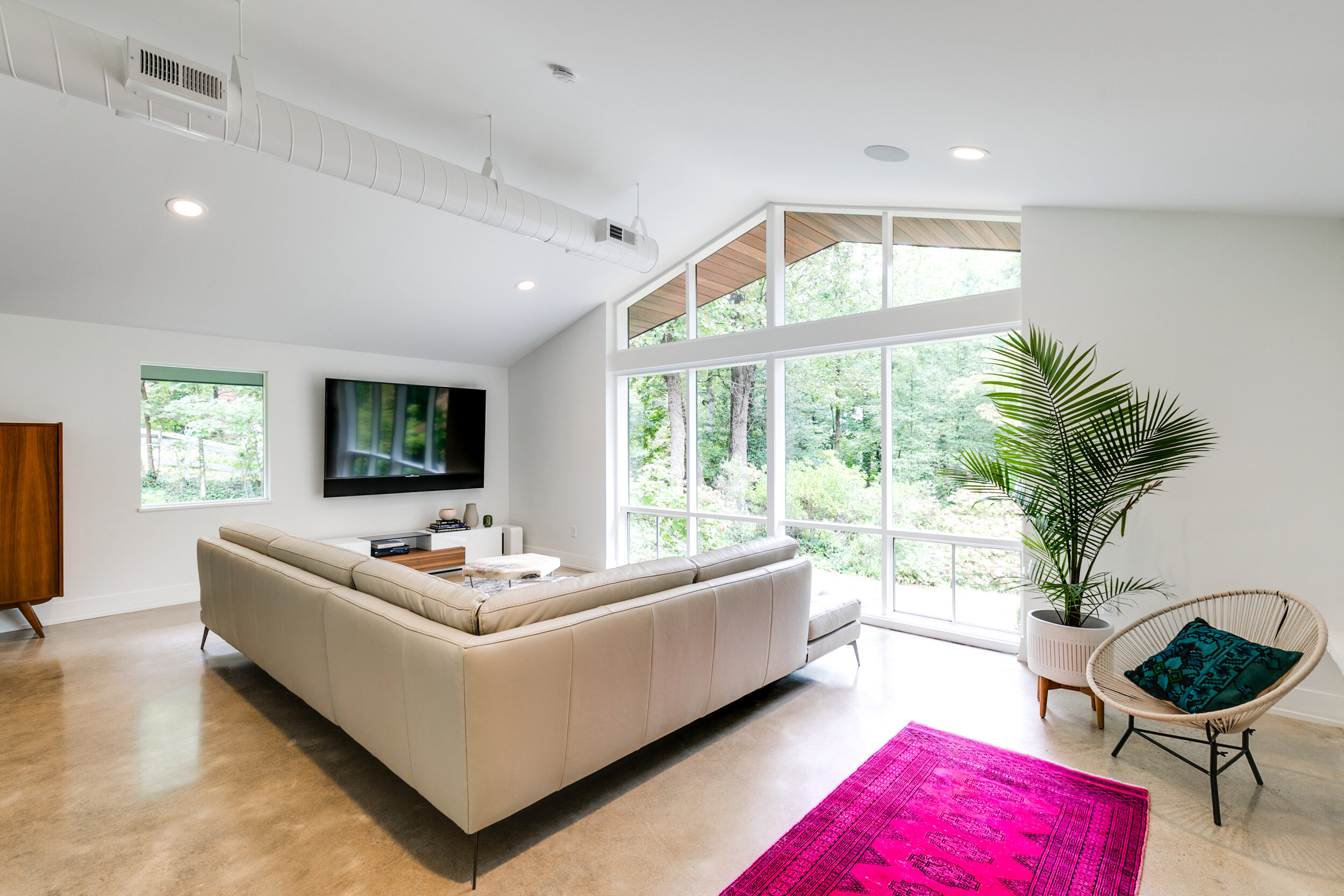
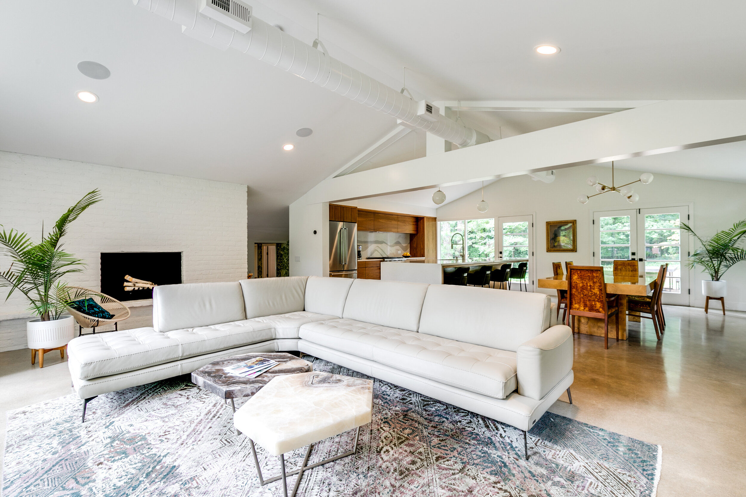
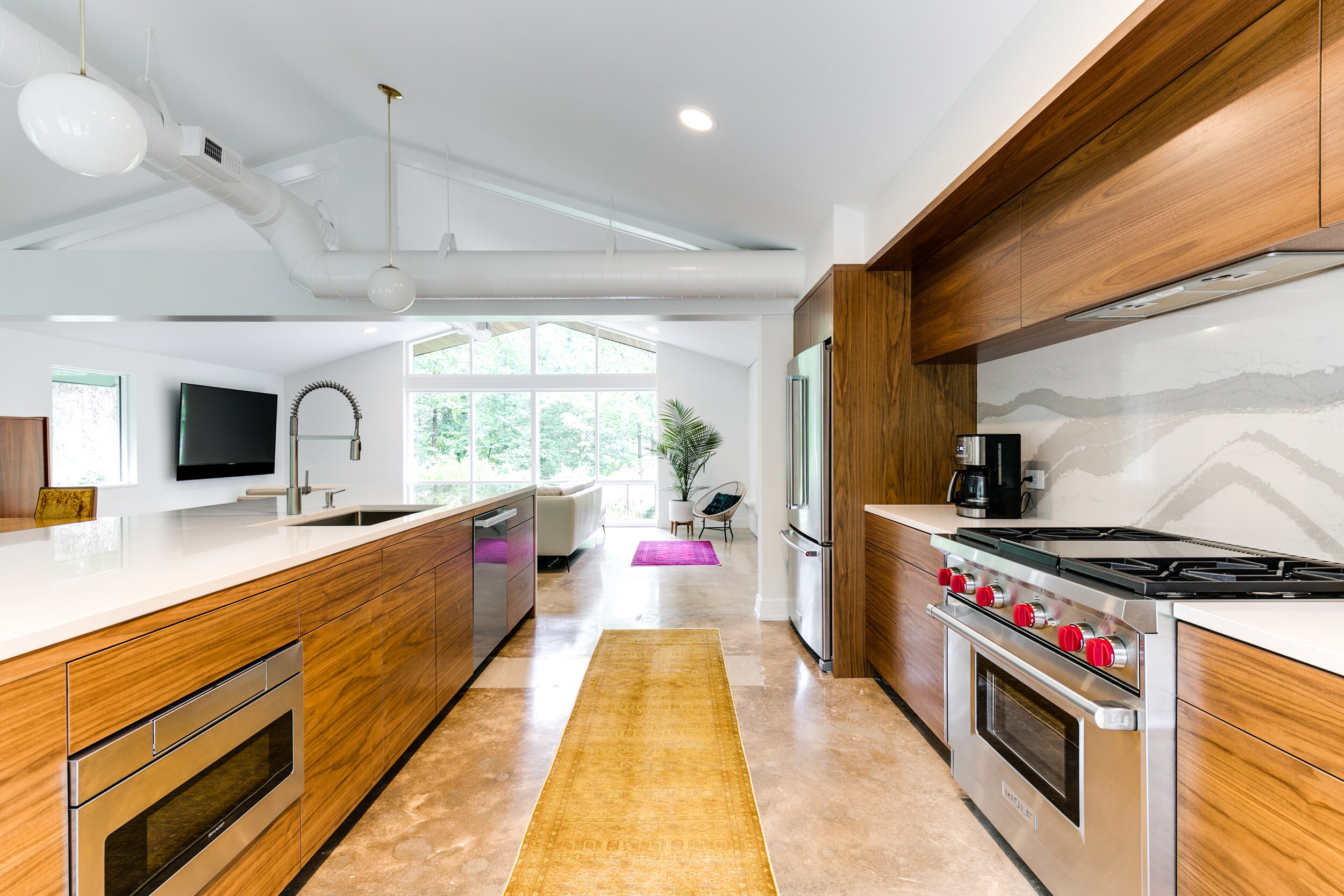
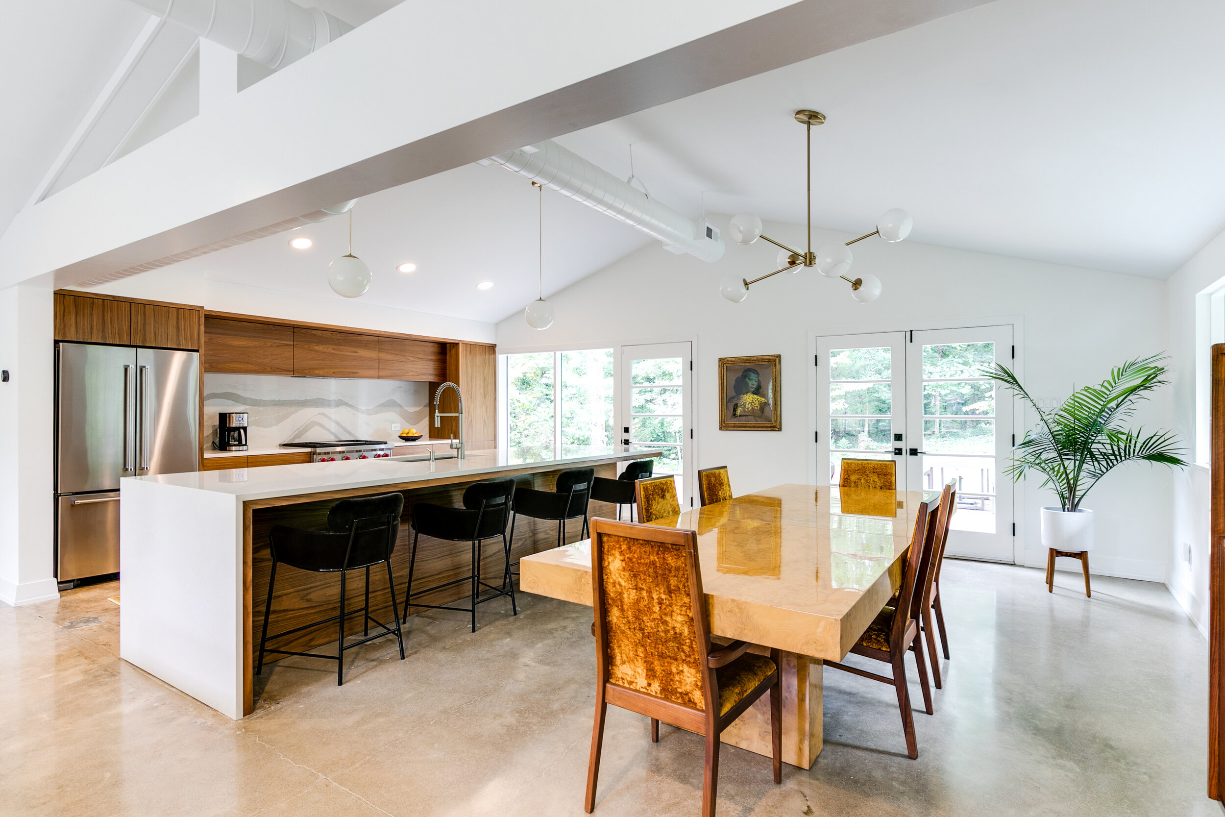
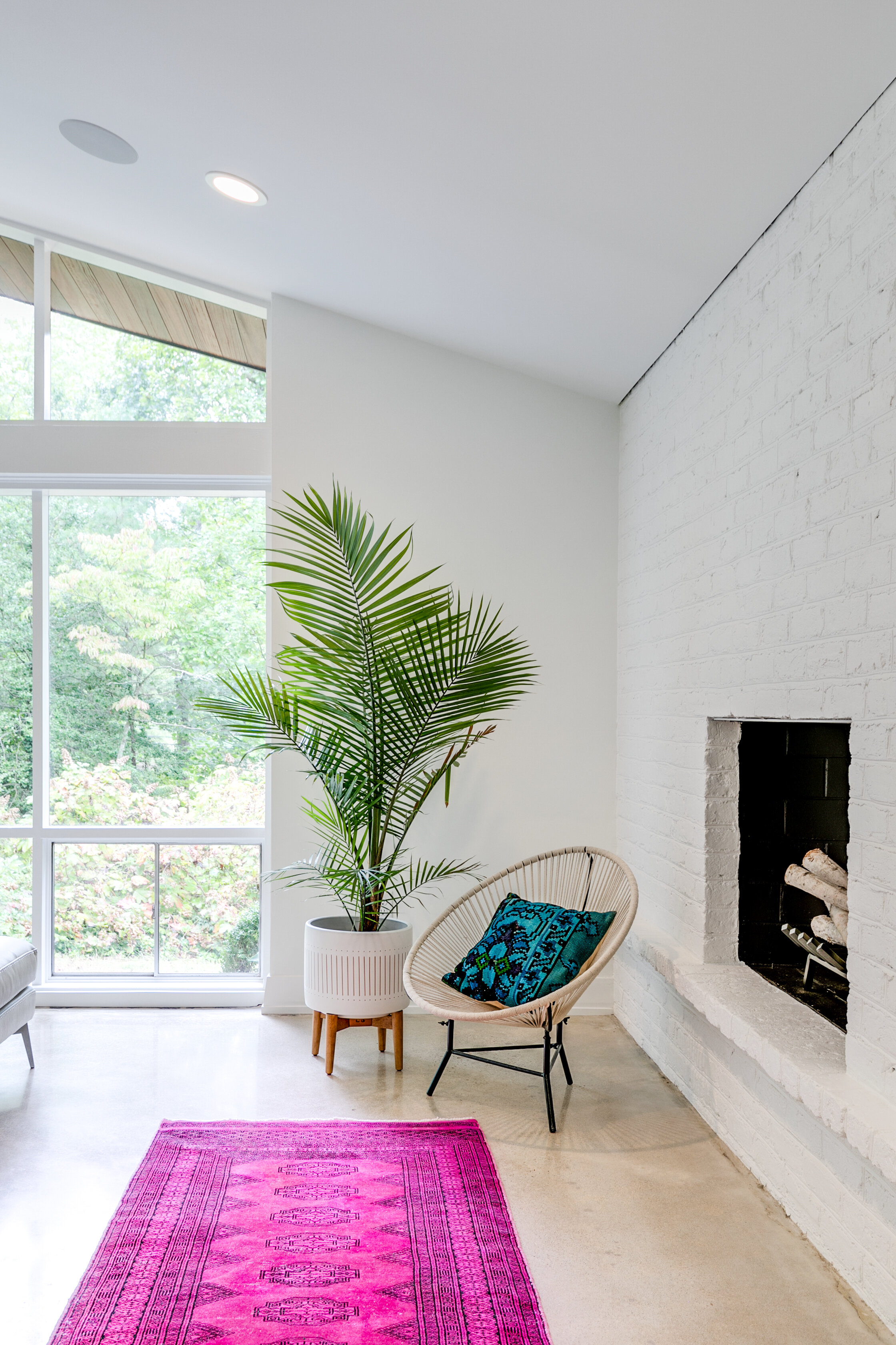
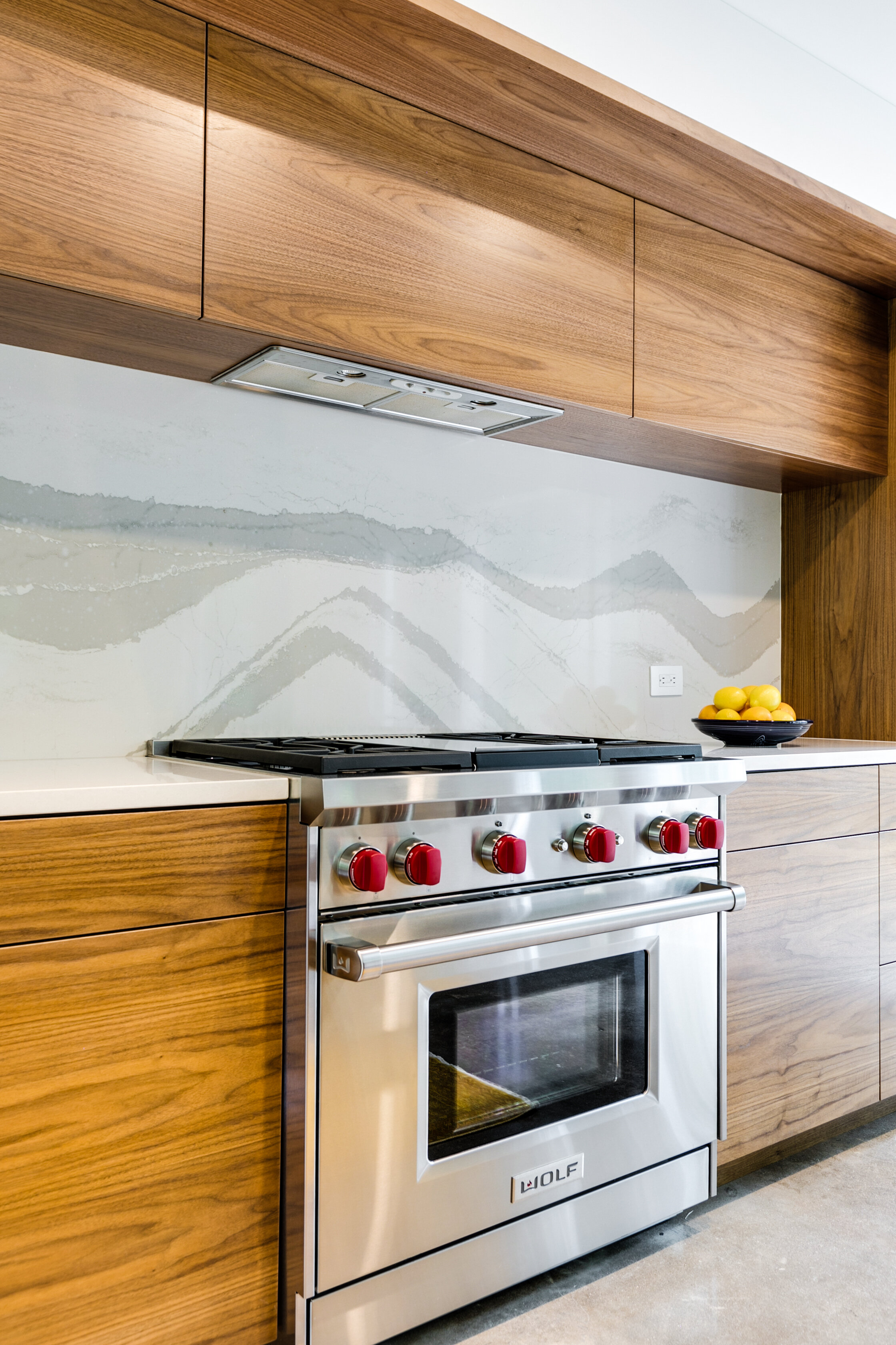
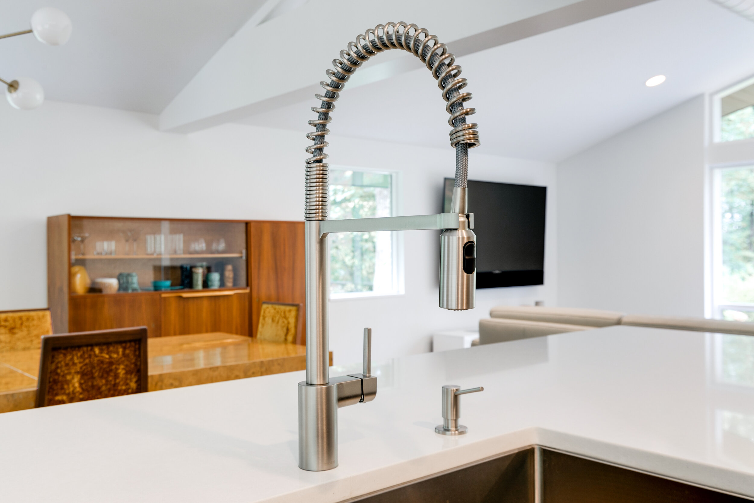
Everyone agrees on their favorite part of the house: the open living, dining and kitchen area. Once dark, enclosed and dated, the kitchen is now the showpiece, second only to the floor to ceiling view of the beautiful, mature trees that surround the house.
“The kitchen is such an integrated part of the living space now and it all feels so connected with the surrounding woods - big changes from the first day we walked through the house!”
-Bronwen Warner, RIC Lead Designer
“By far, the open concept living/kitchen space is our most lived in and loved part of the home. It’s perfect for cooking and entertaining. Large windows surround the entire space, which creates an indoor/outdoor feel that we love.”
-Ron Villacarillo, Homeowner
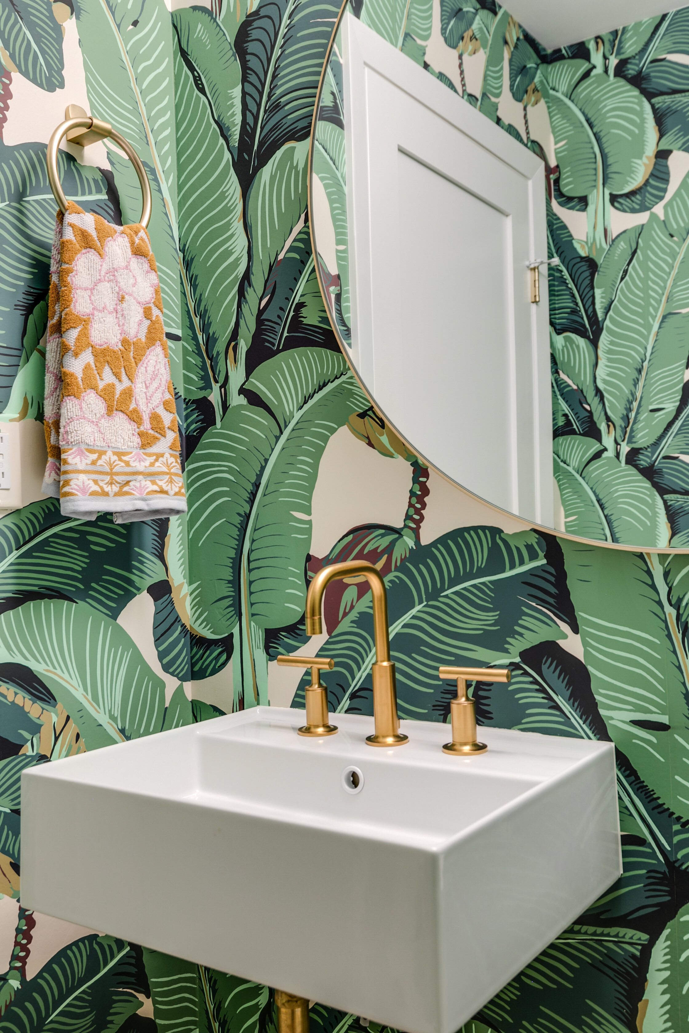
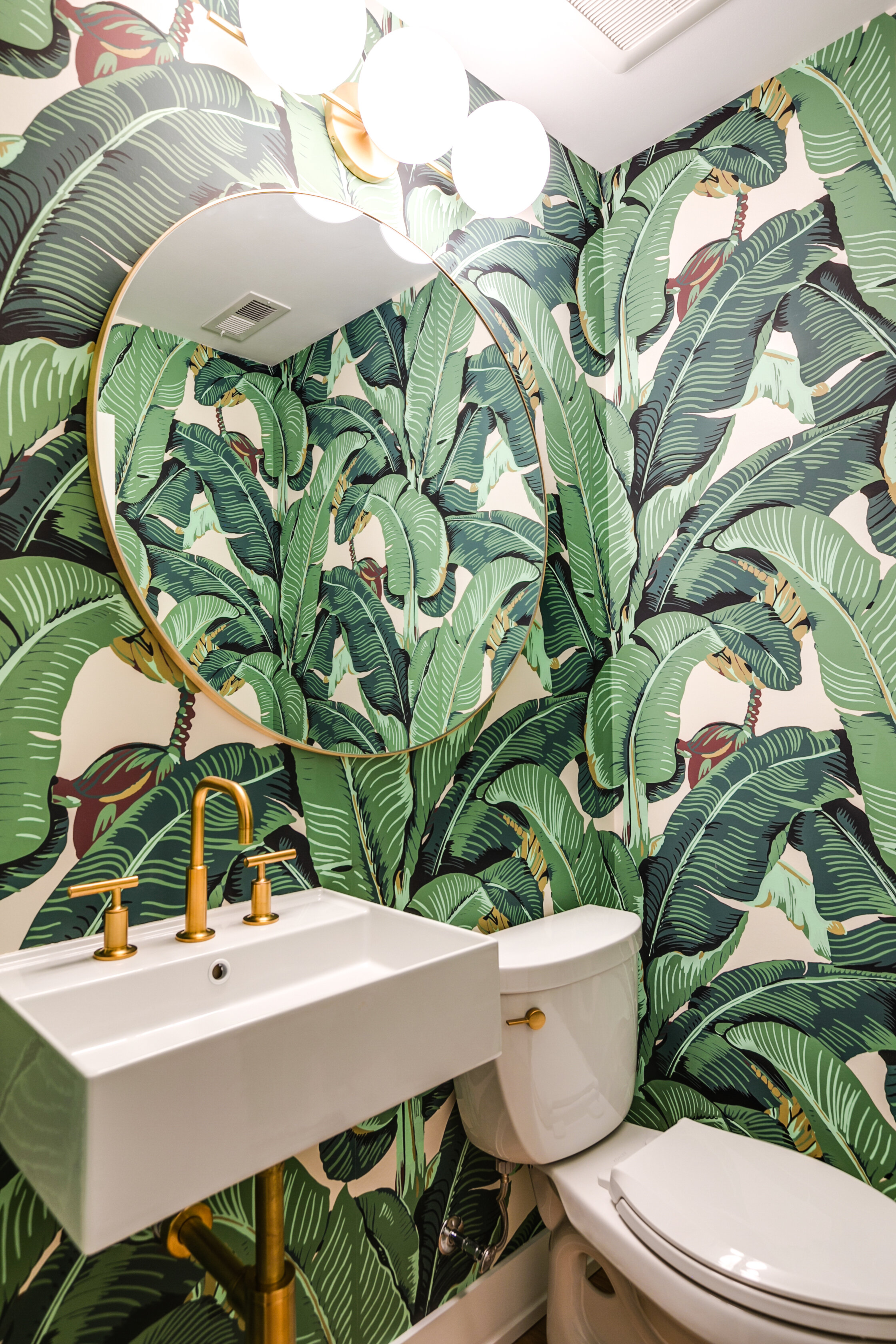
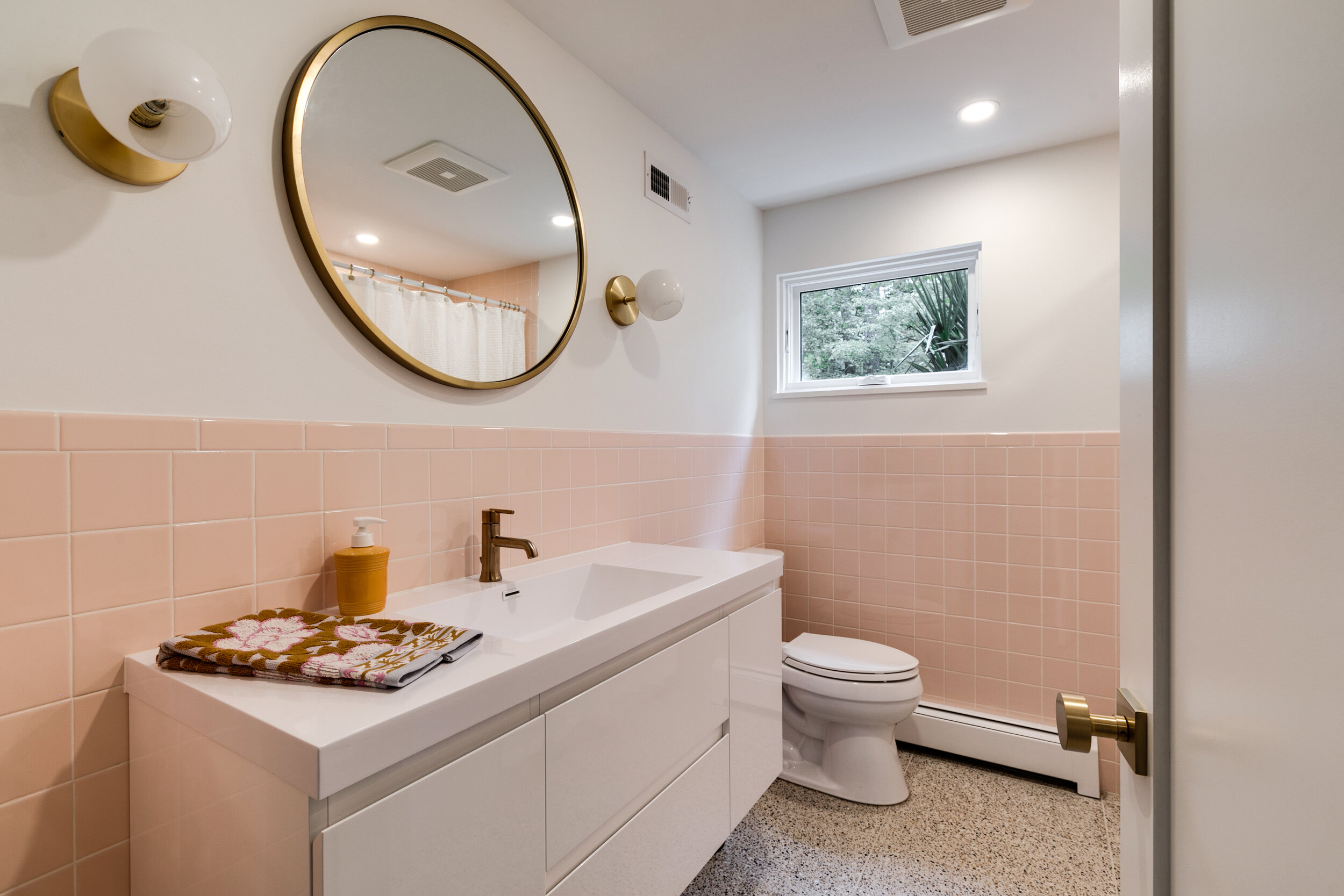
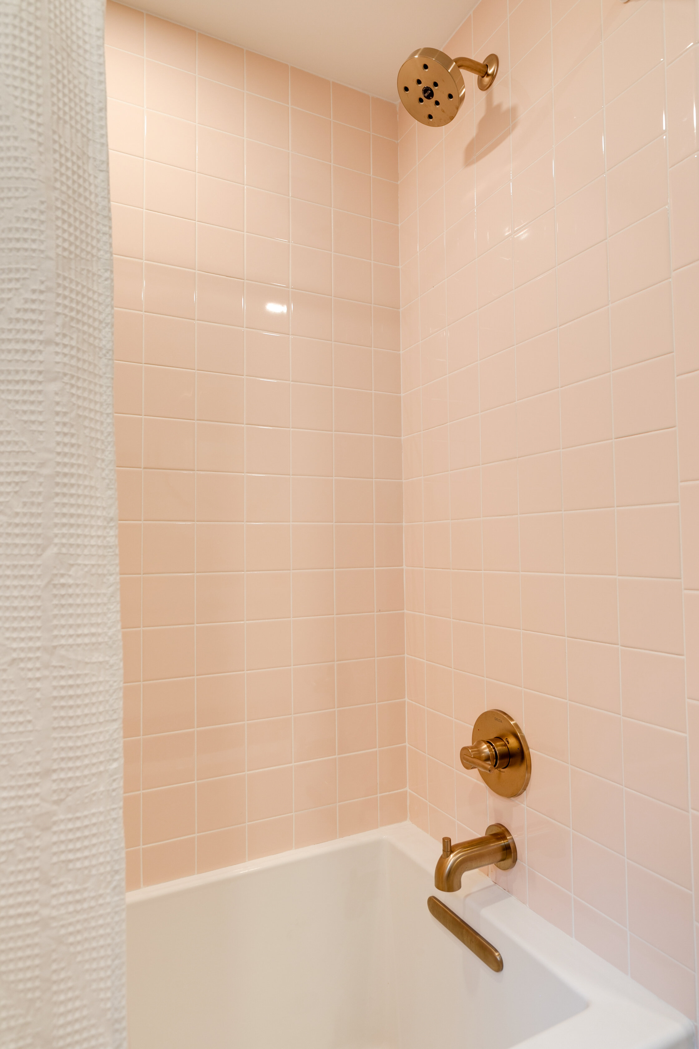
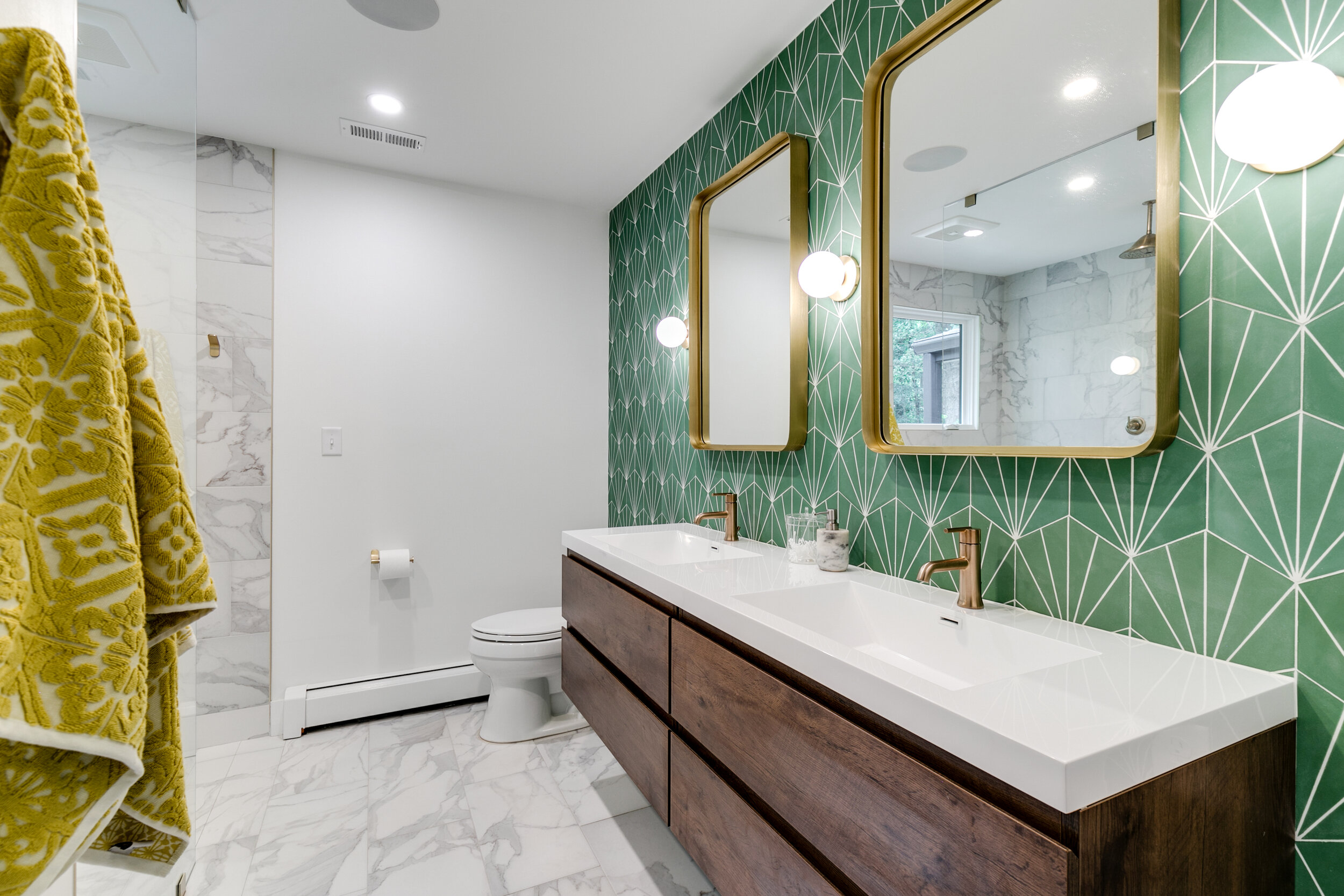
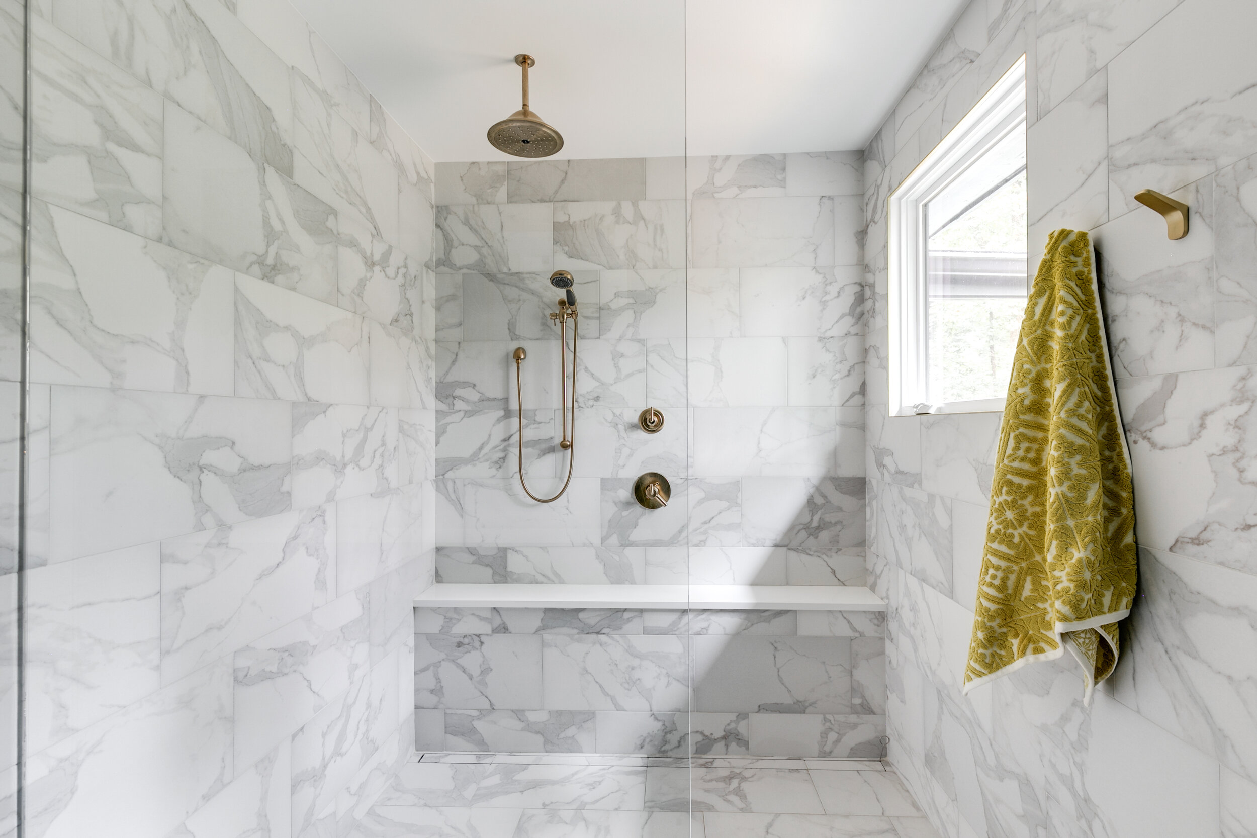
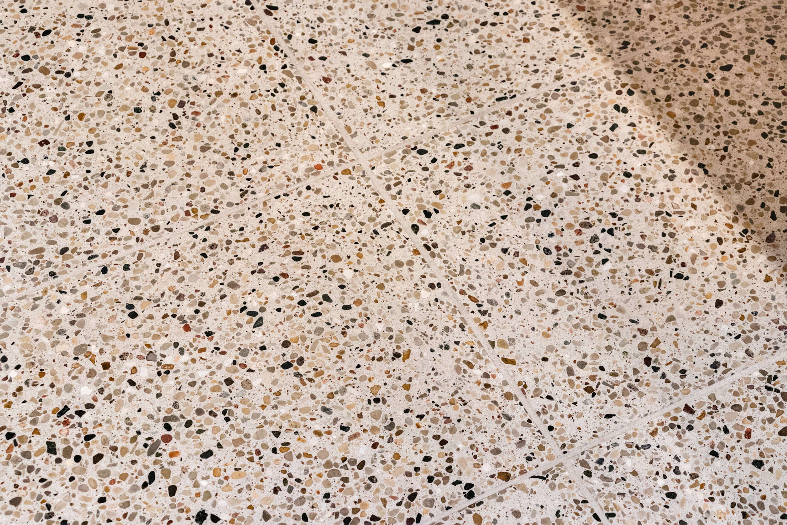
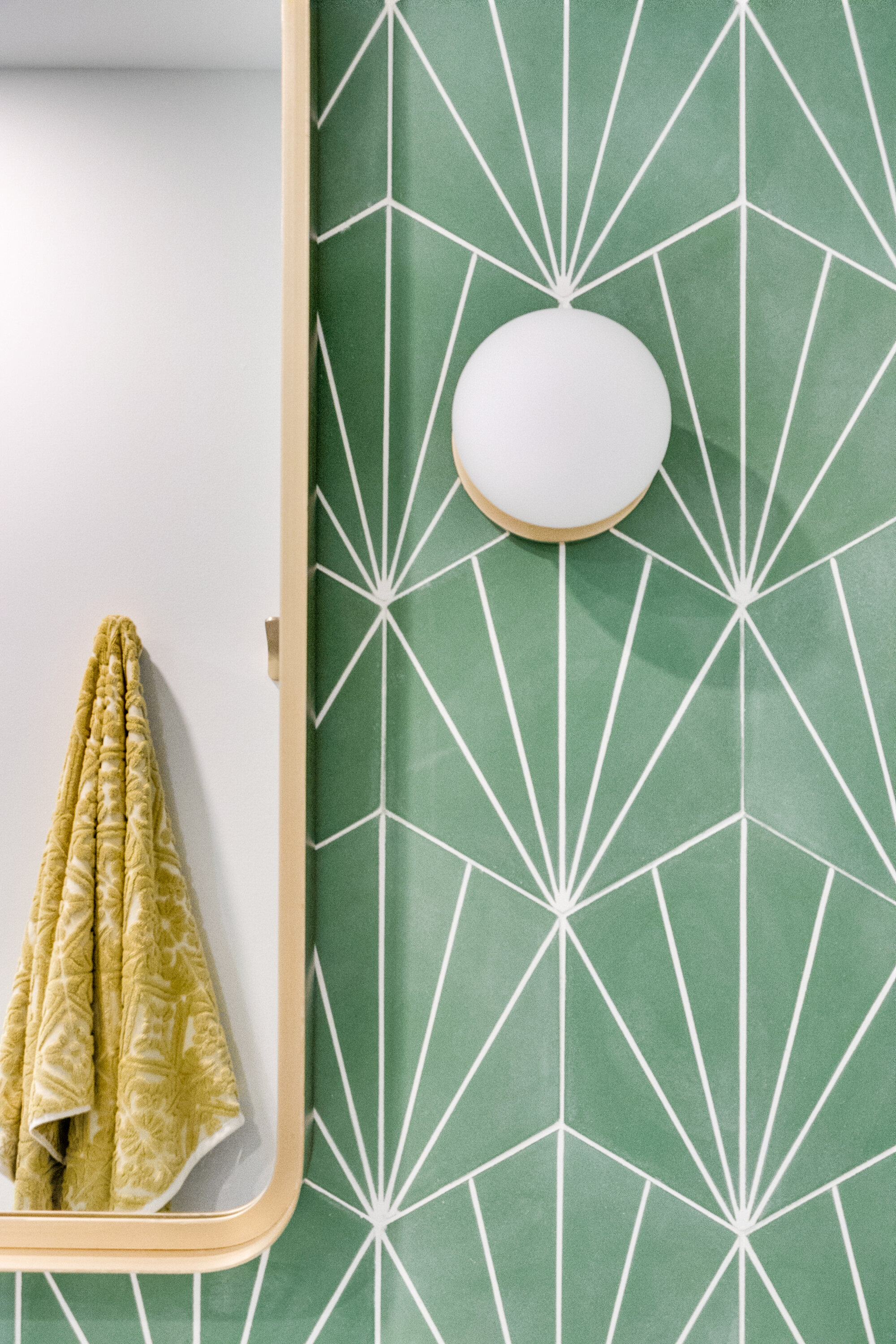
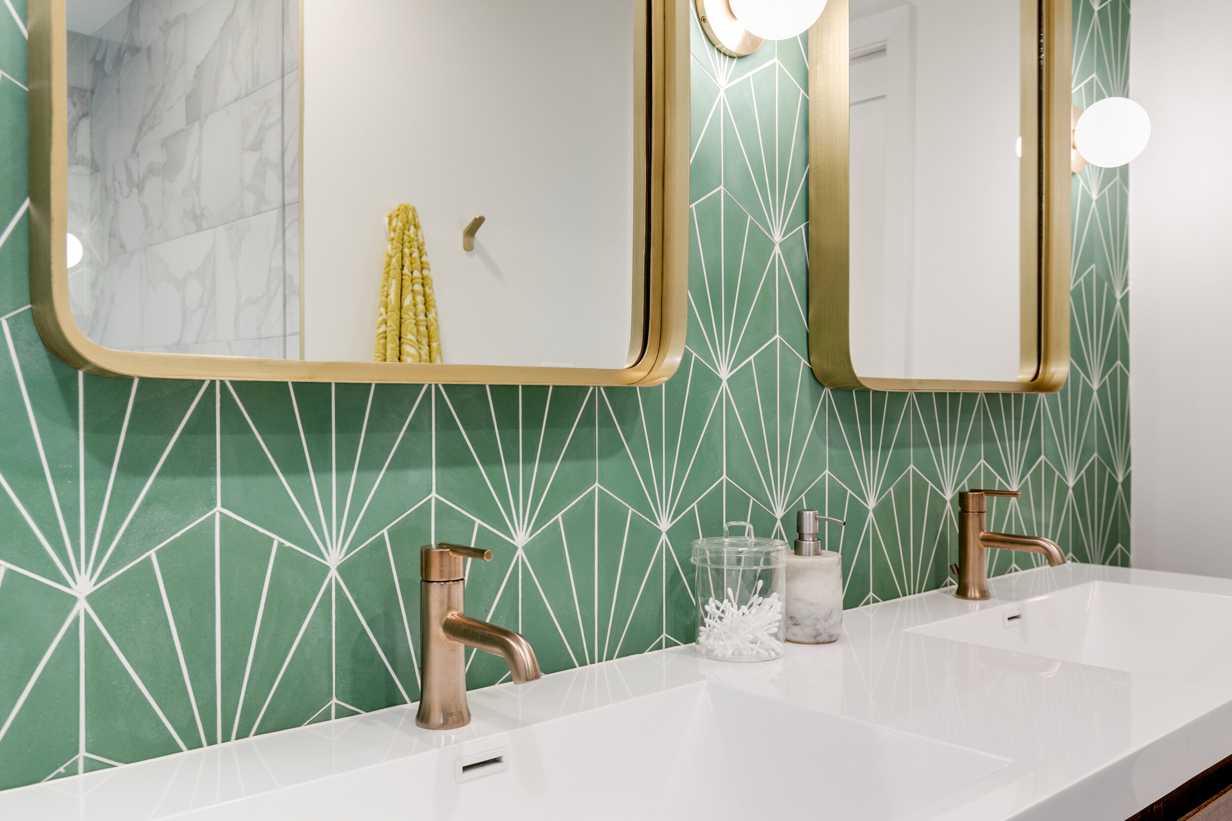
But a close second for everyone’s favorites are the bathroom remodels. While the main living spaces feature clean lines and understated colorways, the bathrooms are packed with personality and style. The primary bathroom features the spacious shower of a lifetime alongside a stunning wall of green starburst tile and floating vanity. The guest bathroom was inspired by the home’s mid-century origins, and features retro pink 4x4 wall tile, terrazzo floor tiles, and brass fixtures. The powder room’s classic Beverly Hills Hotel wallpaper makes this space a tiny tropical hideaway.
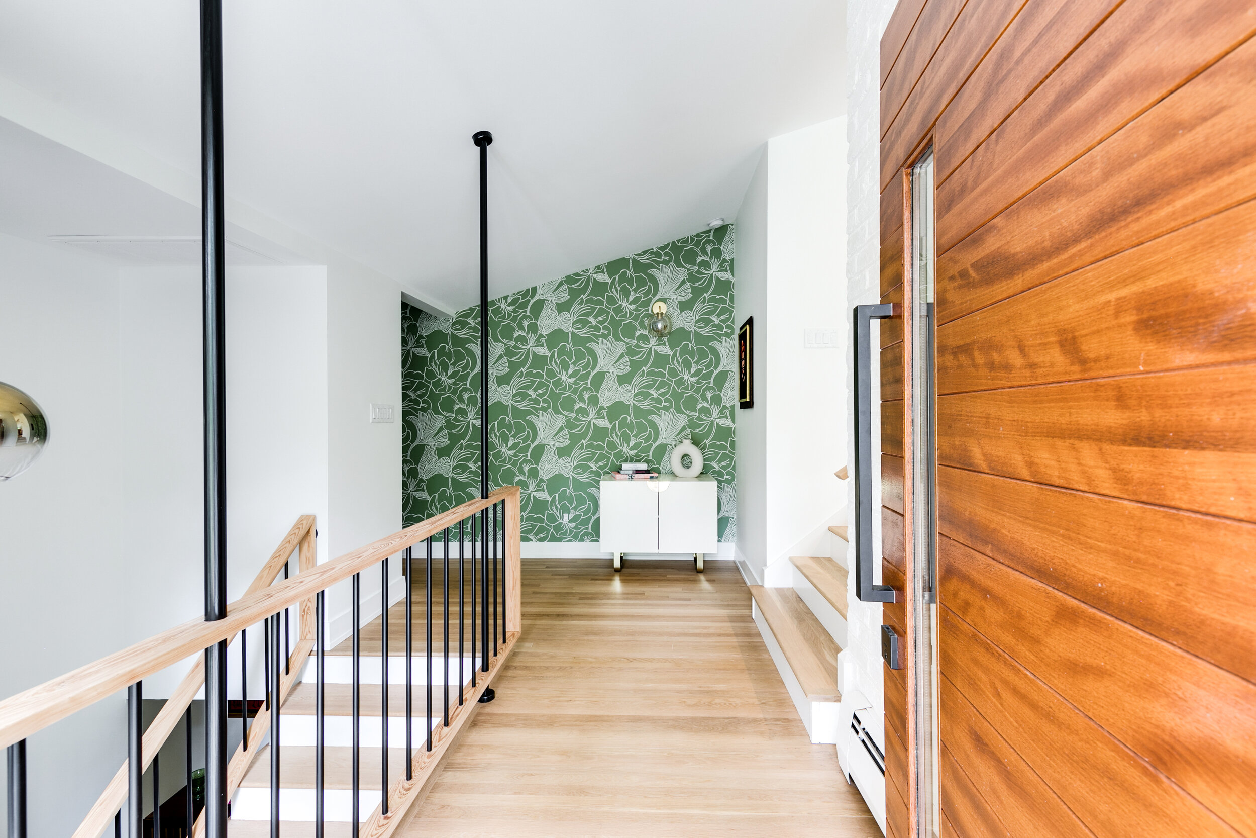
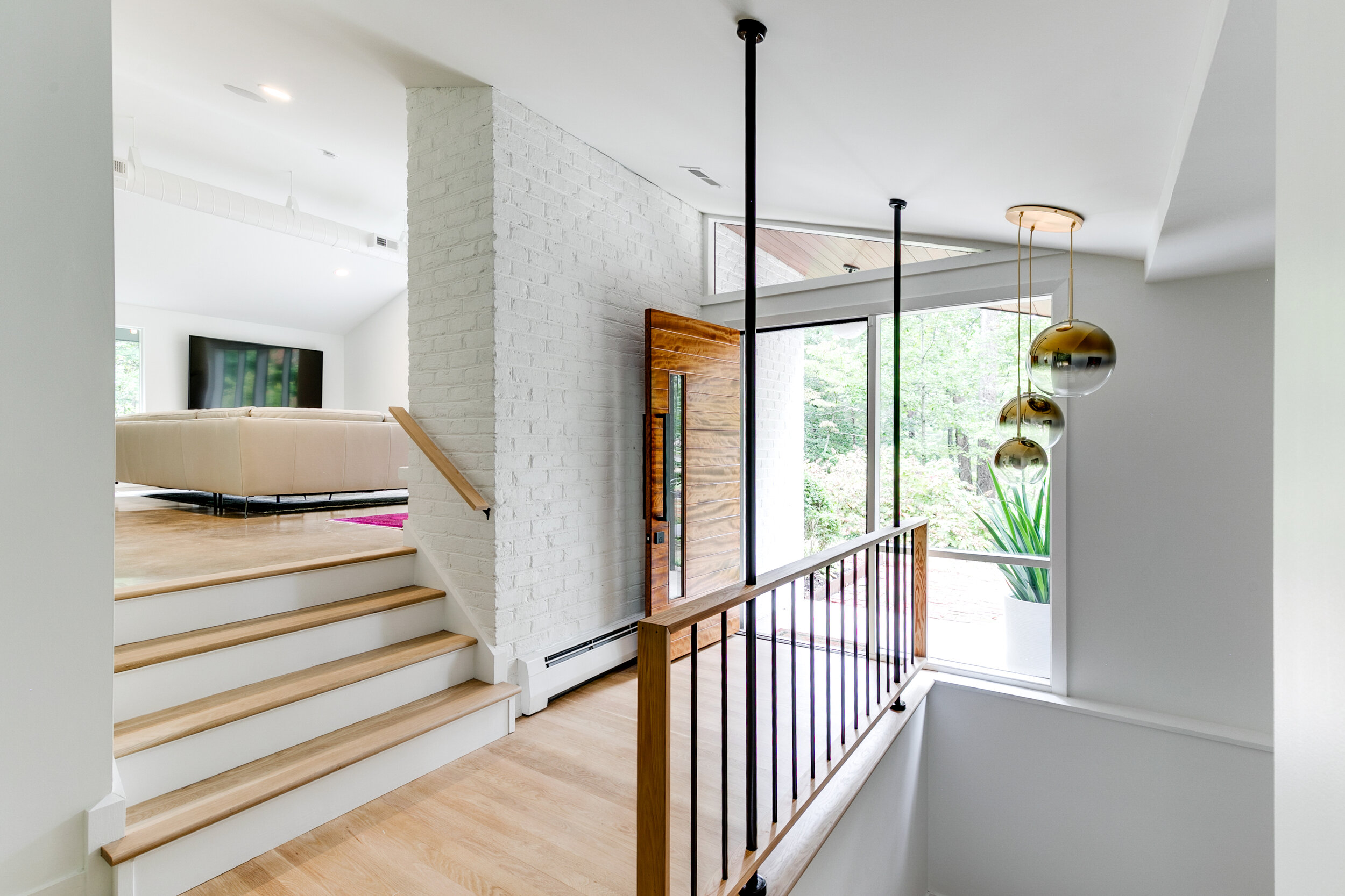
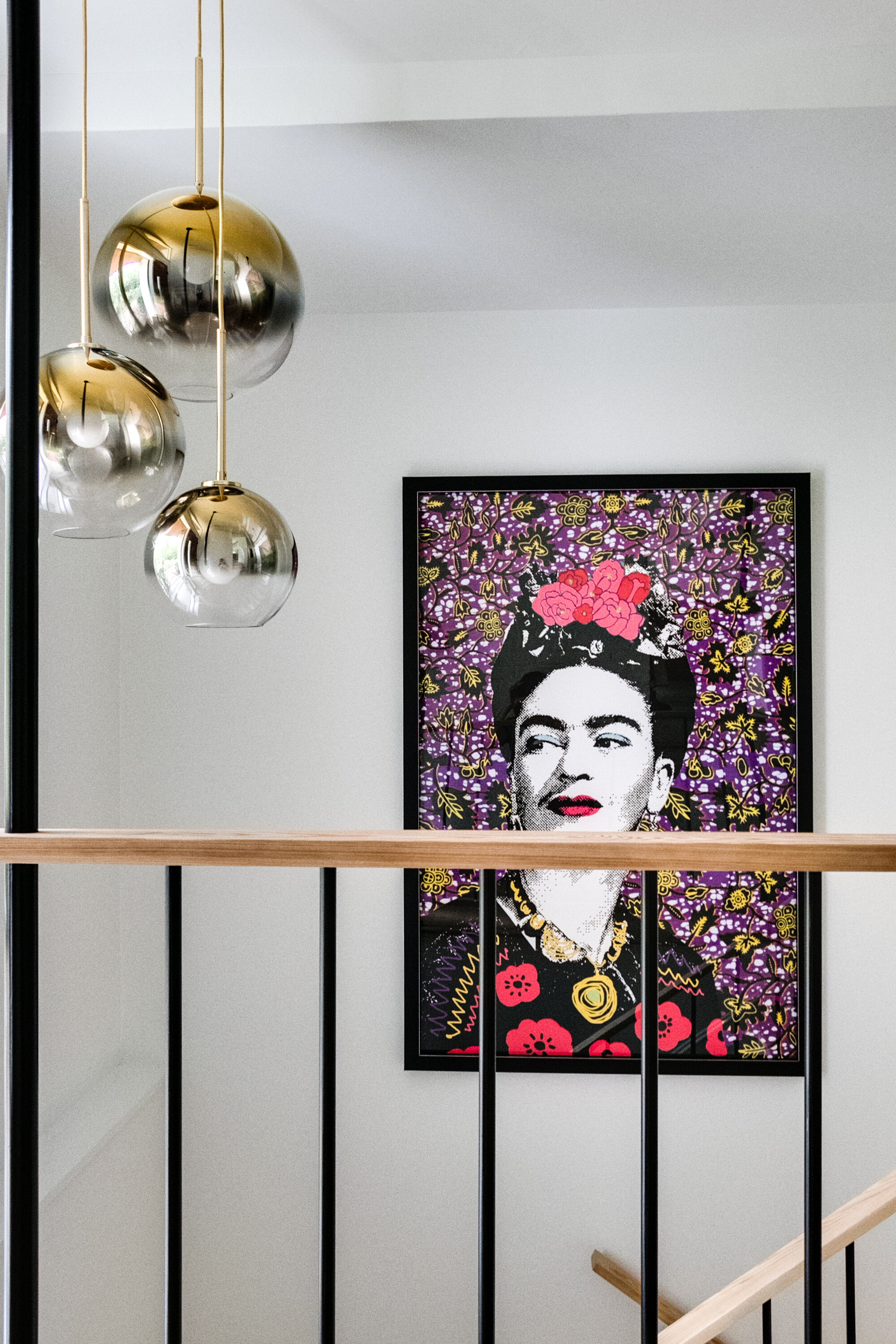
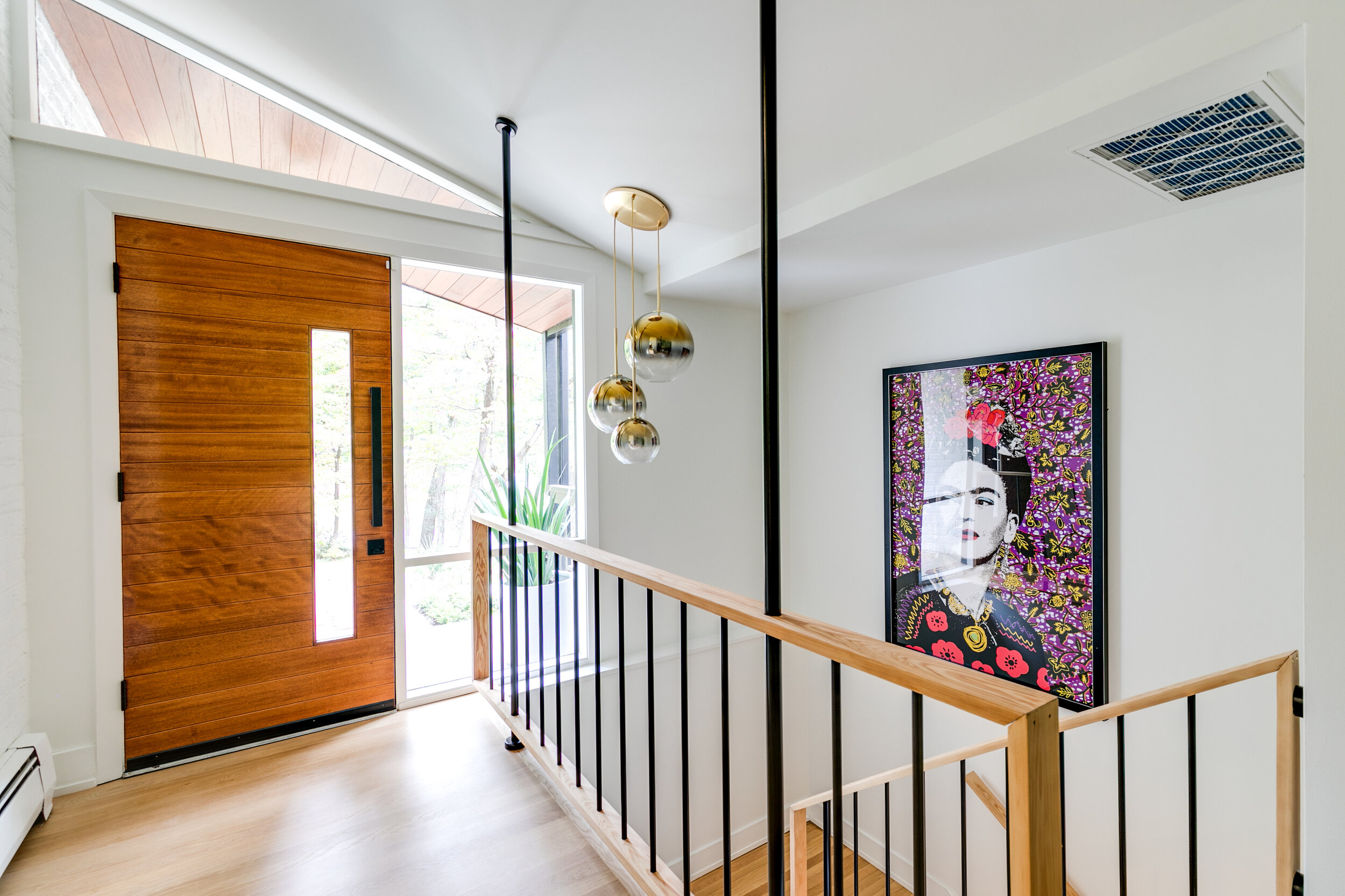
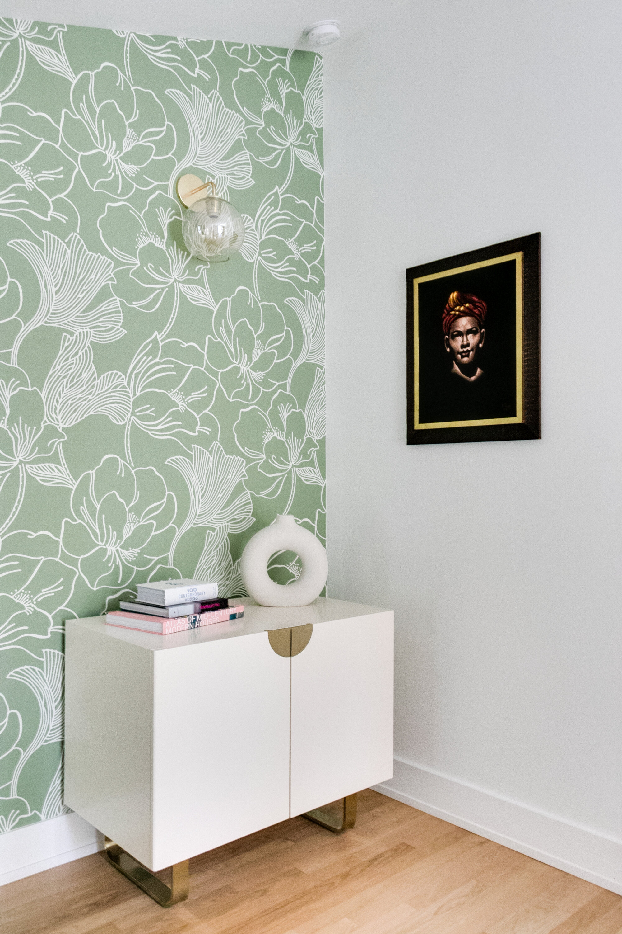
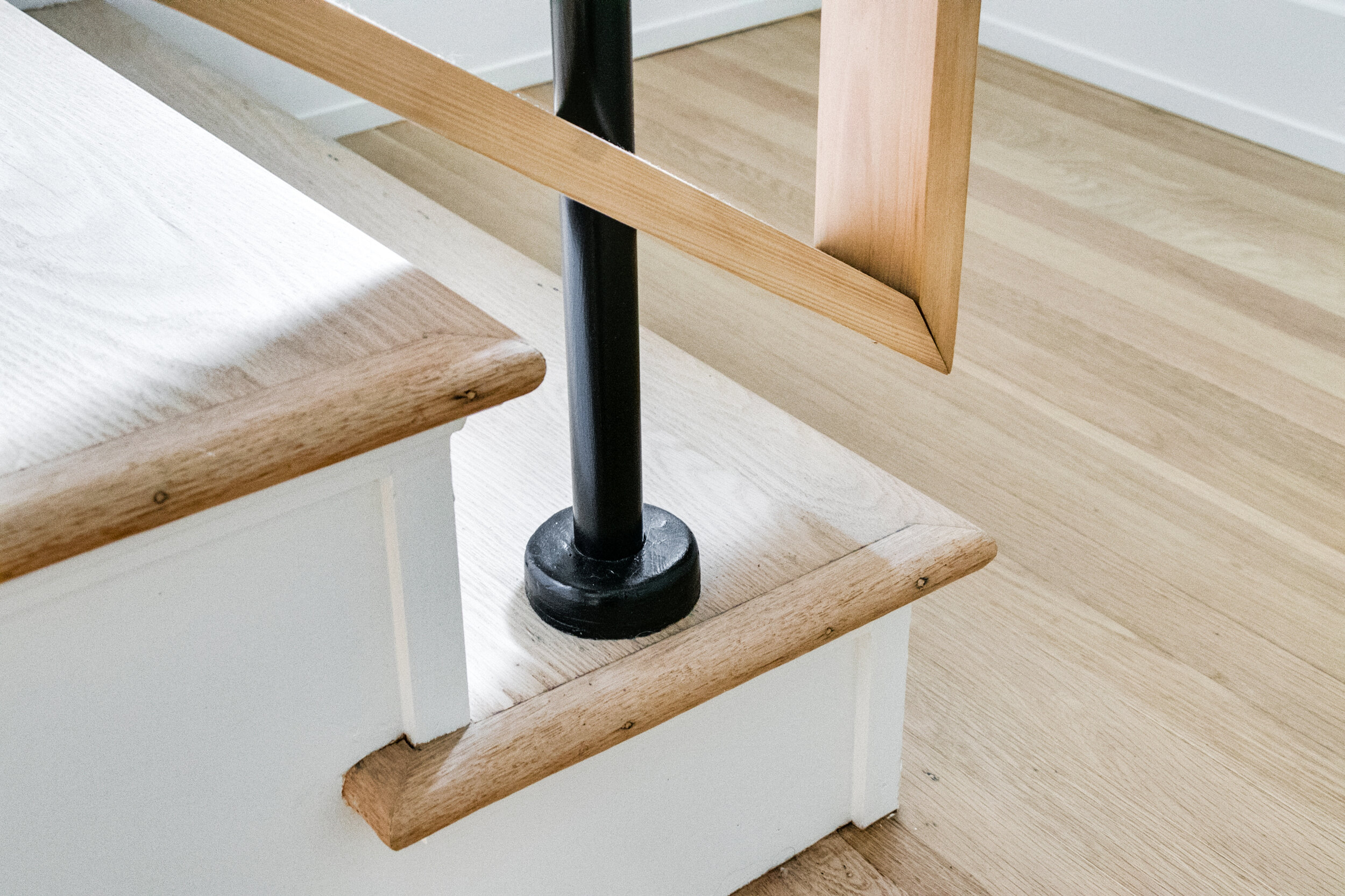
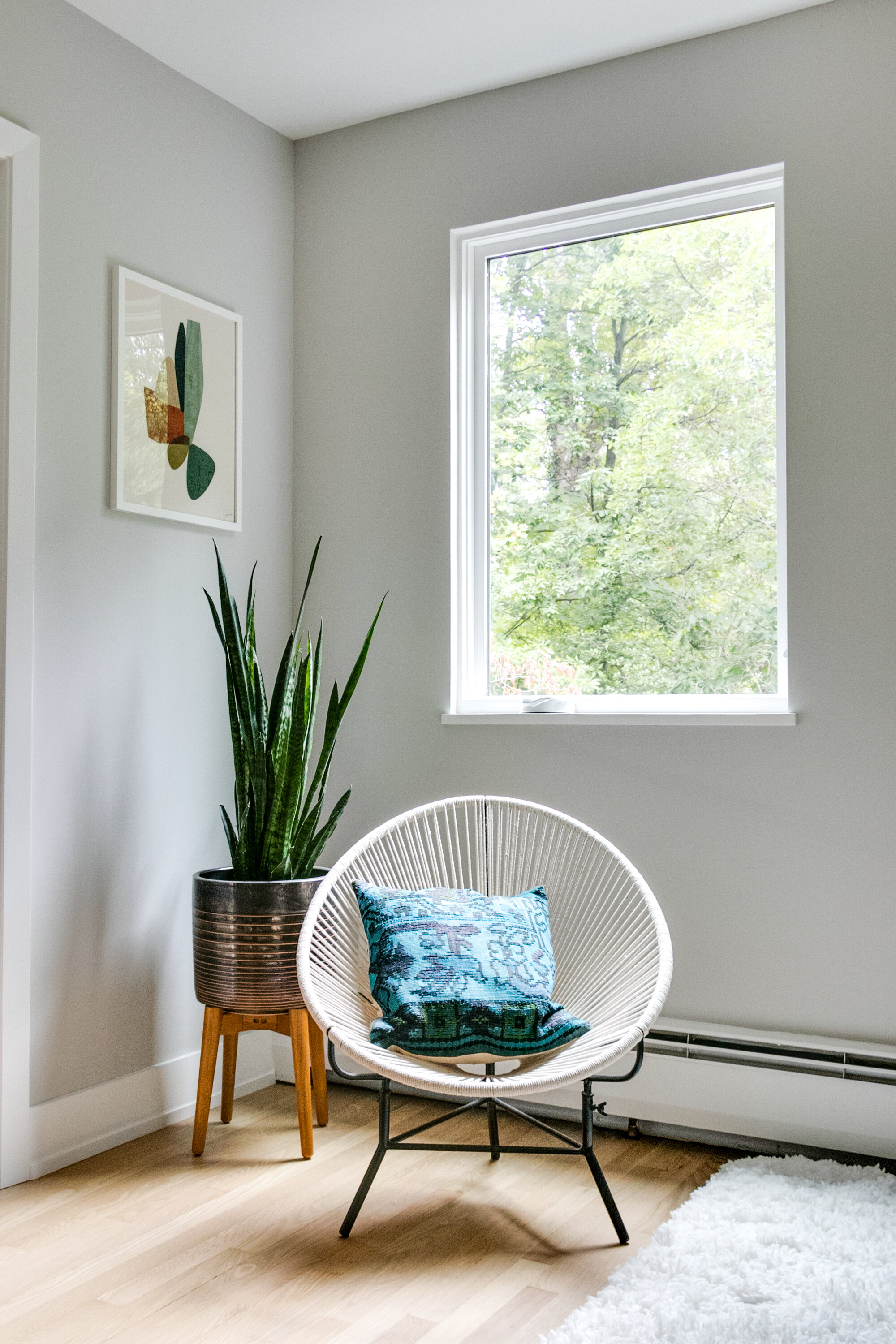
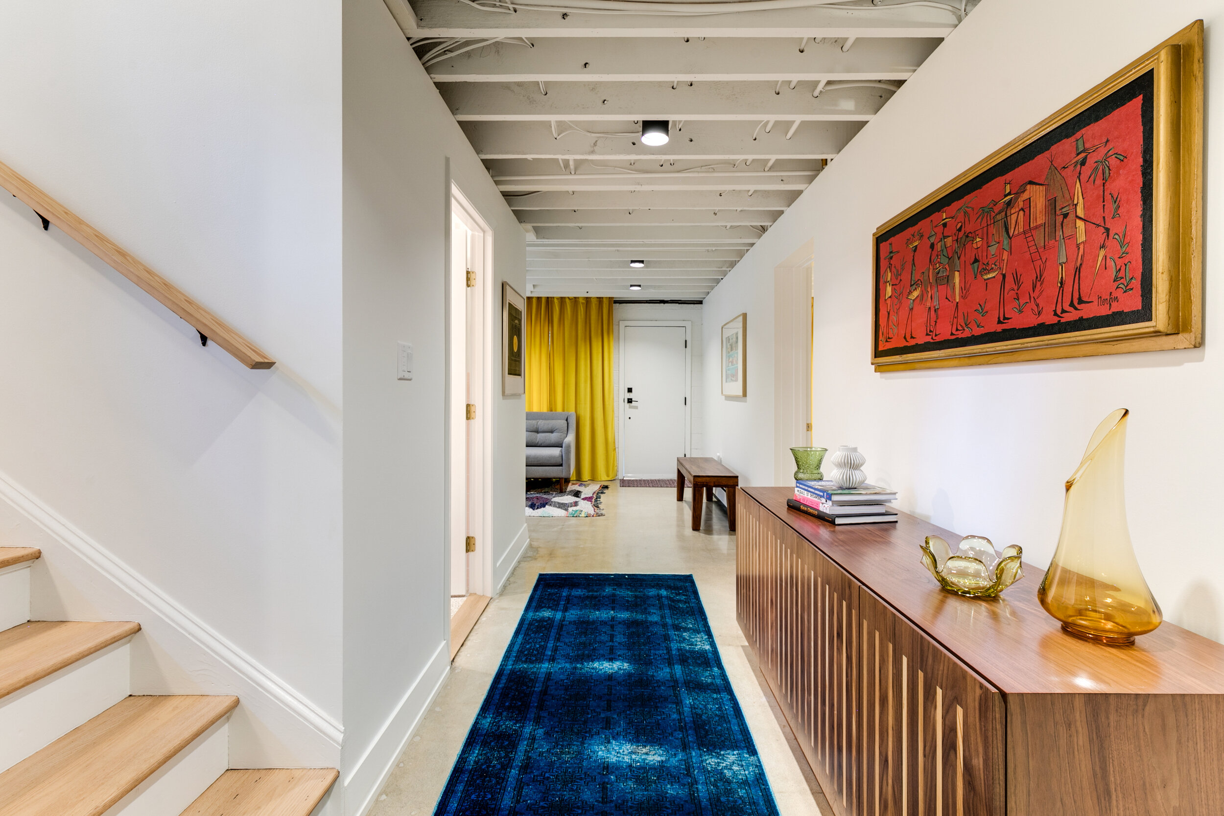
The entryway is also not to be overlooked. This area highlights why the Villacarillos call their home a “revitalization.” The entry stairwell’s original wood and aluminum railing was disassembled, painted and restored before it was re-installed in its original position. Period-appropriate yet contemporary lighting, wallpaper and artwork feels fresh but also like they could have been there when the home was built. This balance is what we all worked toward - honoring the history and intent of the home while improving and updating where necessary.
We asked the Villacarillos if they had any advice for someone thinking about taking on a whole-home renovation of this scale, and their passion for the project is clear in their answer.
“A whole-home renovation can be intimidating, but it has been one of our most rewarding endeavors. Our advice would be to ‘go for it - YOLO!’ Overthinking is perfectly okay and normal. Visit the house as much as you can (if you’re not already living in it!) and visualize yourself living in it as much as you can. Enjoy the process and the finish line will be sweeter.”
We could not agree more. We believe that between the where-do-we-begin “before” pictures and the amazing “after” shots, there’s an incredible transformation to absorb and enjoy. With careful planning, thoughtful design, and the expertise of skilled craftsmen working together on your home each day, watching it all come together can be its own reward.
As always, we’re honored to be a part of restoring and updating this beautiful home for Sarah and Ron, and we wish them and their mid-century gem another 60 wonderful years.
This home was featured in a home tour on dwell.com .

