Renovating a Mid-Century Landmark Part 1: Buying and Designing
Sometimes you choose your house, and sometimes your house chooses you.
Ron and Sarah Villacarillo had been looking casually at listings, trying to decide between relocating or renovating their current home when a mid-century modern split level ranch came on the market. They kept their eye on it - intrigued by the classic mid-century features like floor to ceiling windows, large open living space and overall clean lines, knowing that homes like this can be hard to find in Richmond. The house had been on the market for several months and they couldn’t figure out why. After some research and several drive-bys, they decided they had to see it for themselves. But they didn’t want to see it alone.
The Villacarillos reached out to us before they even put in an offer on the house. They had seen our work on social media and knew that our general design aesthetic and attention to historic detail was a good match for what they wanted to do.
“It was very important that an architectural design company was in lockstep with us. It was a crucial component in the purchase decision. We already had our ideas. We even had references and sketches at the ready, but needed the professional point of view.”
-Ron and Sarah Villacarillo
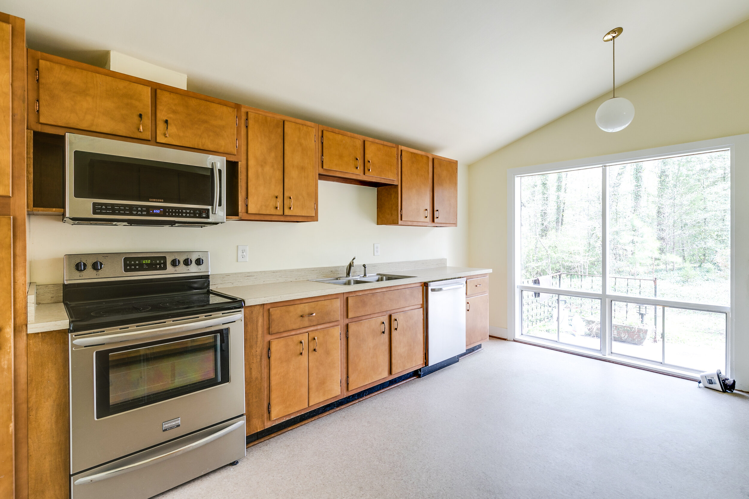
RIC owner, Matt Warner, went out to the house with them to do a viewing to help them determine if they could make their dreams about it a reality. They had been drawn to the house for the same reason as many other lookers, but unlike the others before them, they were able to see past the asbestos tiles, leaky roof, dated carpet and 60-year old kitchen cabinets.
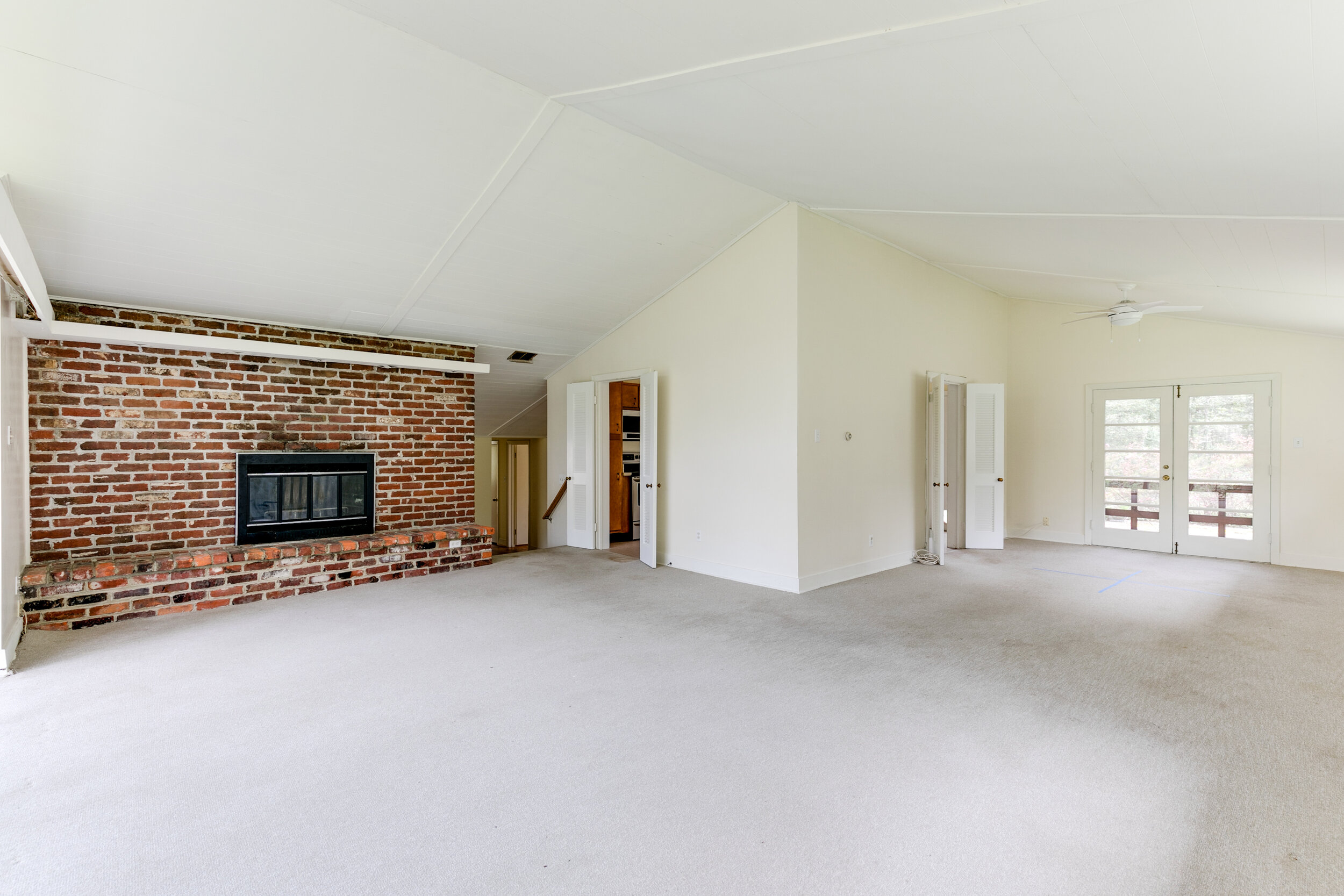
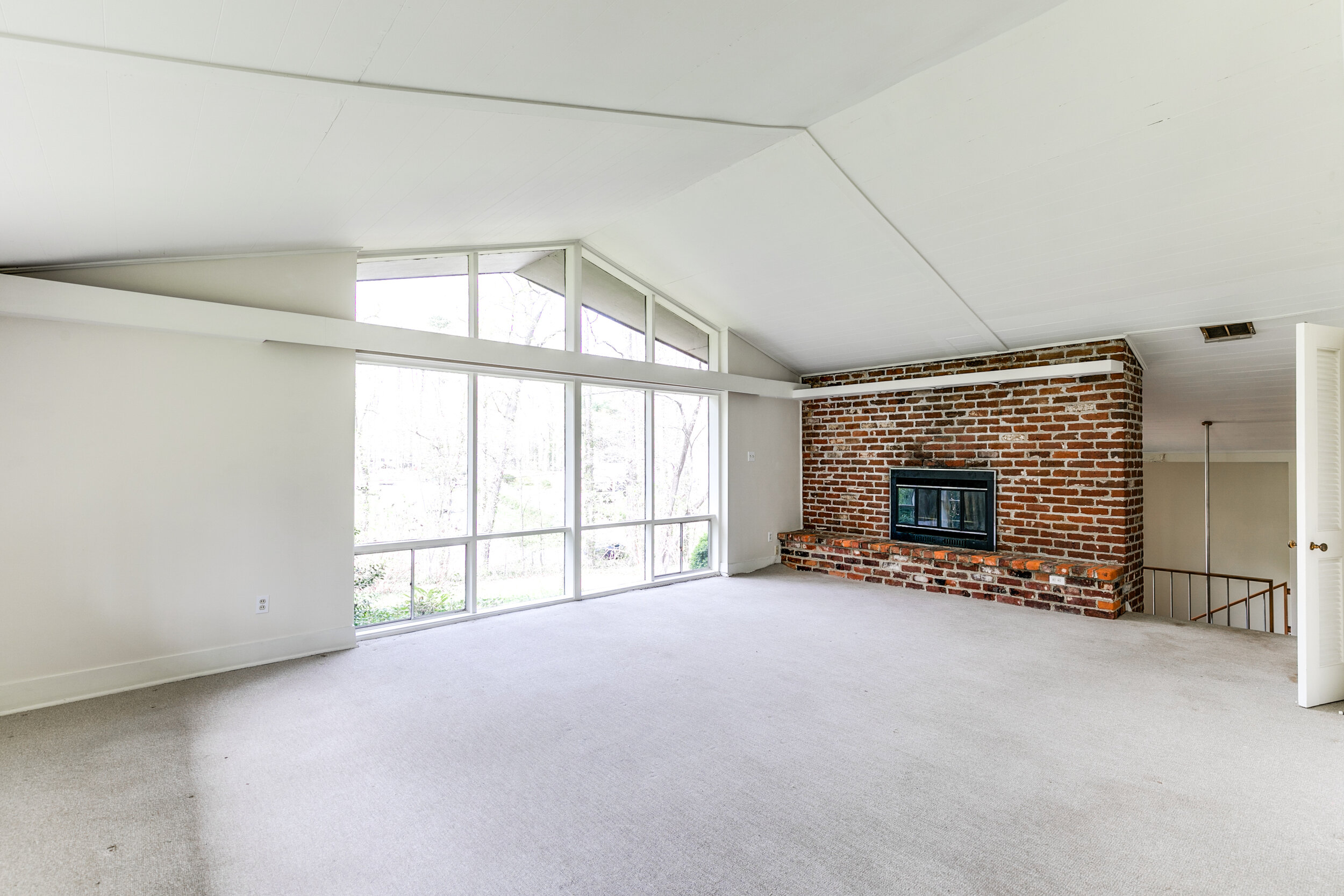
The home is located in the Bon Air neighborhood, which is full of homes built in this era. But unlike other homes it was designed by local architect, Alan McCullough, one of the very few modernist architects practicing in this area at the time. The home was built in 1957 and was well designed and customized to take advantage of its sloping, wooded lot, with main living areas at the high point of the property. Big windows and doors open up the living, dining and kitchen areas to beautiful views of the surrounding woods and landscape. Essentially, the house had a ton of things going for it, but still needed to be brought into the 21st century in critical ways.
“It wasn’t until Bronwen presented the first revised floorplan that we
realized the possibilities. RIC injected their functional and sound building
knowledge to the ideas we could only dream up. They ultimately let us
be the ‘designers’ as they developed a budget and timeline.”
-Ron and Sarah Villacarillo
Bronwen led the design for this project and says it was an exciting prospect. “As soon as you see this home perched on the hill you can’t wait to see the inside - we were all really excited to work on it. The living / dining room is the space that really grabbed everyone’s attention - that big living room window, surrounded by so many mature trees - you imagine 60 years of parties and family gatherings in that living room and can’t wait to get it ready for 60 more.” As far as the main design vision, everyone was on the same page - open up the kitchen space to the living and dining areas so the entire floor can take advantage of the nearly panoramic views.
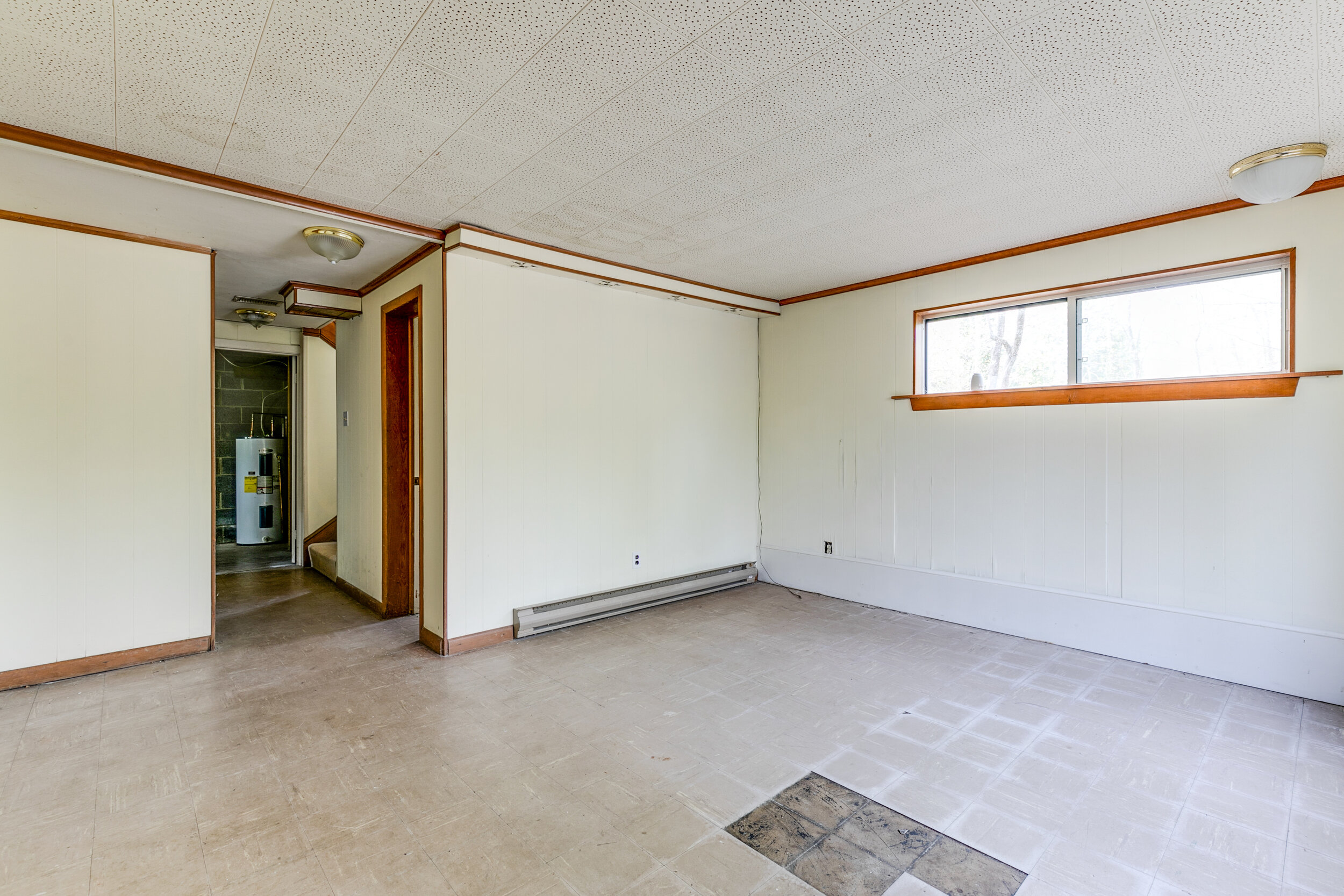
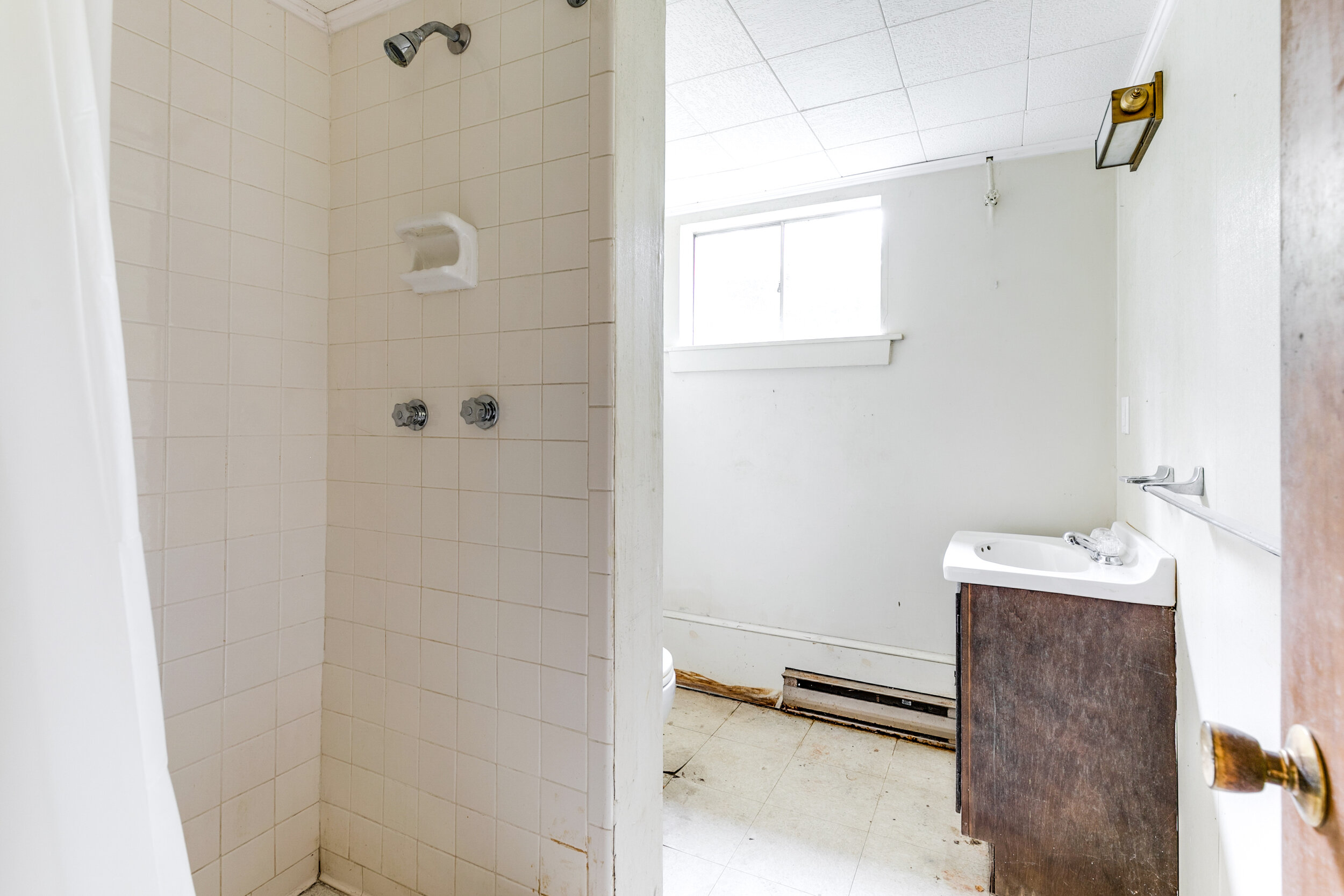
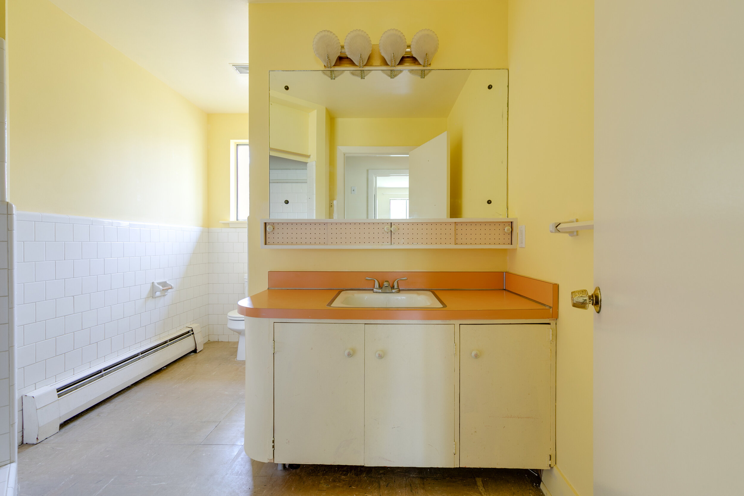
In addition to opening up the flow of the main living area, the bathrooms needed to be scrapped and the bottom floor/basement needed a lot of love to be a really livable space. Additionally the not-so-fun but critical updates of a new roof, HVAC, insulation and other structural issues needed to be dealt with.
Taking out original components of this architectural gem was not a decision that the RIC team or the Villacarillos took lightly.
“We’ve all approached the project with an eye to products and details that are
period appropriate and practical. We reviewed 1957 color palettes and materials,
and fused that inspiration with Sarah and Ron’s modern tastes and personalities -
it’s a great balance throughout the house.”
-Bronwen Warner, Lead Designer
Design details such as 4x4 bathroom tiles and terrazzo tiles pay homage to late 50’s bathroom design even though they are all being gutted and given new layouts. While we are replacing kitchen cabinets and updating the kitchen layout, the new cabinets wouldn’t feel out of place in the original kitchen.
“Our approach was ‘modern meets mid-century modern.’ Instead of ‘saving the charm’, we wanted to bring in contemporary updates that still paid homage to the era. We did the due diligence of researching the architect . . . we asked ourselves ‘what would McCullough do today?’ and tried our best to make decisions based on that.”
-Ron and Sarah Villacarillo
As a design/build team, creating a vision for the project is just step one. The beauty of our business is that we also get to see the project through to the end. Everyone at RIC is as excited as the Villacarillos to see the final product!
Read our next blog in this series where we’ll dive into the design and construction details of this project.


