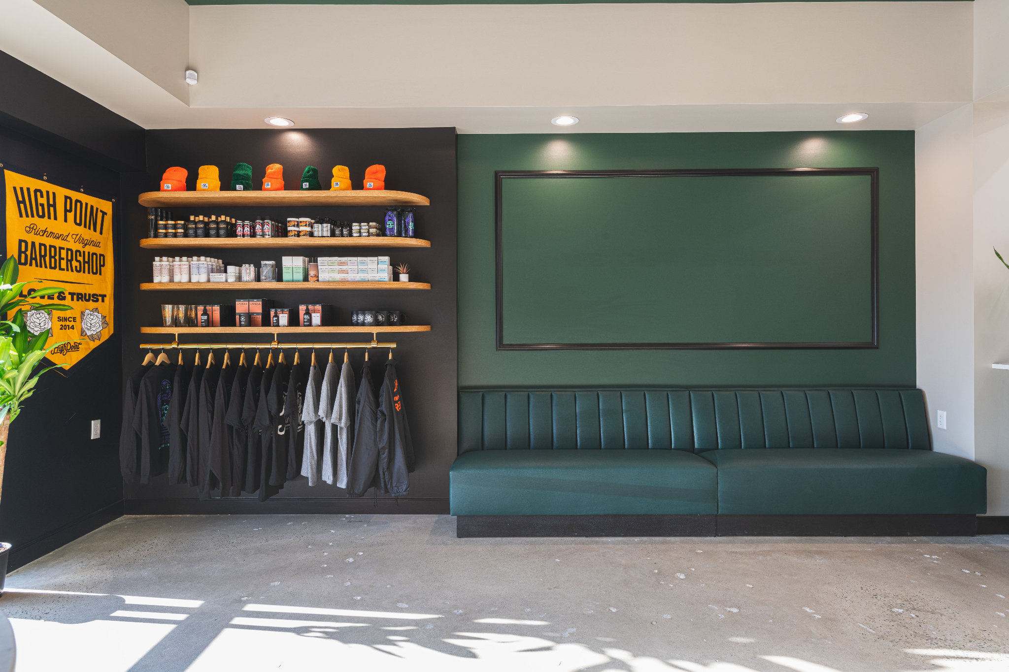
2021 Win: West End High Point Barbershop
One of the most exciting things we accomplished at RIC in 2021 was wrapping up the build out of our second project with High Point Barbershop.
After teaming up with Campfire & Co. for the design portion of the Scott’s Addition location we constructed, it was clear that all three entities worked well together. So when High Point decided to grow to the West End, we got the gang back together again.
With the spirit of collaboration in mind, we thought we’d share all three points of view on this project and how the concept, design and build out stages all work together to create something truly unique and downright cool. We interviewed Darren Brown of High Point, Lauren Stewart of Campfire & Co. and our very own Matt Warner to get as much perspective as possible on how this project came together.
First of all, how does it feel to be finished with the THIRD High Point location? What has that journey been like for you both on your end?
HP/Darren Brown: It feels amazing to have the third shop open! We always saw High Point as something that we wanted to grow and we really believed in its potential. The rate at which the first shop filled up surprised all of us! For that reason, the second shop came sooner than we expected. We were able to be a little more planned and calculated with the third shop. We've allowed the growth of High Point to be organic, and have expanded naturally as our client base has grown. That really feels like the approach for us.
C&Co./Lauren Stewart: It is so gratifying to have repeat clients like High Point that have been with us from almost day one of our company. The Fan location was one of our very first interior design projects! It is so fun to expand on the interior brand with each of their locations and it feels like it gets better and better with each one. The High Point team cares so deeply about how their brand is carried through to their interior experience because that is one of their main differentiators in the market. We love working with them and are excited to grow with their brand.
What were some of the challenges - design or otherwise - of this particular project?
RIC/Matt Warner: The 2020/2021 struggles that the whole world experienced were a bit of a challenge. Covid-related things caused a couple of start and stops with the project which made the total construction duration quite long. But the overall process seemed to flow a lot better having worked with everyone before.
C&Co: Function is always top priority for us. If a space doesn't function for our client we have not done our job well. The barber stations are clutch when it comes to functionality! We have worked hard to incorporate all of the conveniences they need to do their best work efficiently and beautifully.
High Point/C&Co/RIC feels like a real dream team that isn't going to be disbanding anytime soon as High Point continues to expand - why do you think the three organizations work so well together?
RIC: Probably because we all have a lot of familiarity with each other which creates a lot of trust. We have also worked together in other instances outside of construction (Campfire designed and built the RIC website, and RIC has teamed up with Darren on previous real estate needs) which probably aids in the comfort level across team members.
HP: It was great to partner with both Campfire & Co. and RIC again for the newest location. As always, Campfire brought some design details into the space that we would have never thought up. Campfire is also considerate of how our space needs to function. While the space is beautiful, it is still important for it to be a working barbershop. Everything has to be considered, from the spacing of the stations, to the materials used, to the functionality of each area. We appreciate the "whole-shop" approach that Campfire takes with design.
Working with RIC again was a priority for us. RIC understands our design and has an uncompromising attention to detail. RIC was able to handle every aspect of the build out, taking High Point from a set of plans, to a beautifully finished space that we can be proud of every time we enter.
RIC handled the build-out portion while Campfire took on the design. What does this partnership look like in practice? How does a space go from the screen to real life, and what kind of challenges do you go through together along the way?
C&Co.: The RIC team is great! With a background in residential construction they understand the high level of detail that we incorporate into each design and can execute it perfectly. We typically handle all of the layouts and design work that happens up front but once we get to the pricing phase, the RIC team is a great collaborator when we need to rethink a design detail to come in on budget. Both of our teams also use the 3D modeling tool, SketchUp, which really helps us stay on the same page.
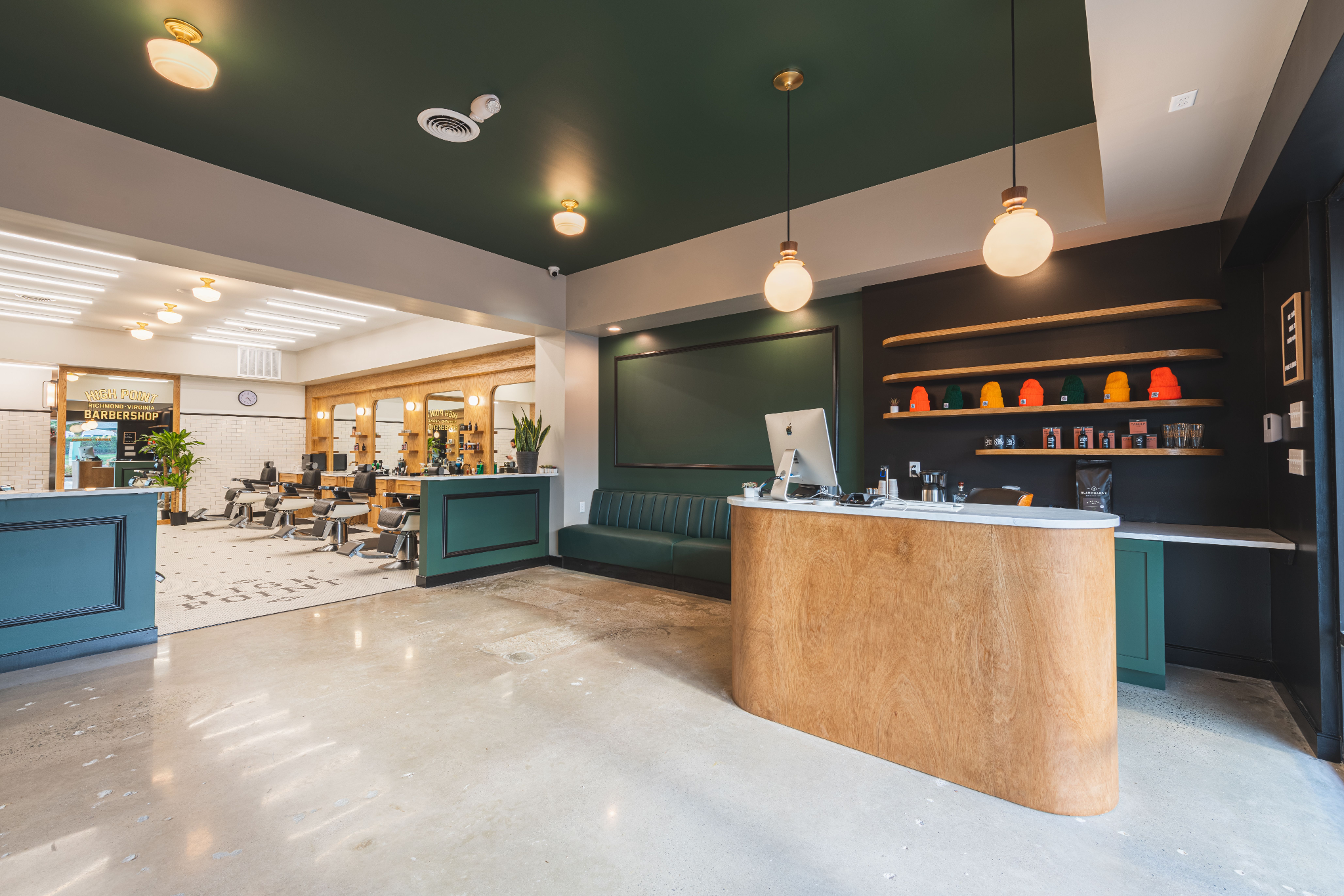
RIC: During construction, we ran into a minor detail on the divider between the Reception Area and the Cutting Floor - originally designed as a bar countertop with seating. High Point realized that the open countertop would create a pinch point for the barbers in those front stations. All three of us worked together to determine the space needed for the barber to work (down to the inch) and also decided to have the area below the countertop closed off with a wall for better seating on the benches. Campfire was quick to provide some final details on that item with the trim panel and colors to unify that element with the overall design.
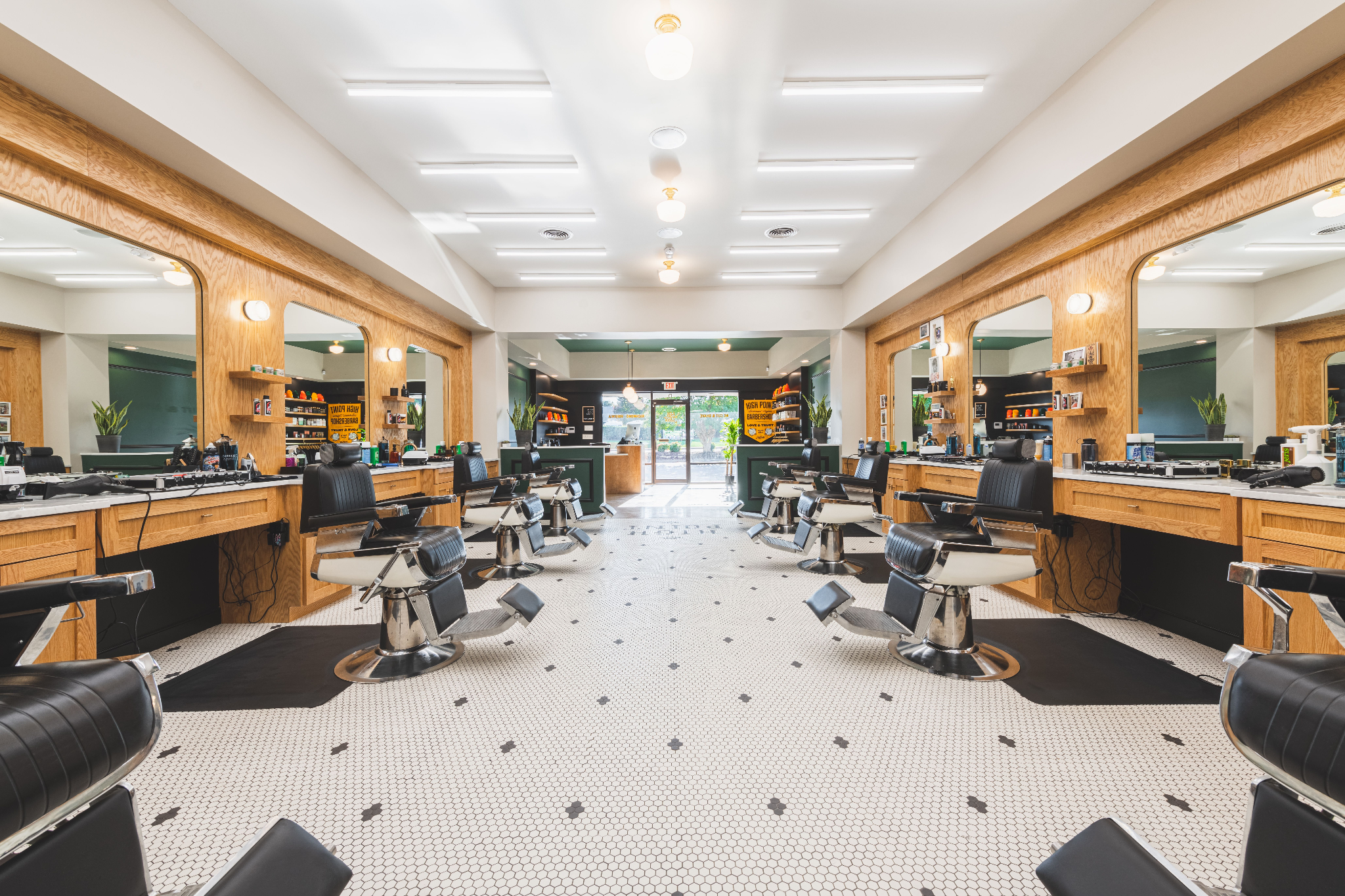
The design was measured down to the inch to make sure each barber had the most functional workstation possible.
High Point obviously has a very specific look and feel at all its locations, but what do you do to make each space a little unique and different from the others?
HP: We really appreciate the consistencies in the shops and those ever-present features have become a part of our brand and our identity. To make each shop unique and different, we let the space speak to us. It's typically a mix between how the space feels, what the context is, and what design features we think would be cool within the space.
C&Co.: We take cues from the existing architecture of the building and the history of the neighborhood they are in. So the Fan location feels the most classic because it is surrounded by so much historic architecture. The Scott’s Addition location has a more clean and industrial feel being set in a neighborhood of warehouses. The new location didn't have as much history to pull from, so we created a design that will transport High Point clients to another place that feels modern yet historic and hip all at the same time.
Darren and Matt in front of their first location collab in Scott’s Addition.
Conversely - what design detail HAS to be at every location that is absolutely critical to a High Point space?
HP: The one detail that we carry through to each location is our name, big and bold in the tile floor. When we build-out, we commit to the space, and we like the permanence that the tile name puts on the space.
Behind the scenes of creating this integral brand moment.
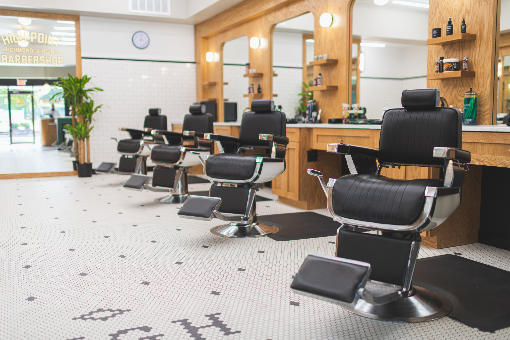
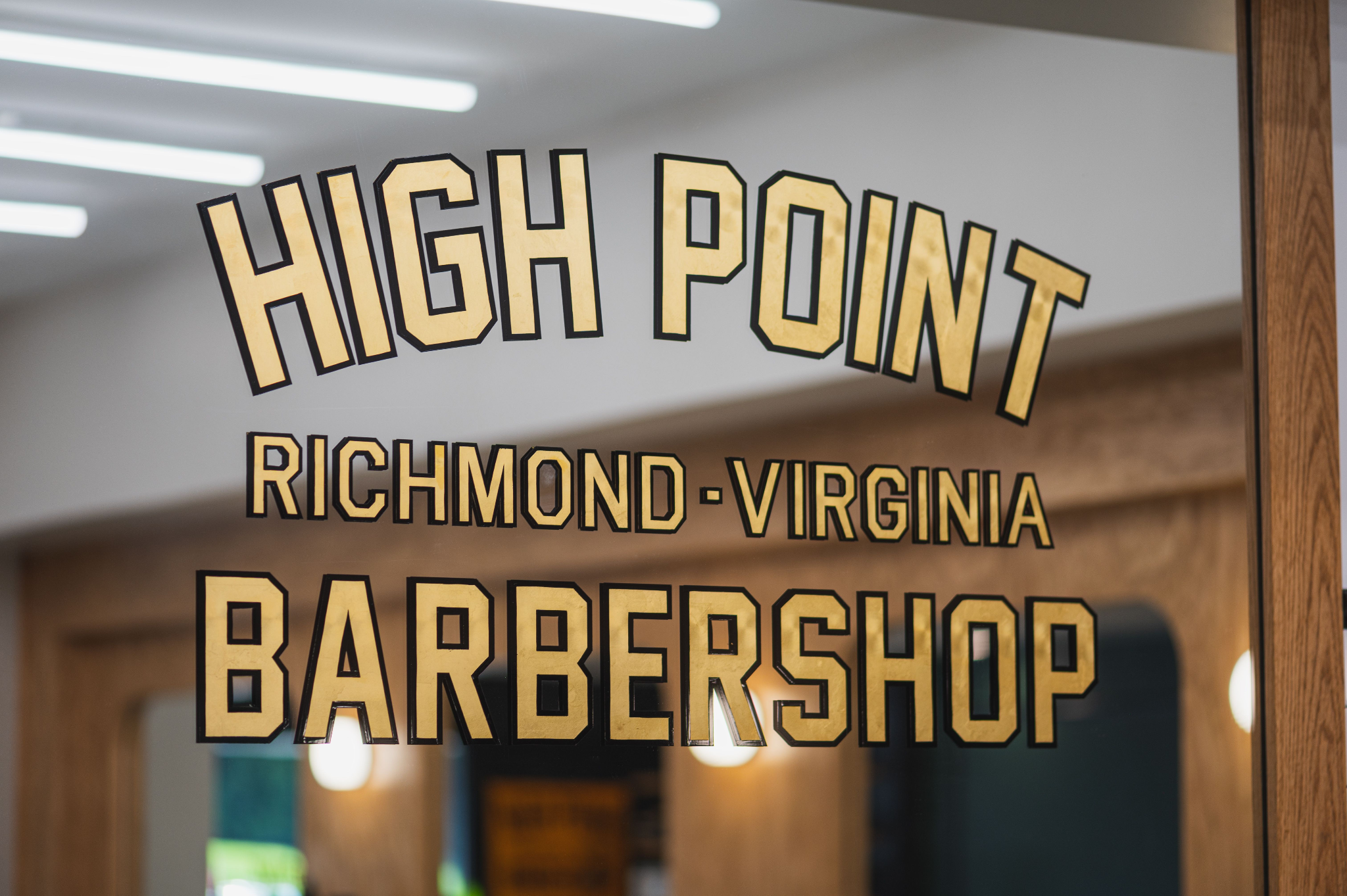
C&Co.: As a lifestyle brand, signage and brand moments are a really important part of the customer experience. The High Point name in the hexagon floor tile is one of the most instagrammed branded moments at each location. Other details like the gold foiled hand painted signage and the vintage inspired Belmont barber chairs have become iconic elements of the High Point experience.
What’s your favorite design detail in the new space?
RIC: The Cutting Floor, which is not really a “detail,” but more of the larger scale aspect of the space. But all of the materials and fixtures - when they come together - look awesome and spot-on for the High Point brand. It's really impressive to see all of that in a real workshop-type space for the barbers to work in.
C&Co.: The subtle curves we incorporated into the custom casework and the saturated green paint! These are both new additions to the design and we love how they make the space feel bold yet comfortable and remain classic with a modern touch.
HP: My favorite design detail in the newest location is the curves around the inset mirrors. The curves are a beautiful detail, executed perfectly by RIC. It brings a softness to hard edges of the design that makes the shop really interesting. It's fascinating to walk down the middle of the shop and look at the curves from all angles.
Darren, how did you choose this latest location and - the big, annoying question - where will the next one be??
HP: The first location made a lot of sense being in the center of The Fan. The Fan is a neighborhood where all of us at High Point have lived. We selected the second location because of the proximity to all things in Richmond, and the ability to work with developers and contractors as the entire building was being renovated. It doesn't hurt that the Gelati Celesti is right next door! We knew that we wanted the third shop to be in the West End. It was a priority for us that the third location was a place that our clients could swing in-and-out of easily and without the stress of traffic. The Three Chopt corridor made a lot of sense for those reasons.
As far as the next location - you tell us! It's not where we want to be, it's where our people want us to be. We take feedback from our clients and the public seriously and we listen when people say, "you should have a shop here!" We'll let you know as soon as we have the fourth location locked in
-
Big thanks to our friends at High Point Barbershop and Campfire & Co. for another successful collaboration. Looking forward to the next!


