The Art of the Addition
Building a home addition isn’t as easy as just tacking on another room to an existing structure.
For an addition to look intentional, as well as to work functionally inside, a lot of design planning needs to be done. There are no hard and fast rules about how an addition should look. Some homeowners want the extension to blend seamlessly into the original house. Others prefer to acknowledge the age differences in the spaces through contrasting architectural styles. Then there are myriad approaches in between.
Much of the work we do is reconfiguring and adding on space to older homes, so we’ve run the gamut of styles and approaches. Today we’re sharing just a few of our favorite designs that illustrate the form and function of a successful home addition.
The Empty Nest Addition
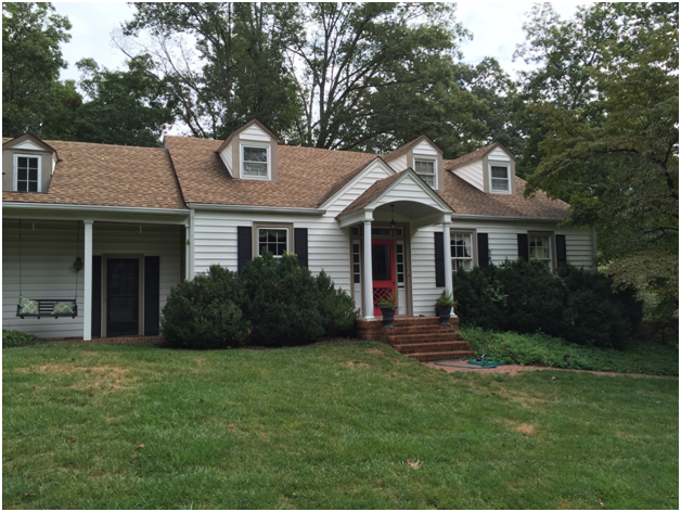
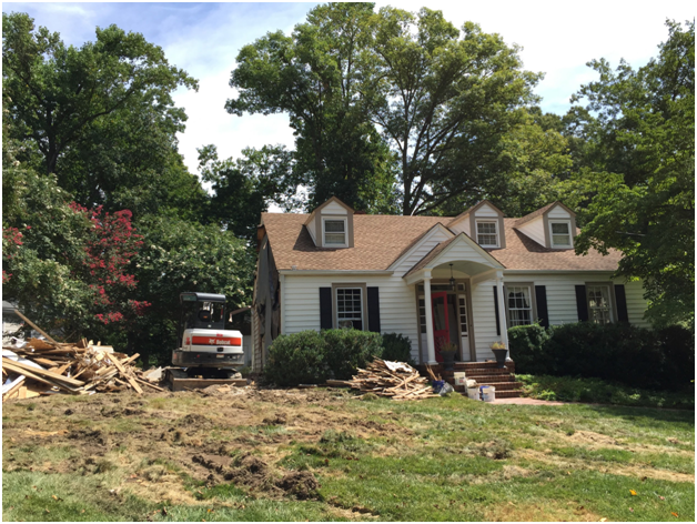
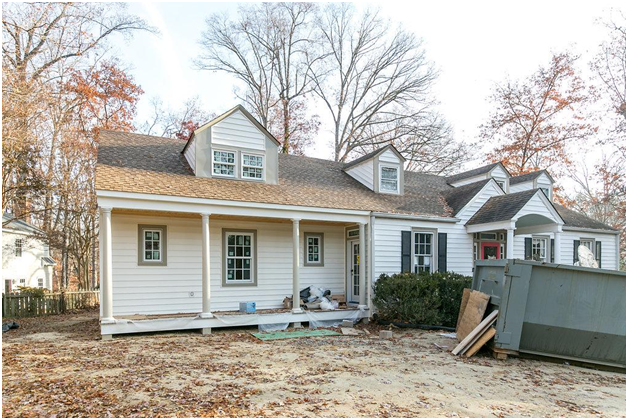
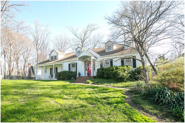
Our clients had lived in this 1920’s farmhouse for over 30 years and now had three grown children living in Richmond and five grandchildren right in the neighborhood. For this reason, they never considered the option of moving to a new home once they became “empty nesters.”
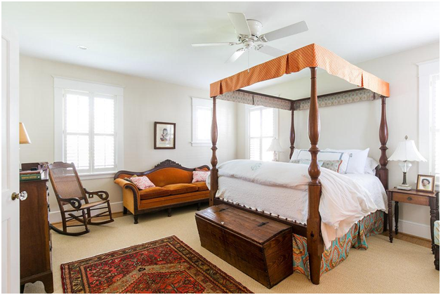
Their lifestyle had changed, though, and they knew that if they wanted to stay in their home for another 30 years, there needed to be some new design priorities. This included a first-floor primary suite, a larger dining room for family gatherings, and improved energy efficiency throughout their home.
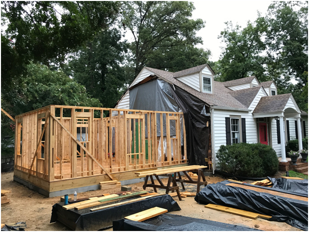
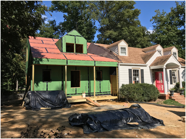
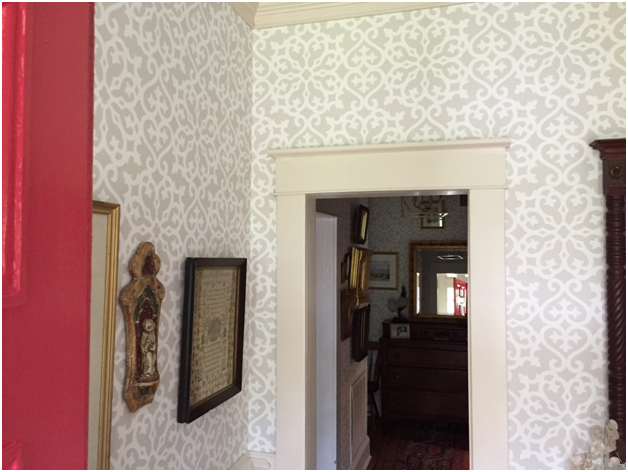
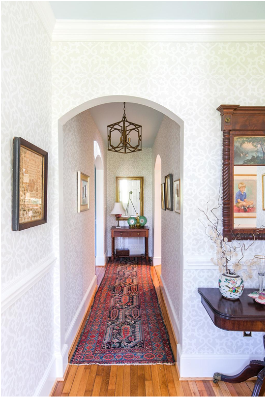
In this case, an addition had been built onto the original home that had suffered moisture, mildew and foundation issues. This section of the house needed to be completely demolished and rebuilt, but it was important to the client that the history of the home be preserved and extended into the new spaces, so our crew took great care to repurpose old doors and hardware, match the new trim to the existing trim, refinish the heart pine floors, and create archways that matched the home’s original design.
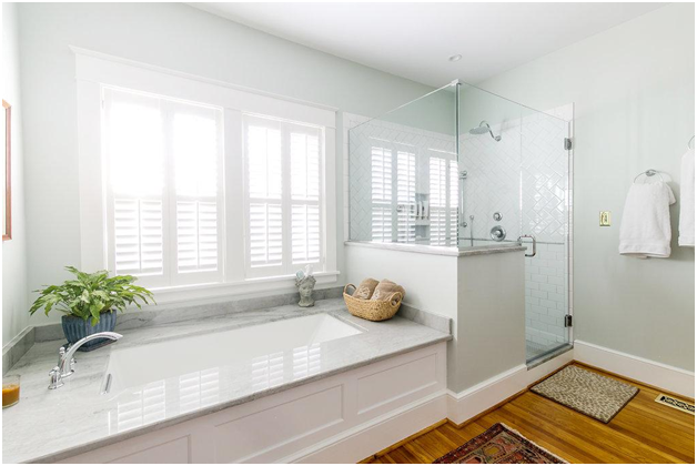
From the outside, it’s difficult to tell how significant some of the changes were in this renovation. But inside, a spacious entryway, large dining room, and primary first-floor retreat made a huge difference in the flow and use of the home.
Craftsman Style Addition
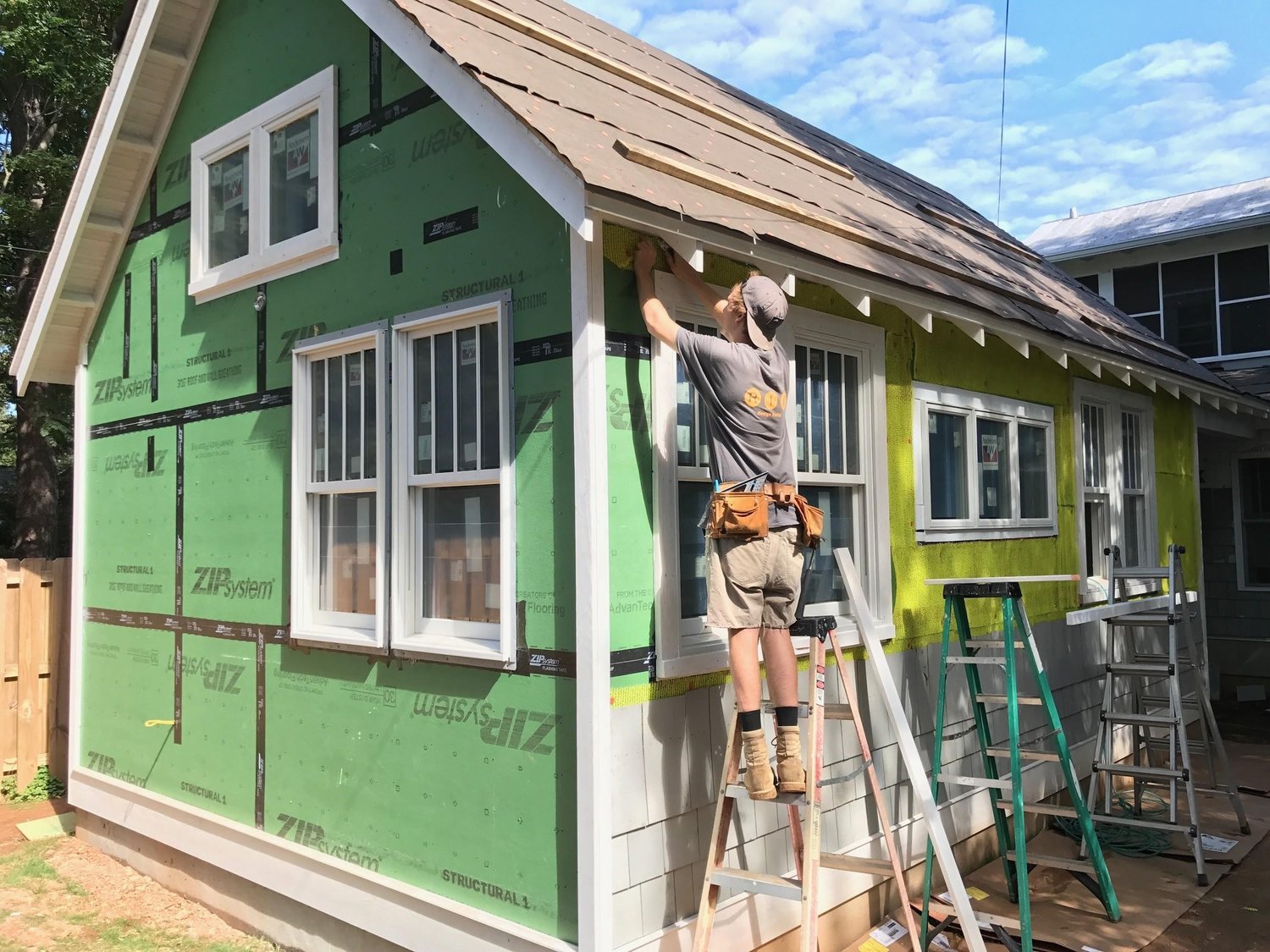
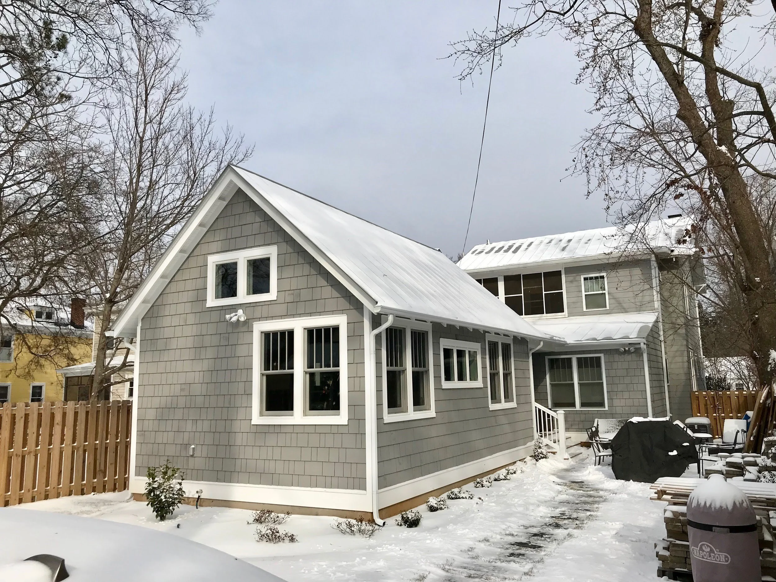
What started out as a conversation about converting a small garage into a man cave resulted in a 700 square foot addition to this Craftsman style home back in 2016. The change in plans was partially influenced by some utility constraints, but also the idea of building an addition on their first floor would allow our clients to “age in place” in the home they loved.
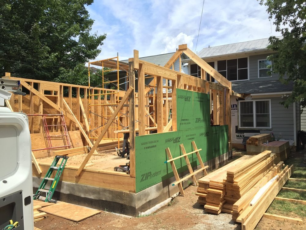
While we did not do the design portion of this project (the client had close friends who were architects), we did collaborate well with this design team and mutually insisted on extremely thorough designs, drawings and decision making prior to the build out phase. This decreases the amount of time a family’s life is necessarily interrupted by the construction of an addition.
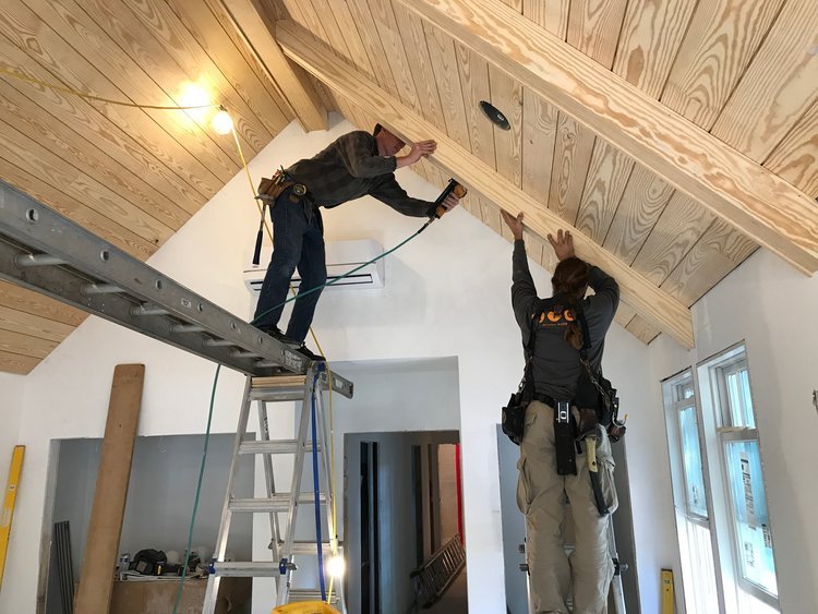
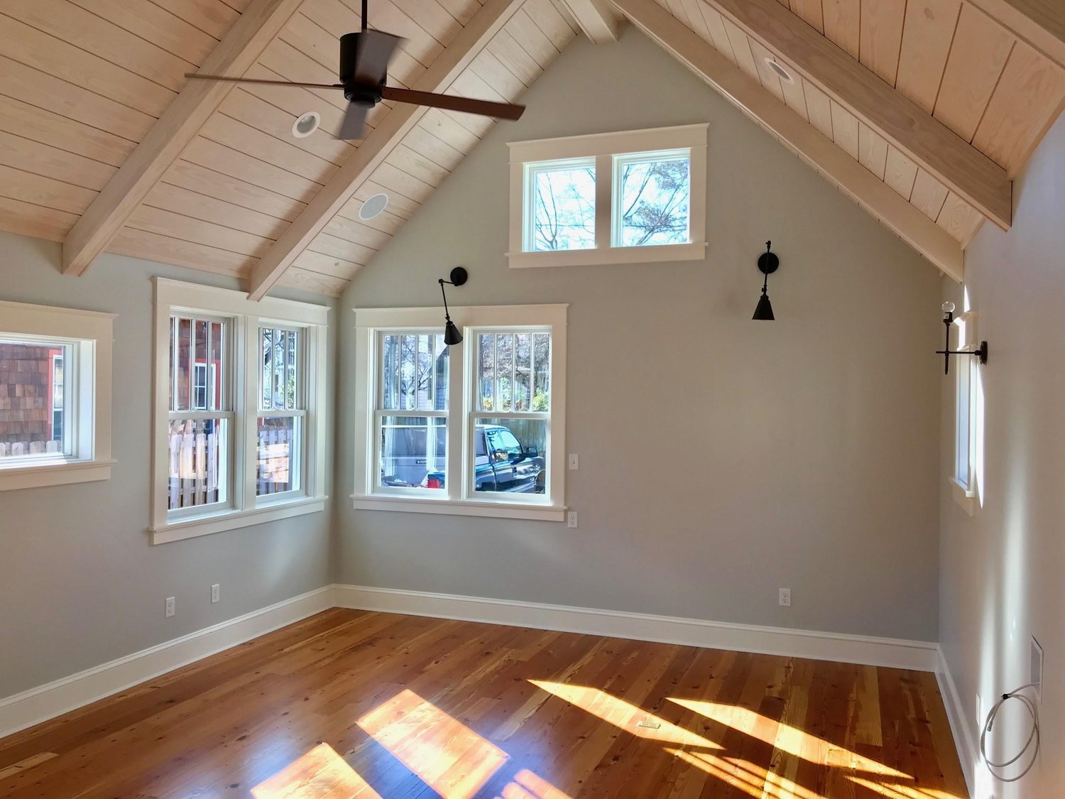
Our clients made very intentional decisions on both internal and external materials like reclaimed heart pine floors that flowed nicely with the rest of the home. Shiplap and wooden beams were installed on the ceilings - a great design choice for this style.
This addition provided them with a den/study/guest room, new bathroom and laundry room, but more than that, it allowed them the security of knowing they will be able to stay in their home longer, enjoying the space with their family.
Church Hill Addition
For this Church Hill whole home renovation and addition, it was important to the new owners not to interrupt the dynamic of the historic neighborhood. For this reason, they decided to keep all the exterior changes to the back of the house, with the front remaining mostly unchanged.
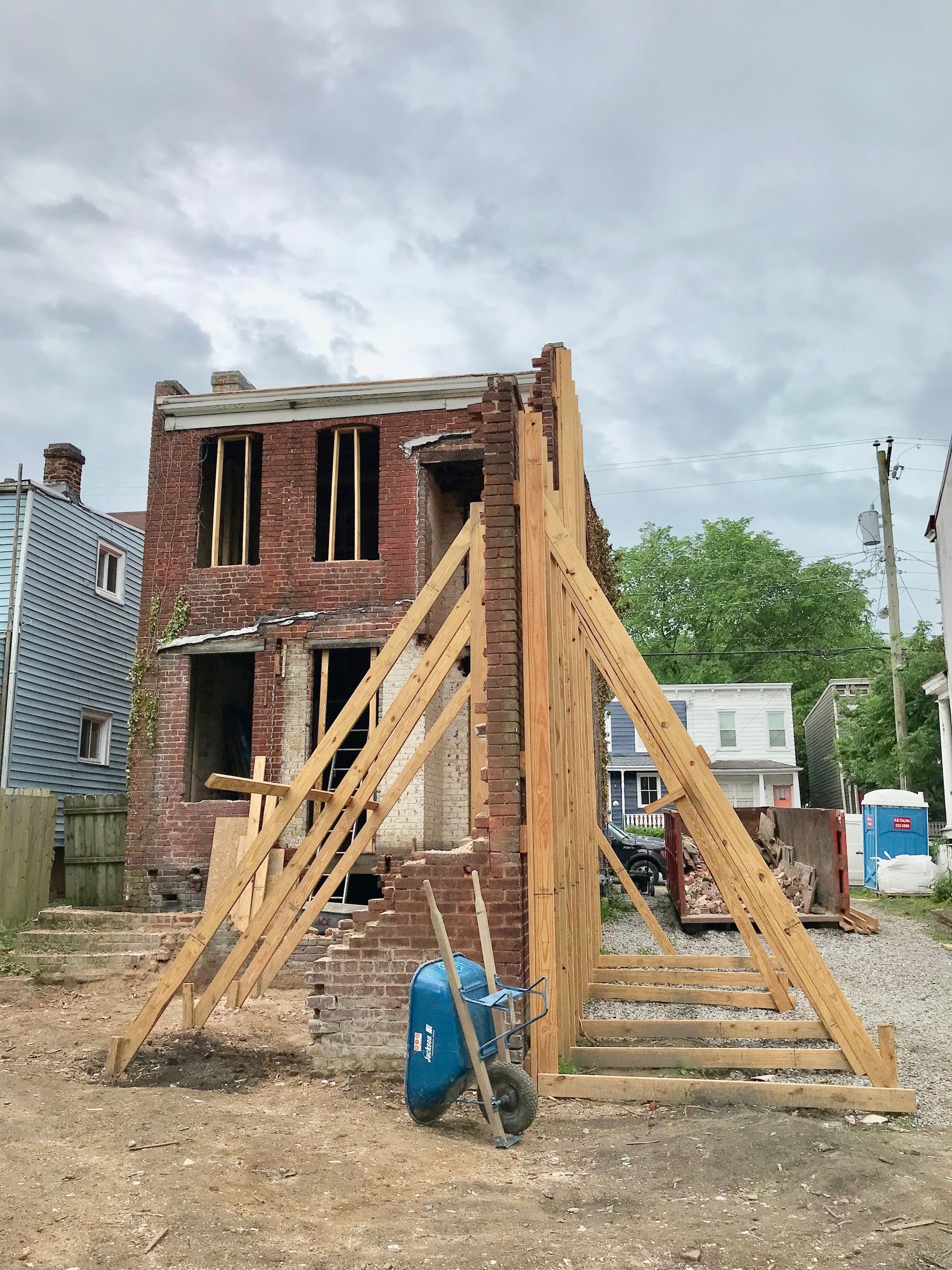
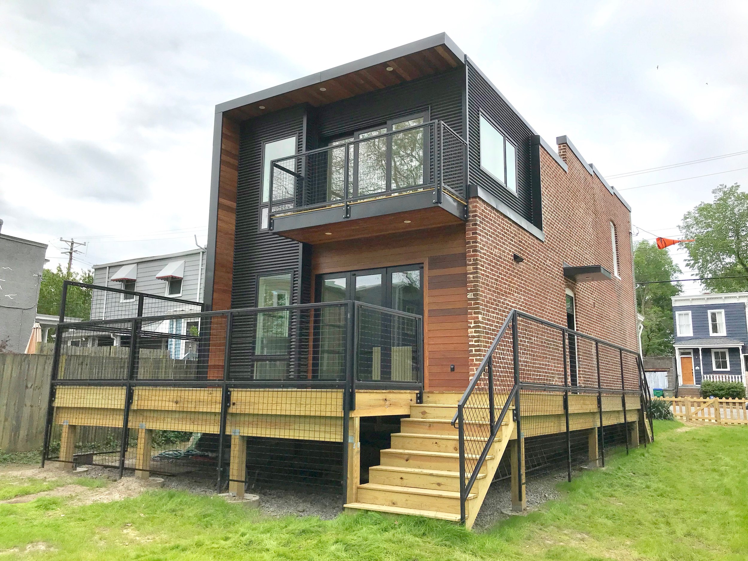
Although the front of the house doesn’t give away any secrets, the back of the house is an unexpected surprise. A modern addition on the back is embraced with the home’s original brick wall. Architectural designs as well as the Commission of Architectural Review requirements put a lot of emphasis on keeping the original masonry intact, which was no small feat.
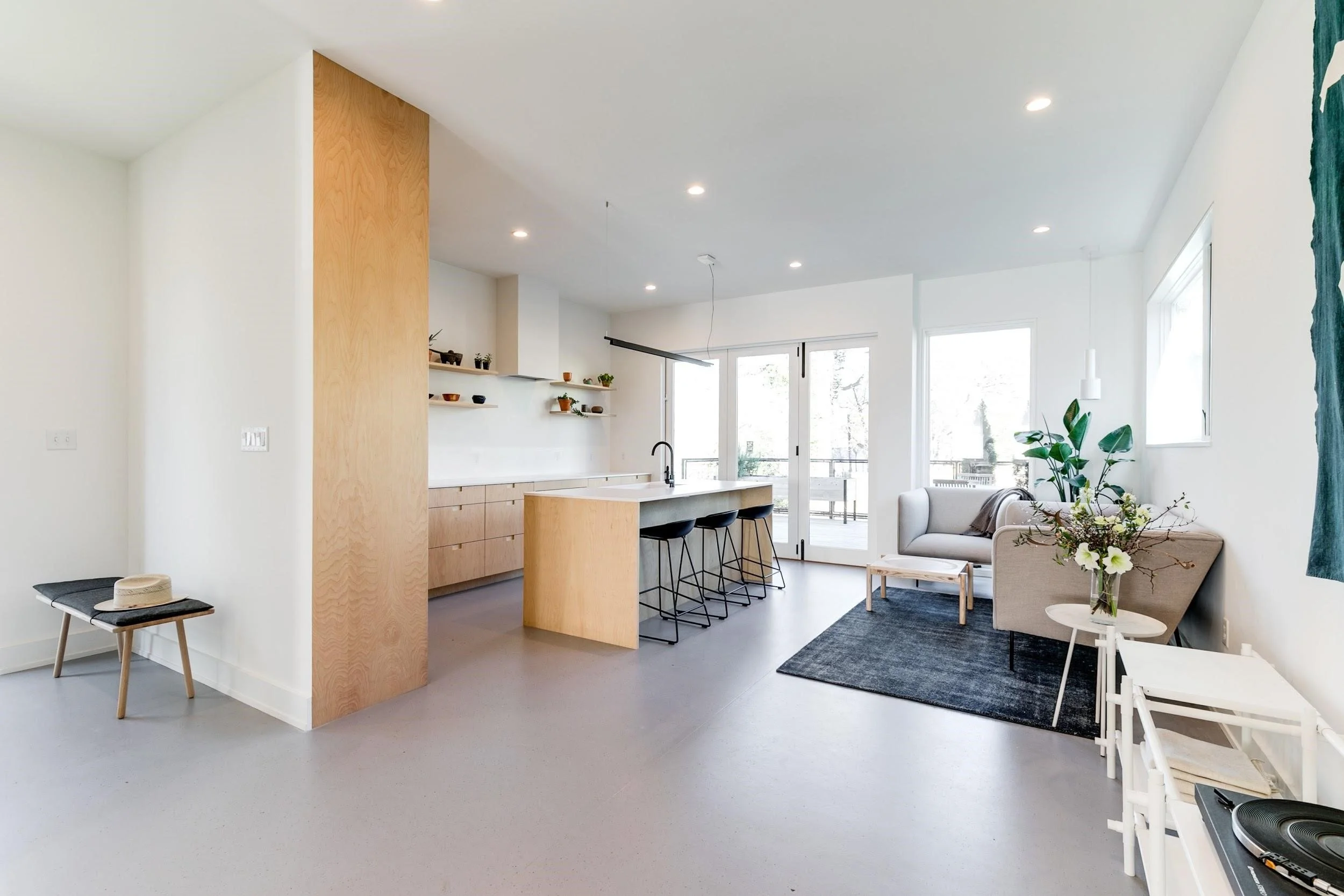
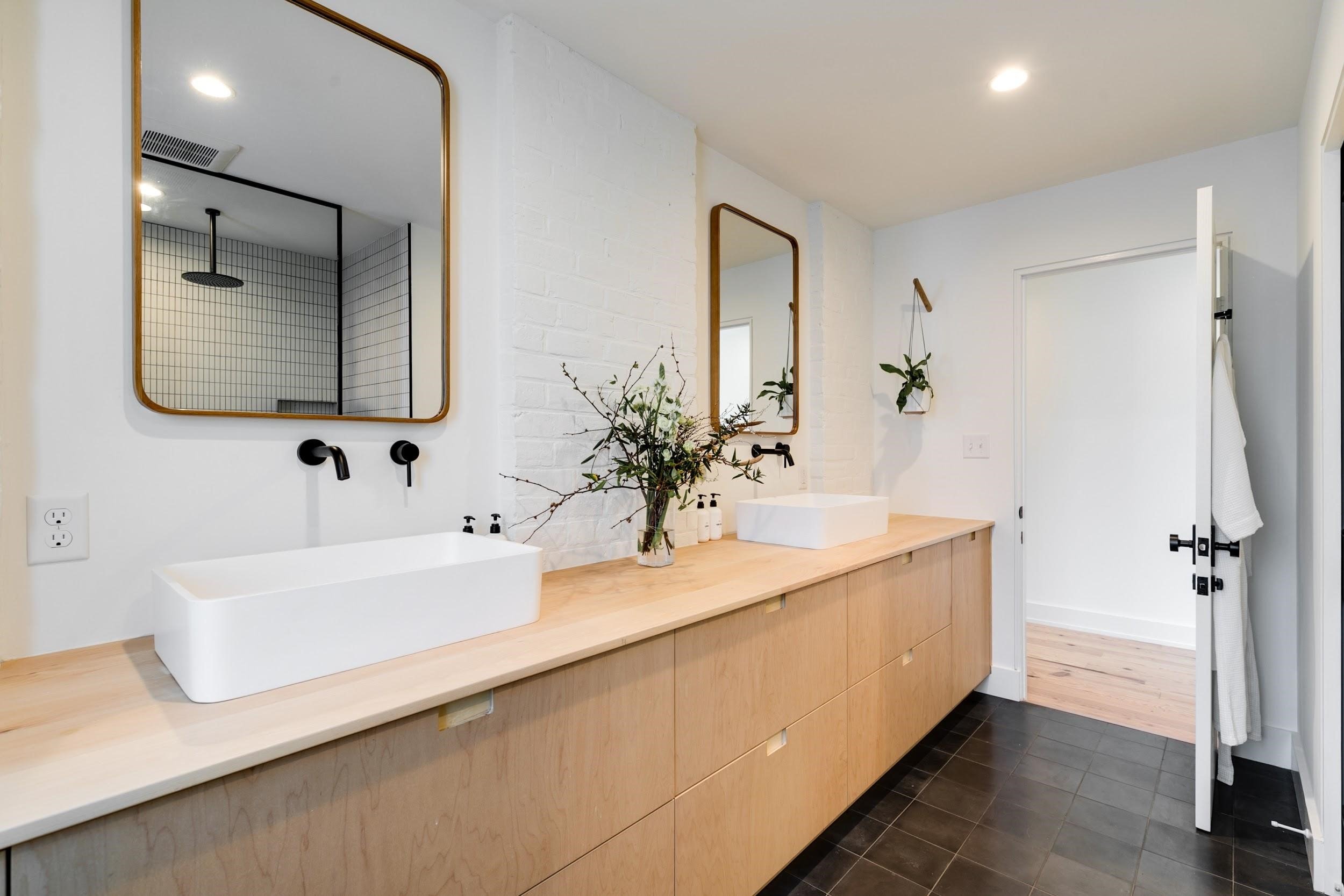
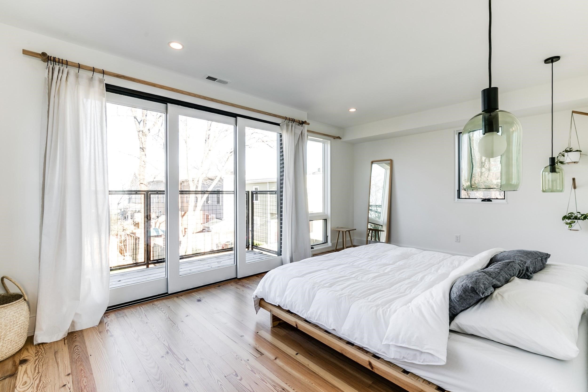
The space in the addition allowed for an extended kitchen with walk out deck and a primary suite above with a spa-inspired bathroom. This old-meets-new style fits perfectly with this young couple’s aesthetic, appreciation and lifestyle.
Historic Spanish Colonial Addition
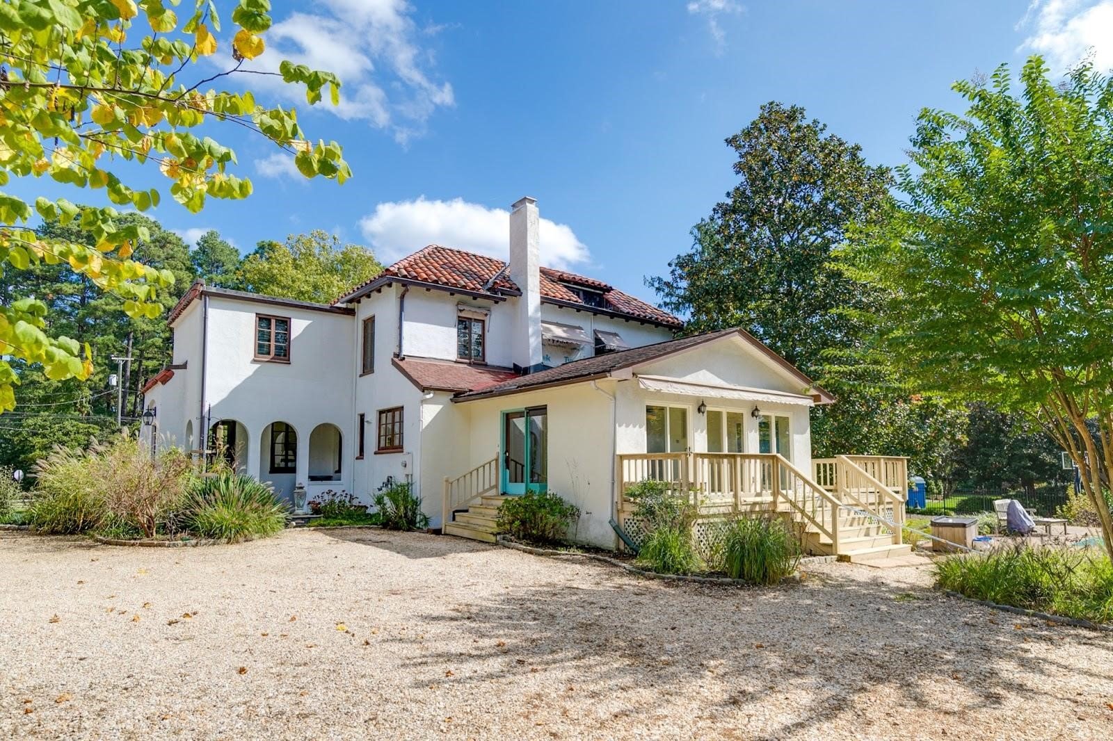
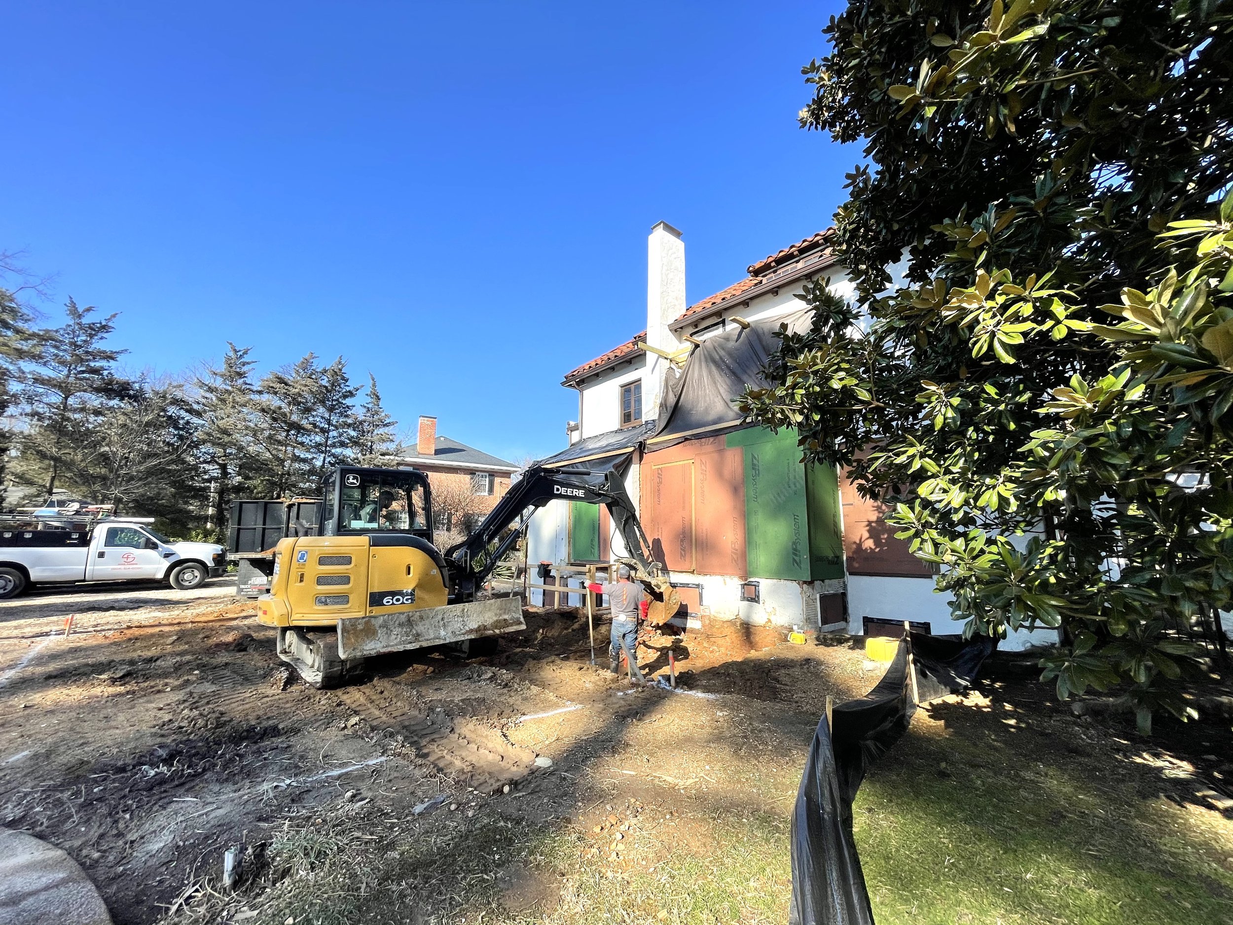
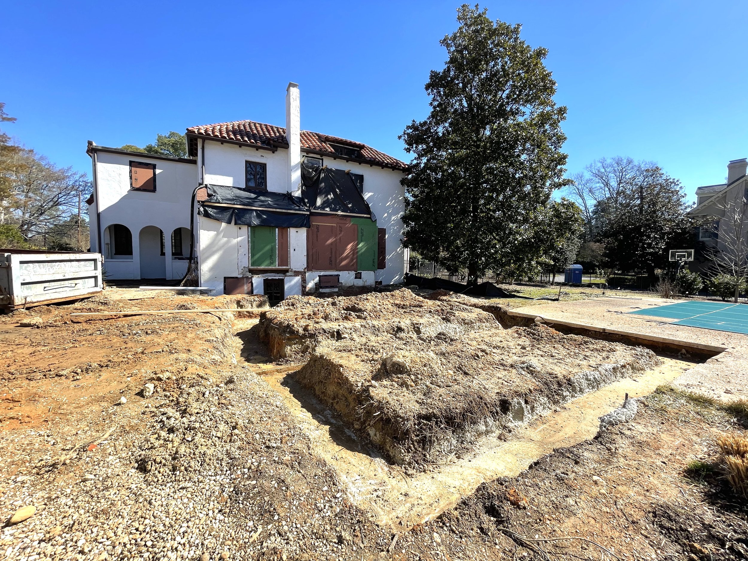
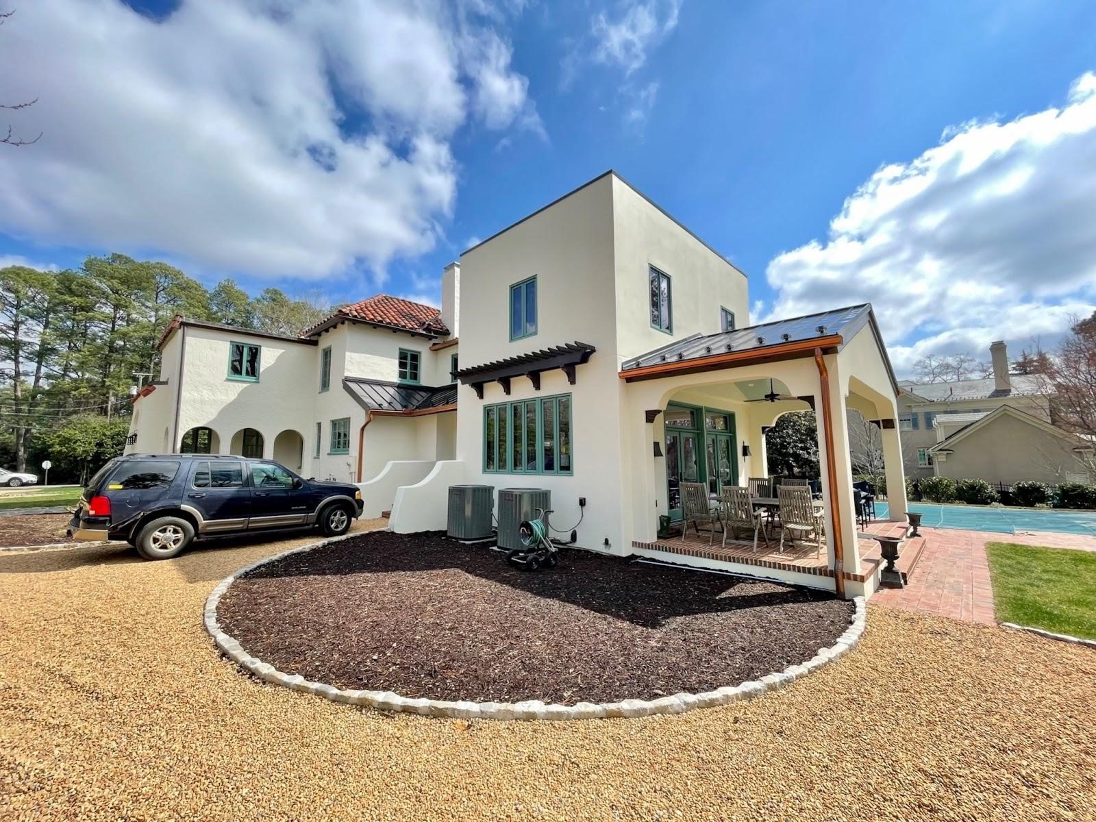
This historic Spanish Colonial was built in 1915 and our clients bought it from a family who had lived there for 30 years. They fell so in love with the house that they even hosted their own wedding in the beautiful backyard.
Although it was love at first sight, there were still some long overdue updates that needed to be made. Many of these updates, the owners had made on their own before bringing us in when they realized their family was growing and there was a need for additional bedrooms, a family room and a kitchen with more storage.
The house is part of the Three Chopt Road Historic District, both a part of the Virginia Landmarks Register and the National Register of Historic Places. This meant that any restoration, renovation, changes or additions to the home required stringent review and approval through the Department of Historic Resources. These requirements drove the design and the intentionality of blending the new into the old.
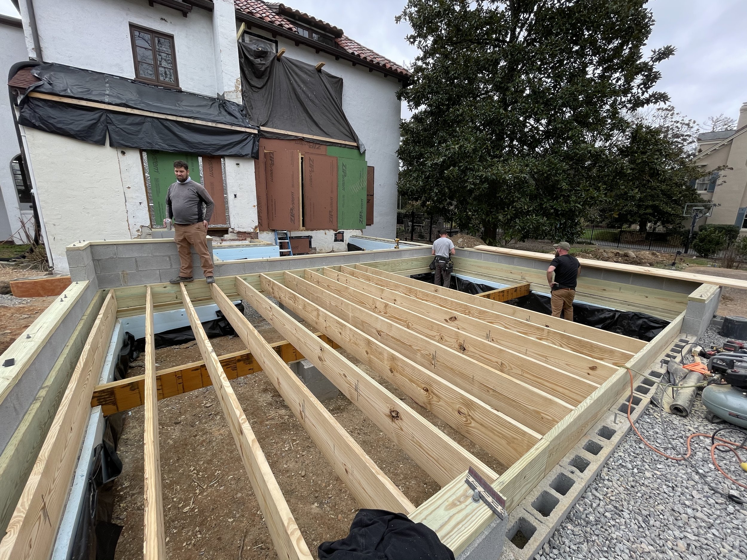
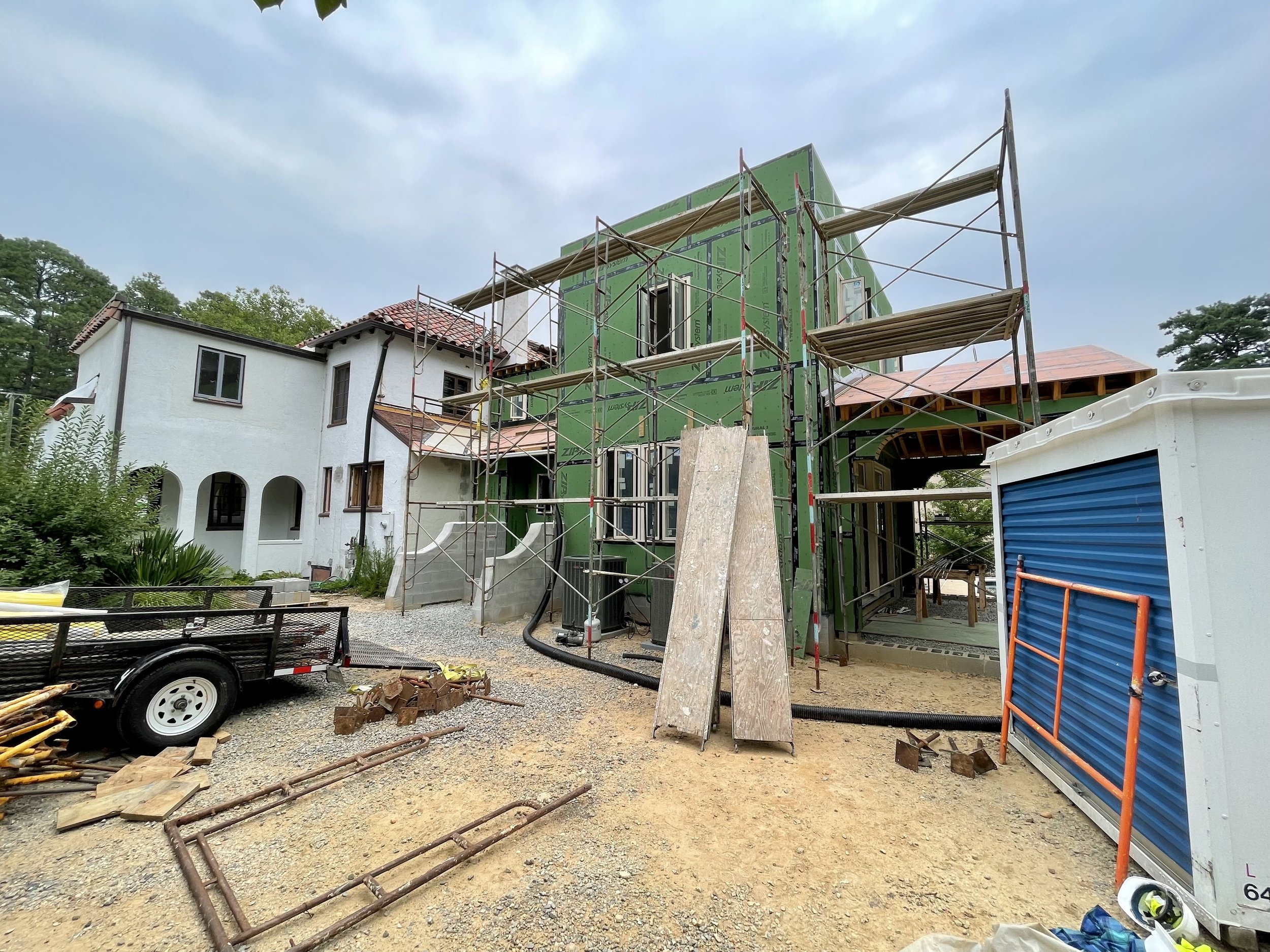
First an addition from the 80’s had to be removed. The new addition had to touch the original home very lightly - preserving original clay tile and rooflines. The material palette stayed true to the original house: casement windows, saltillo tile, hardwood floors, stained woodwork, brick porches, stucco exterior, but with a slightly more modern detail to distinguish the historic original components from the addition.
The family’s new addition offers expanded living space with a first floor family room that opens to the garden where they said their “I do’s.” Upstairs are two new bedrooms and a laundry room. Downstairs a new covered side porch connects the backyard garage and parking area to the new breakfast room and drop zone.
Adding on to the family addition
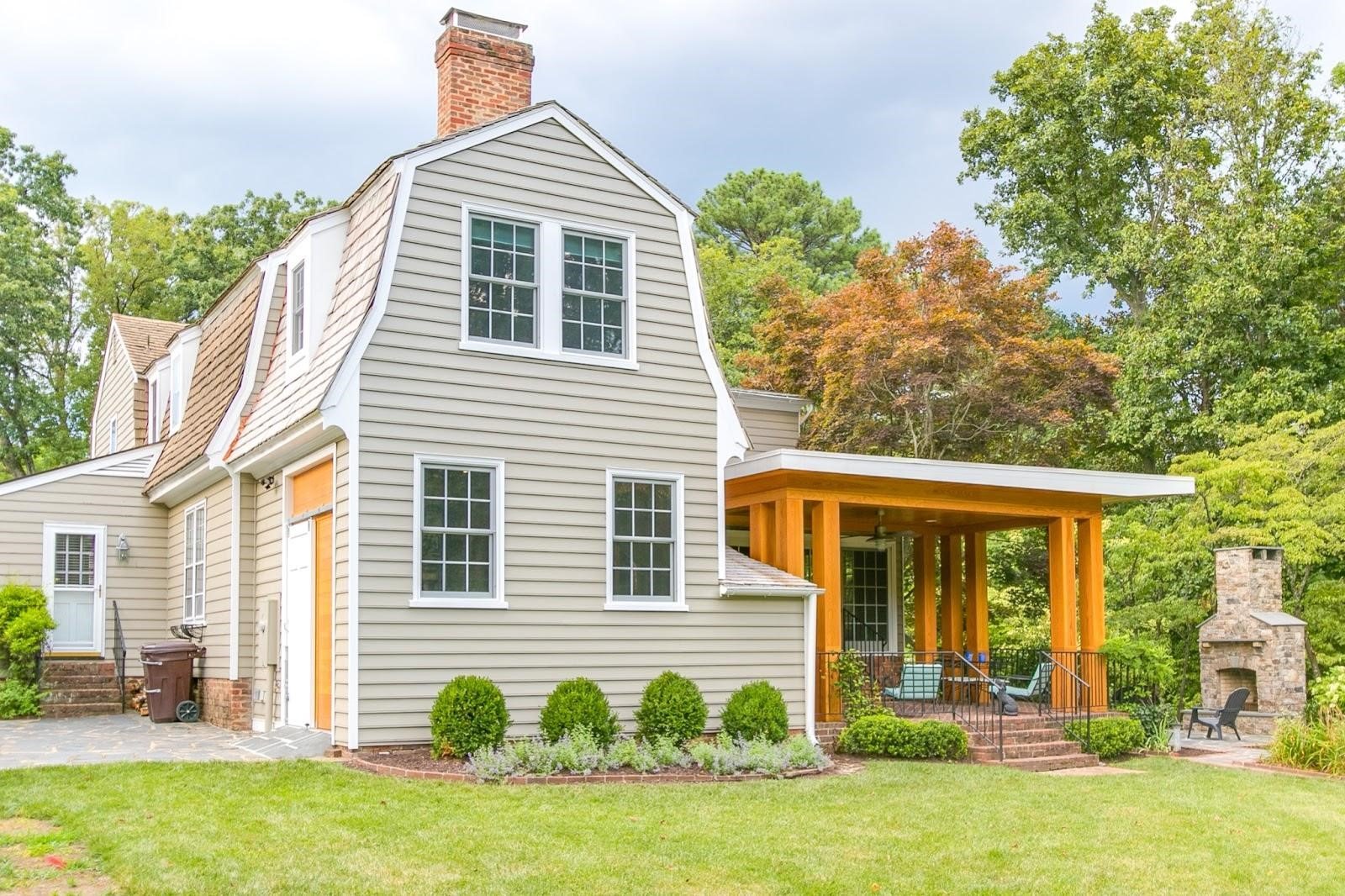
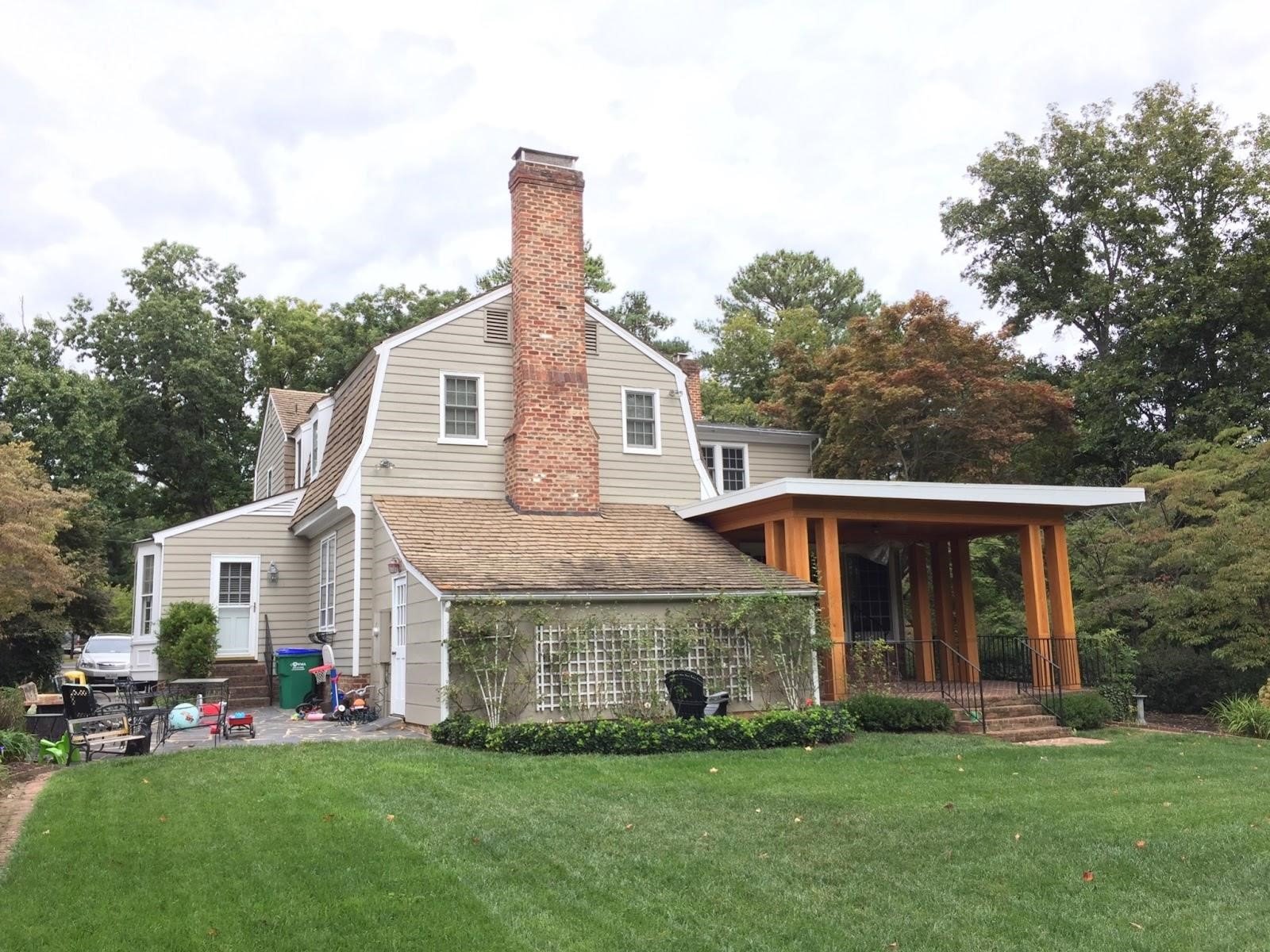
In 2015 we started a porch enclosure project with these clients, and within a year we were working together again on an addition to accommodate a new bedroom for their expanding family.
In the case of this home, we worked hard to blend the new portions seamlessly into the architectural style of the original home as well as working around the newly designed and constructed porch.
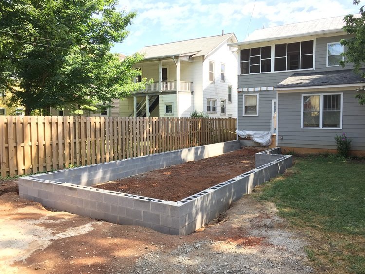
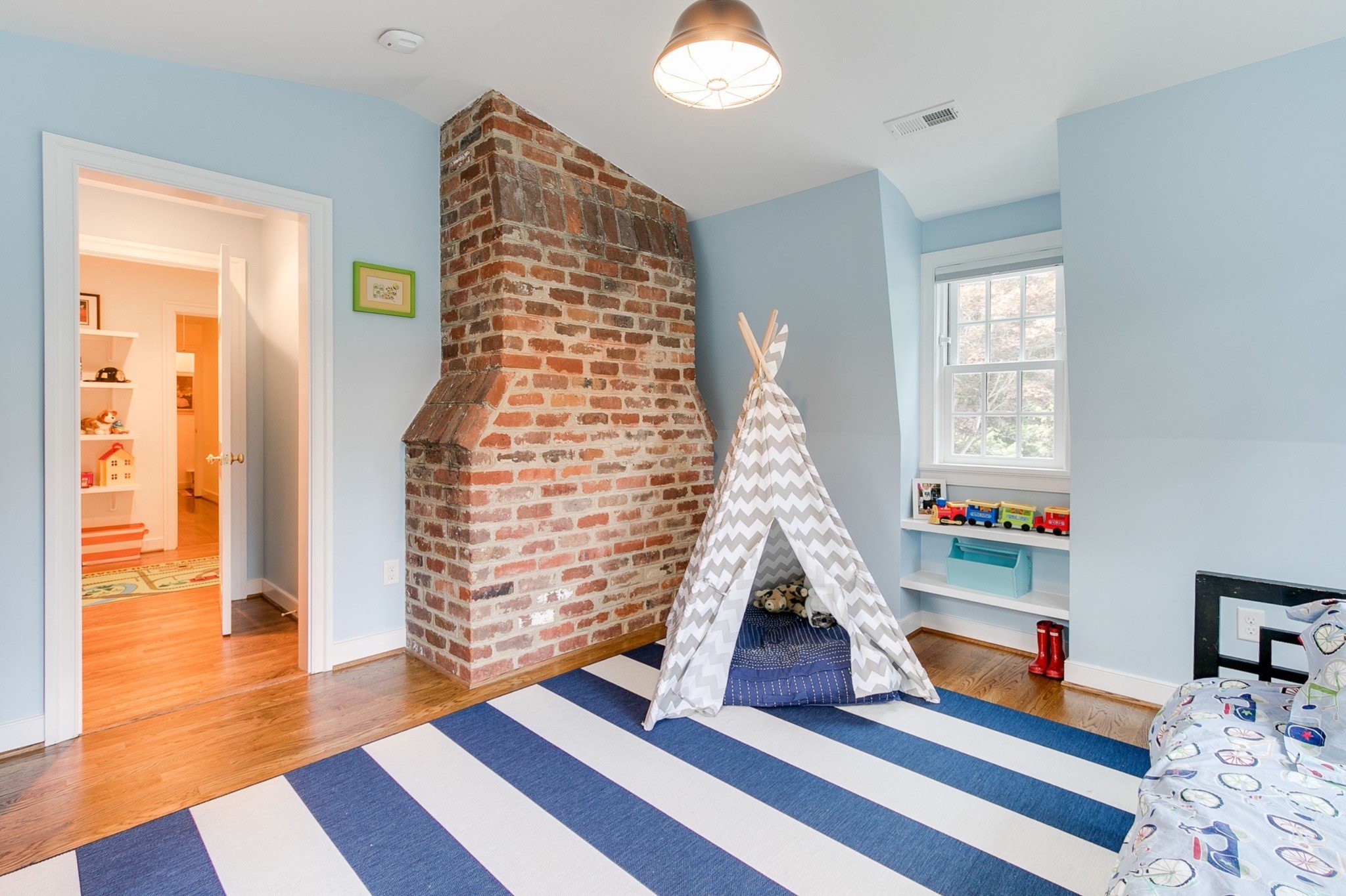
Building up and around the original brick fireplace allowed for some fun interior elements in the new space. This addition allowed our clients to stay in a home they had lovingly improved while welcoming a new member to their family.

