Powder Rooms: Little Space, Big Style
It’s a room that goes by many names: powder room, wash closet, half bath, guest bath, lavatory, the loo, and probably a few more we’re not aware of.
Whatever you call it, these small bathroom spaces have long been overlooked in the design department, perhaps because of their small, function-forward nature. But these small spaces provide one of the easiest ways to make a big design impact, and in a room that nearly any visitor is likely to see. Our clients know this well, and many of our projects have featured powder room glow ups that will inspire you to rethink this little overlooked space in your house. Here are a few of our favorites.
Tropical Tiki
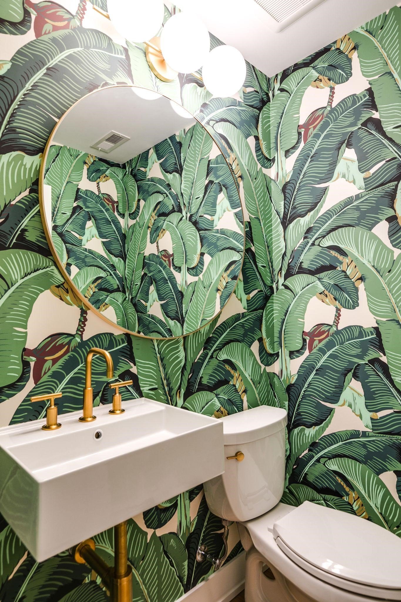
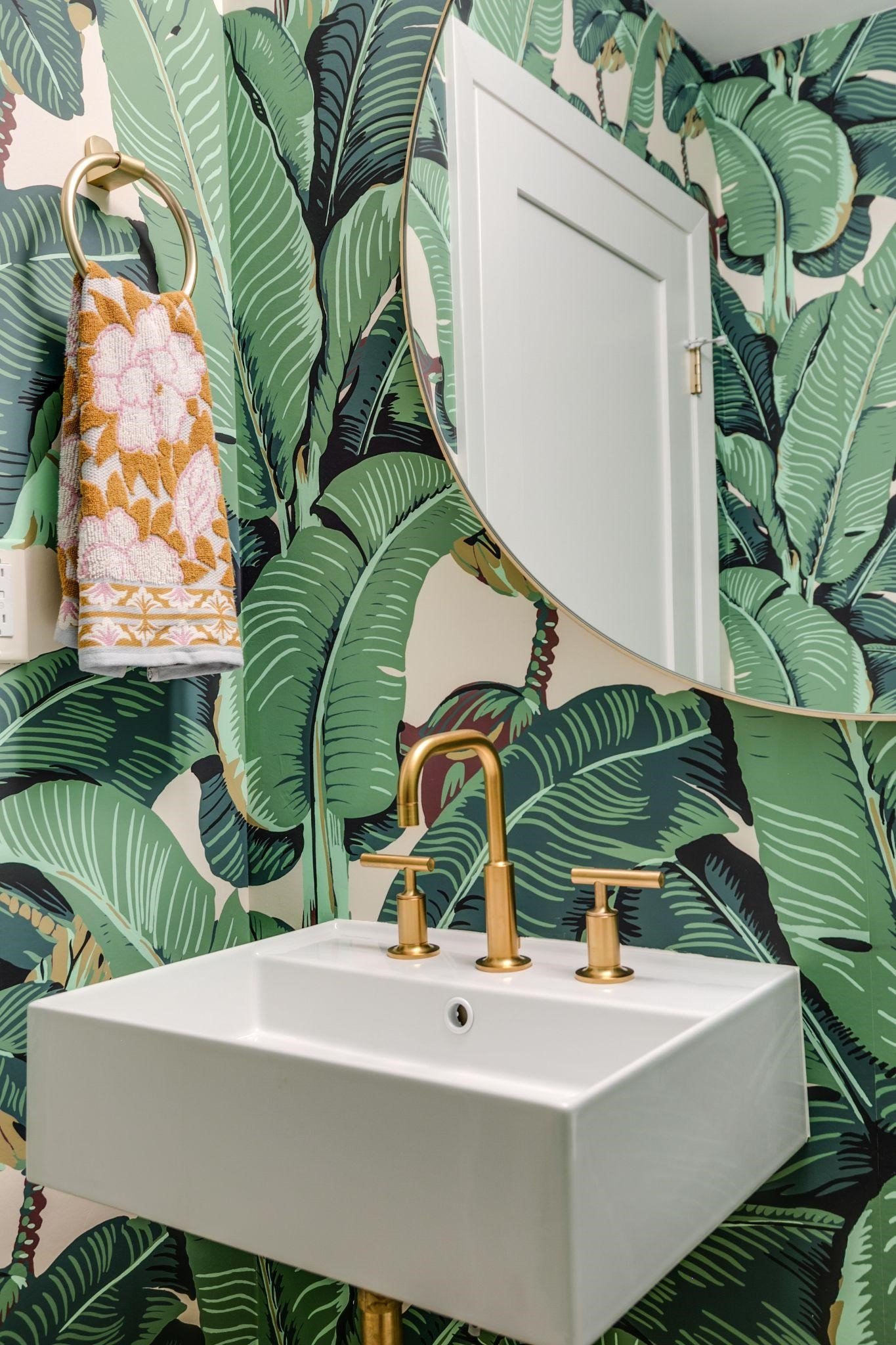
Does this wallpaper look familiar to you? That’s because it’s famous! The iconic Beverly Hills™ wallpaper in classic green is inspired by the hallways at the world-famous Beverly Hills Hotel. But you’ve probably seen it in other applications like a Mariah Carey album cover or the Golden Girls or Friends TV Shows. For our clients, Ron and Sarah Villacarillo, it was the perfect fit for their mid-century renovation. This little powder room didn’t exist in the original home’s layout, so we carved out space for it when refiguring the layout of the main floor.
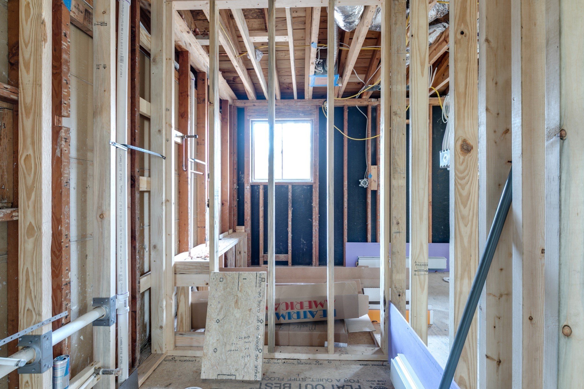
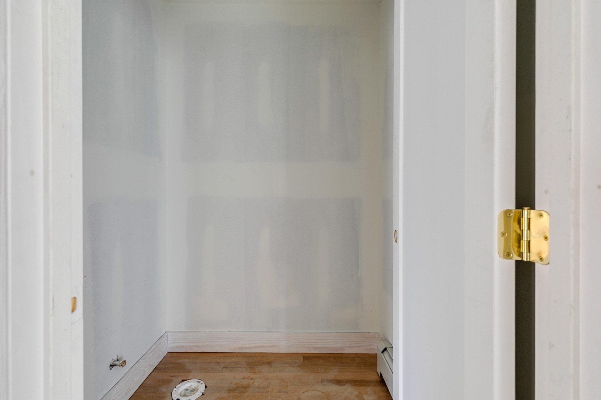
In the first photo you’ll see how we marked out where the walls of the powder room would be as we worked out how to turn this choppy hallway into a primary suite and half bath. The wallpaper paired with matte brass hardware and vintage lighting feels like a scene out of a California episode of Madmen. The attention to detail paid off with a house feature in Dwell and a Historic Richmond Foundation Golden Hammer Award.
Rustic Modern
For this project, a 1970’s home got a major modern facelift both inside and out. The theme through the house was clean, simple lines, but with a tilt toward the rustic, with wood tones to keep the space from feeling too cold or stark.
You can see from the before that this was a major glow up and required an entire reworking of the space. The thick wood countertop replaced an outdated pedestal sink. Minimalist hardware keeps the focus on the natural elements like the weathered wood wallpaper. Clean white walls focus all your attention on the vanity area. It’s simple, but statement making and incredibly functional to boot.
Black and white and cool all over
Powder rooms aren’t just for residential spaces. Commercial restrooms have the opportunity to make a big impact as well. This one from the Scott’s Addition location of High Point Barbershop was designed by Campfire & Co and built by us from the ground up in this empty industrial building.
Starting with a clean slate allowed for a lot of creativity, but with High Point, every design detail is about staying on-brand. Campfire & Co. knows this well, and we worked together (not for the first or last time!) to make sure this attention to detail carried through to every space in the shop. Vintage style black and white hex tiles create a moody, masculine vibe that is punctuated by bright brass accents. Even the black toilet and sink were carefully chosen and installed to create a vibe and experience for every customer.
Mid-century Makeover
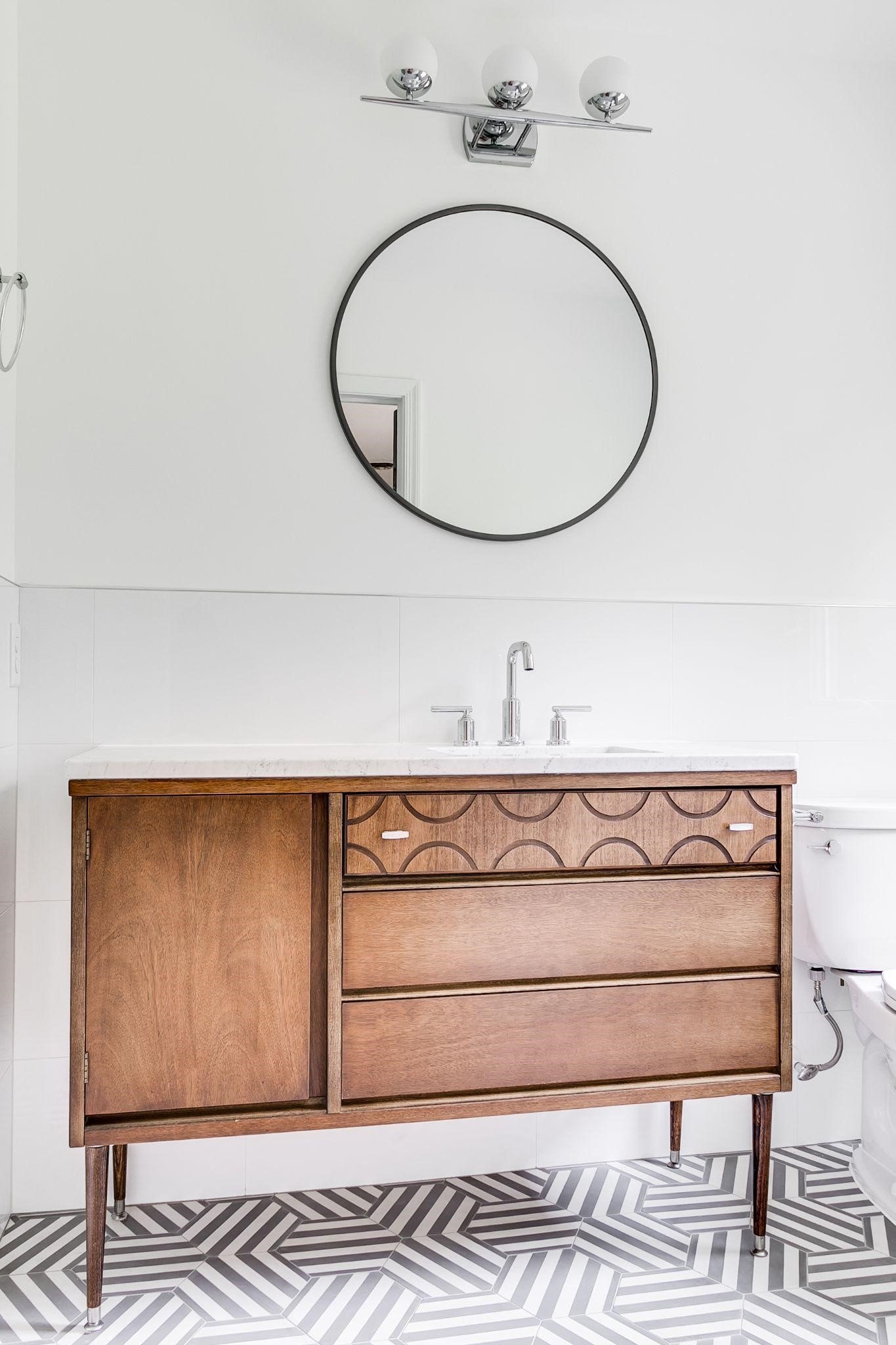
A mid-century split level got a major glow up a few years ago when we renovated this house for resale. This meant our in-house designer, Bronwen Warner, was able to make all the decisions herself. That included this amazing, original mid-century dresser she scored at a thrift store that we then carefully converted to a marble-topped vanity. We installed a geometric floor tile for visual interest and kept the walls white to let those two design details stand on their own.
The Bold and the Beautiful
This is yet another project where we were able to create a powder room when reconfiguring the main floor layout and where we converted a dresser into a vanity. This one the owner already had, and we let the bold wallpaper choice influence the deep blue color we ended up painting it. Ornate gold hardware, scones and mirror lean hard into this design direction, and we love how it turned out.
This is a selfie-worthy bathroom that proves sometimes you just gotta go bold or go home. These clients managed to do both.
The Harry Potter Half Bath
It’s not uncommon in older homes for us to use the space underneath an existing staircase for a very small, but usable powder room. In this old-meets-new Church Hill renovation, the interior redesign is unabashedly bright and light-filled. To juxtapose that, our clients took the opportunity to have fun with dark wood, tile and fixtures in this little hidey-hole space.
The result is a sophisticated space that makes this home much more functional for the homeowners and their guests. And all without adding any square footage.

